Category: "R:WM Dev Blog"

A Tale of Two BuilderBots....
Feb 28th

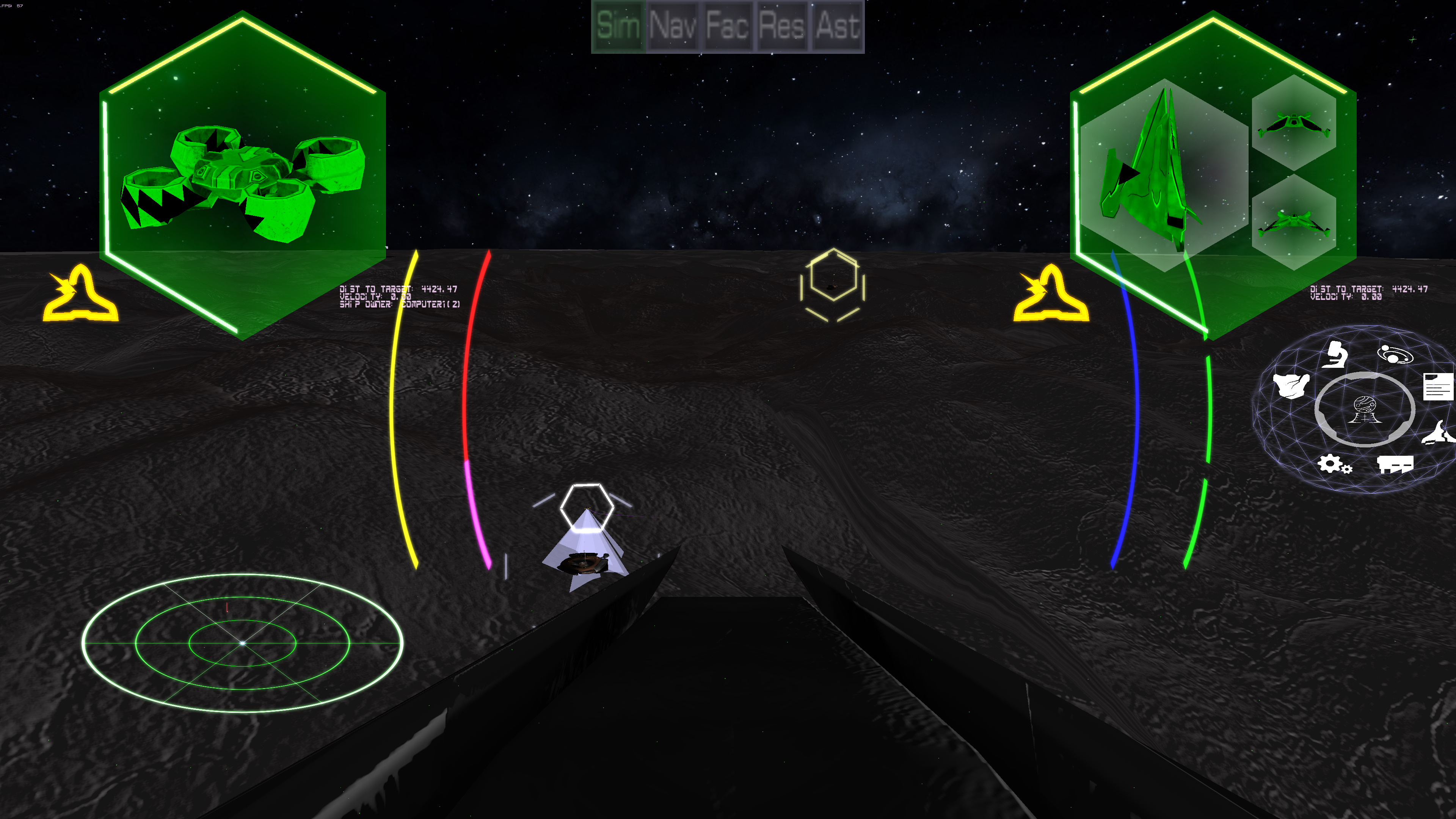
As GDC approaches (now canceled it seems as of earlier tonight...But we are still going!), the push is to get the single player fully running by mid-March, which has unfortunately delayed the livesteams as we push for getting everything done in time. (Sorry about that). As shown in the pictures, there are two AI controlled builder bots slowly building a city each. Not only that, but since it makes a reactor (for power) and research center, the WarMaster AI also researches. It actually only starts with the plans for a warehouse, a reactor and research center. It has to research the rest (as you do too as the player). So it currently is actually able to do the full cycle of researching the buildings it needs to complete the city and in turn actually place and build them. Once the factory is ready (and of course, the mine and refinery are ready), it starts to produce ships, like you've seen in other screen shots. The difference is, in those cases, the city was built by the scripts, not by "hand". Now the system is able to build the cities itself, as well as research on it's own. Currently, there are minimal fleet commands within the main simulation, which means as a player, you can take the same path and research and build a city, and start making your own custom ships. The fleet commands allow you to direct your ships without manually piloting them. Such things as "fire at will" and "Attack my target". The visual part of the interface still needs work, but the commands themselves work.
Also, another major change is the Autosave feature is now implemented! Currently it is running every 20 seconds for debug reasons, but the timing is settable in the configuration file quite easily. The good thing is, the autosave is so quick that it is barely noticable, and only noticiable if you are trying to look for it. It appears a a minor lag spike at worst. Hence the 20 seconds so its easy to reload from what one had left off if there was a crash. So now, I can have it crash, fix it, and see if I fixed it, rather than waiting the many minutes it might have taken to get to that point again. I will admit, it is strange having the load/save actually work, but I'm happy it does. (So many years without such a feature...)
Once the fleet commands are properly working, the game is basically ready to come out of Pre-Alpha and become Alpha. There are LOTS of features that still need to be added, but a full basic game (very basic) would be possible. Very scary and very exciting at the same time!
As far as GDC goes, the current plans are still to go to Game Connection that is(was?) along side GDC in San Francisco, and hopefully honor all the meetings that same week that were supposed to be at GDC. I'm not 100% sure how that will happen, but Game Connection is still open, so perhaps use their meeting places. I'm sure this will all get more worked out in the coming weeks.
Please check out the next livestream on Youtube and subscribe (https://www.youtube.com/channel/UCXex4ualUNFdSVHJhtxDsWg) and follow us on twitter at http://twitter.com/@LBPSInc !

UI/UX Artist: Installation Bar — Now With 80% More Greebles!
Feb 27th
Hi all. This is your UI/UX Artist Paul. This week I have finer details to show for the Asset Screen. Specifically, the Installation Bar.
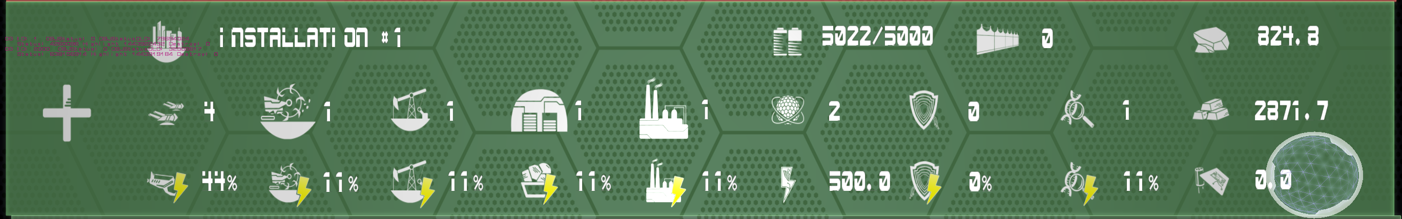
The Installation Bar is an overview of all the player's total "immobile" possessions and assets. Things like buildings, cities, mining sites, power plants, factories, research labs, raw & processed materials, components, and even defensive fortifications will be represented here, but not more "mobile" things like ships and personell. The above is the concurrent Installation Bar, showing the icons necessary to represent all pertinent information, as well as one possible layout for all of them.

This is a 1:1 retexture of the same layout shown before. The screen backdrop and gradiented outline from the other Asset Bar elements were once again brought in. A smaller set of background "runner" bands were placed behind the icons to both organize them into more clearly defined rows and make them stand out from the backdrop. The top band shows actual assets, while the lower band shows the power levels for each one in vertical correspondence. Redundent icons were removed in favor of having simply one icon, the lightning bolt to the left, indicate the entire row's purpose and prioritize the actual numerical data being conveyed. This mockup was a step in the right direction but it had its flaws. The two icons at the top, aptly named "I forget this one" and "This too. Wut do?" actually belonged in the "run" with the other icons. The lightning bolt the far left, though a good route to take, left no room for the Expand icon that would open the dropdown of specific assets. The box on the far right, showing raw, processed, & component materials was not associated with the run and therefore could have been resituated.
All of the above flaws addressed, we have the final Installation Bar. Proper transparency of the screen fill has been implemented. The Resources Box on the far right has been made into a row and moved to the top. The lightning bolt icon has once again been redone in the form of a part of the transparent backdrop for the lower runner band, clearly and unobtrusively denoting what the percentages overlaying it refer to. This gives room for the plus sign Expand icon. The battery icon, being a total power overall indicator, received its own band, with a visual connection to the reactor icon to denote meaning. The wall icon has taken its place in the run now that the resources no longer take up horizontal space. An off-center circle now occupies the top left as a holster for the Installation Icon, making it stand out from the other hexagon-themed backdrops. Lastly, a new "Transfer Assets" icon (the arrows in the hexagon top right) was designed to allow players an easy-access button to send assets to installations or personell.

Tutorials, Scripting, & Bug Fixes
Feb 22nd
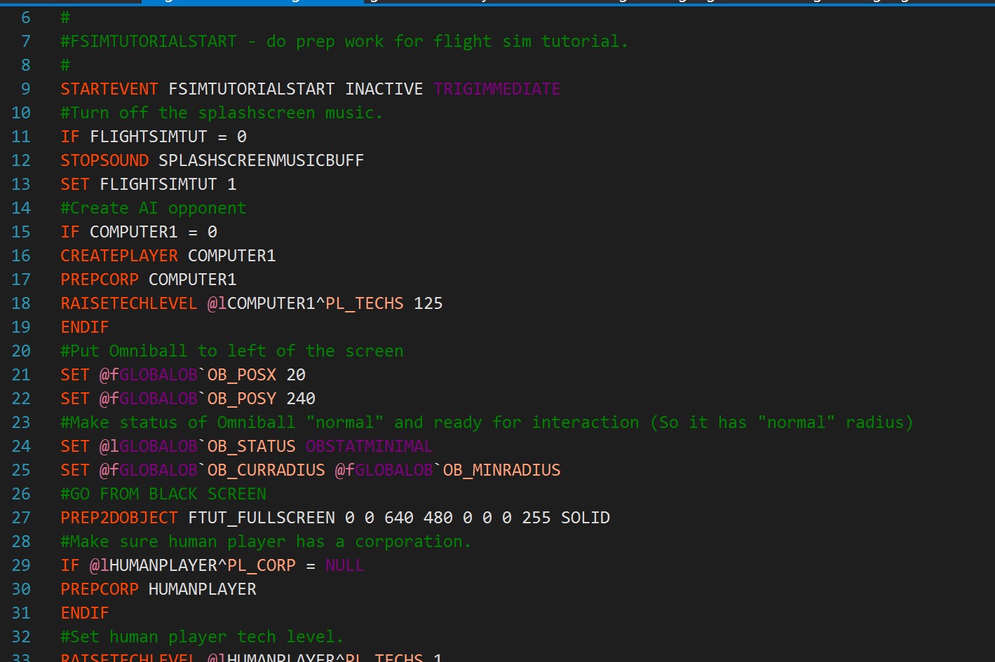
The clock is ticking down to our visit to GDC and Game Connection in mid-March, which means it's time to finish things like our tutorials, which are written in our custom scripting language, as you can see above. Rank: Warmaster is completely moddable out of the box. Want to create your own quests or scenarios for you and your friends? You can. Want to swap out the default ship hulls for the ones in your favorite series, or create your own custom solar systems? You can do that, too.
We've also recently made the transition from testing particular pieces of code to testing actual game flow, i.e. actually playing the game to make sure everything is working together properly. The longer we can play without running into problems, the better. Of course this is leading to plenty of bug fixes, but we're still playing the game.
Lastly, our artists have recently turned their attention to the asset screen, so we should have some much upgraded pictures of the game in action next time.

Backdrops for the pitch deck
Feb 21st

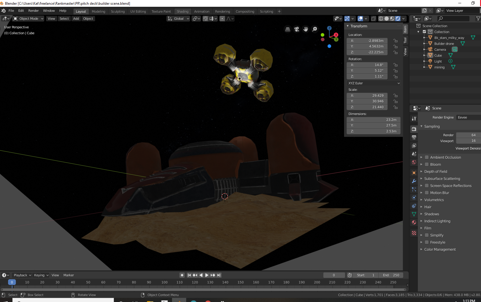
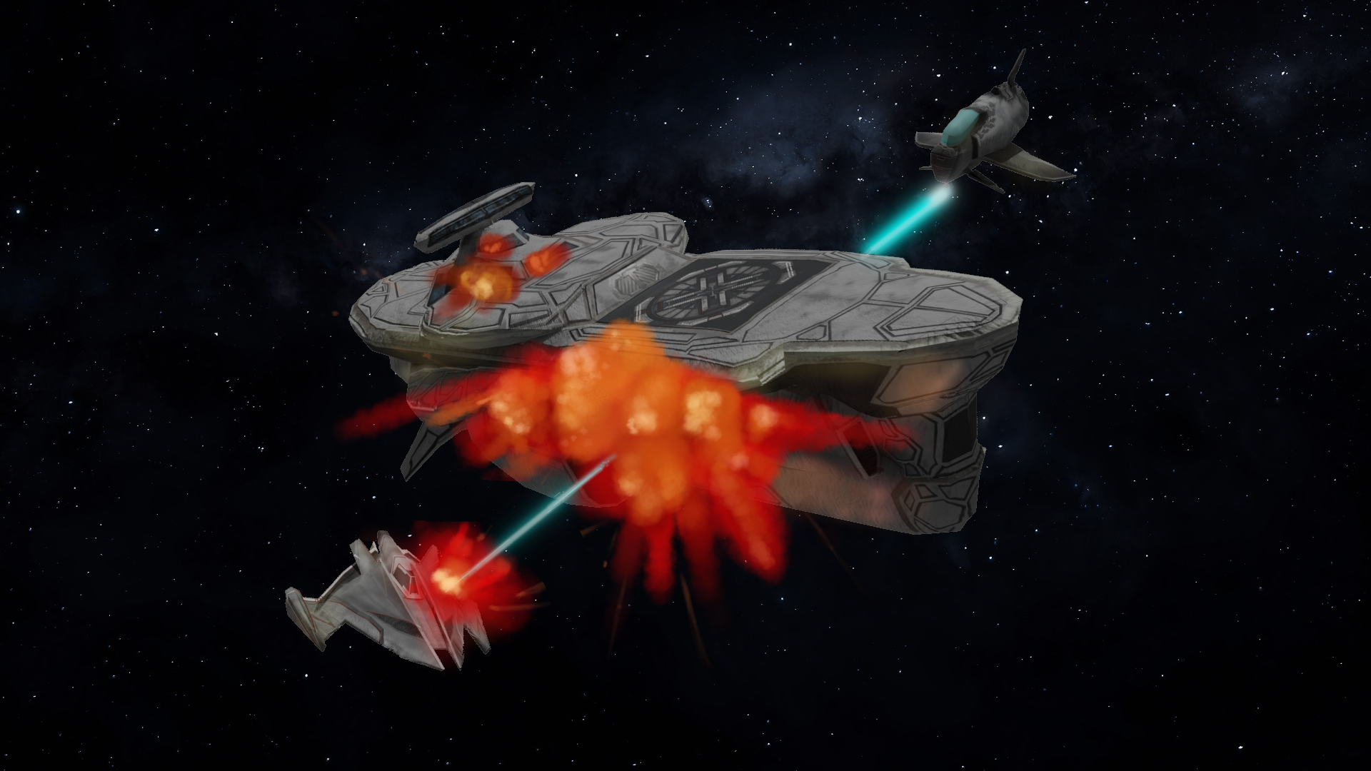
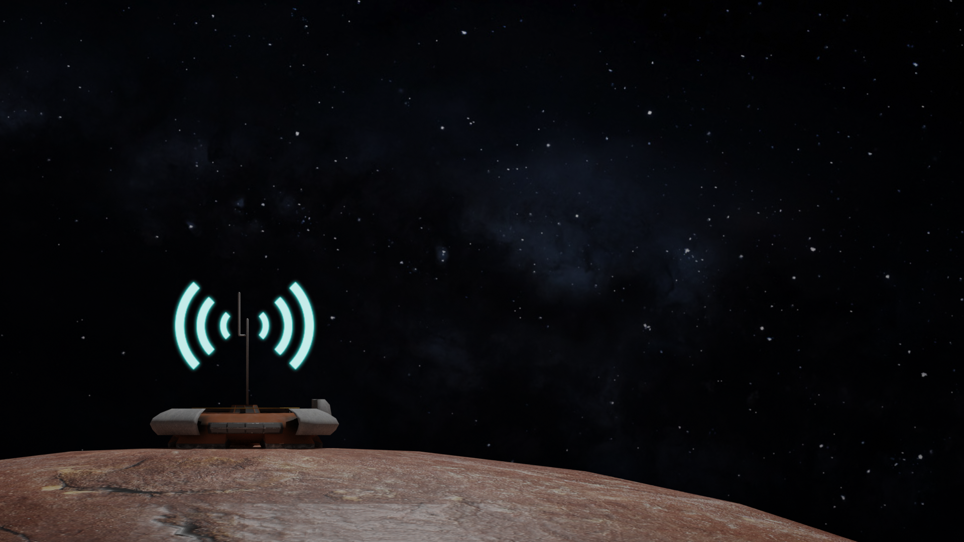
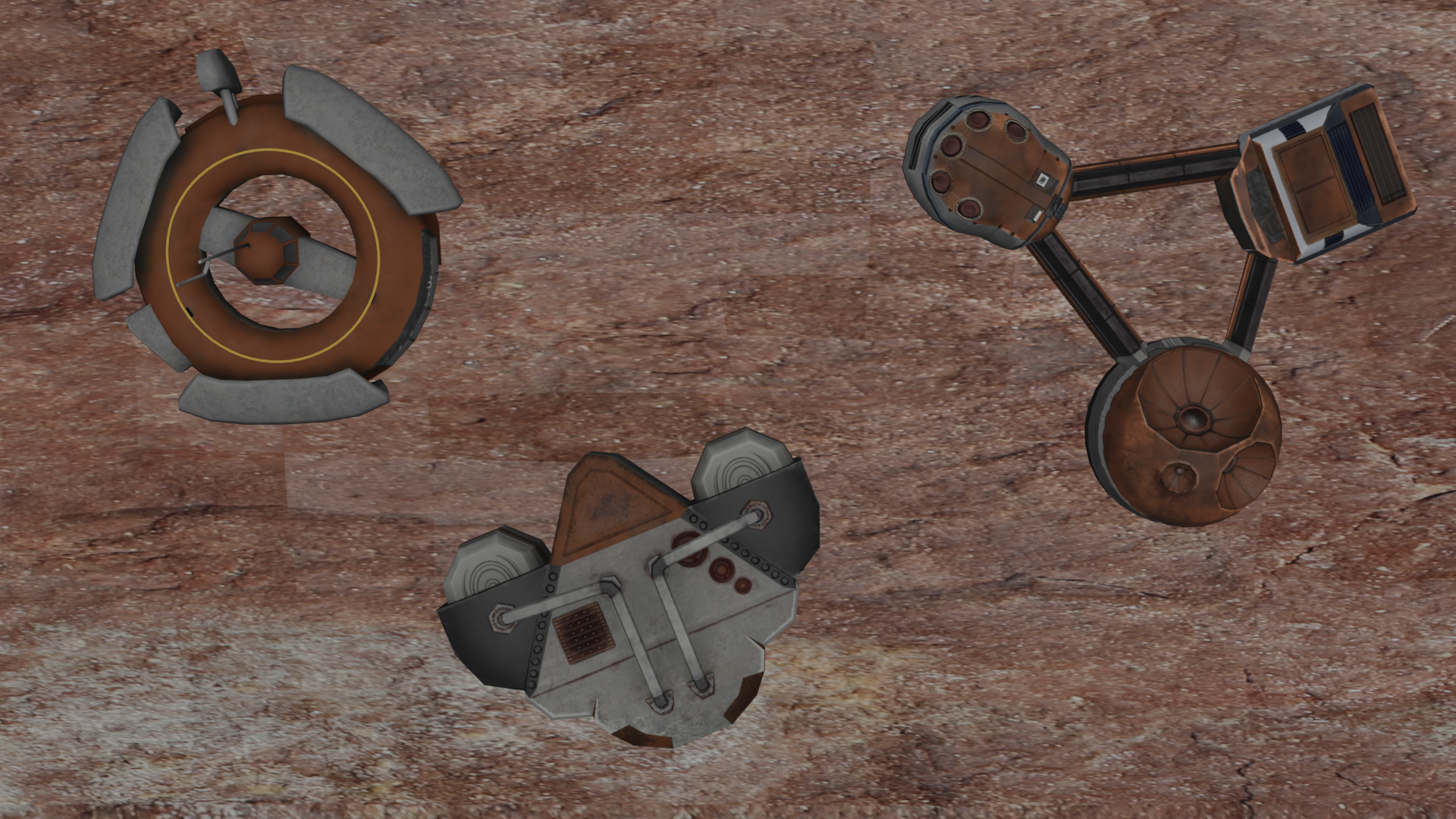
Sharing this week are a few pitch deck and concept images. The last image is how the builder bot scene was created in Blender, my prefered 3d program.
Building/Builder Menu Updated
Feb 14th
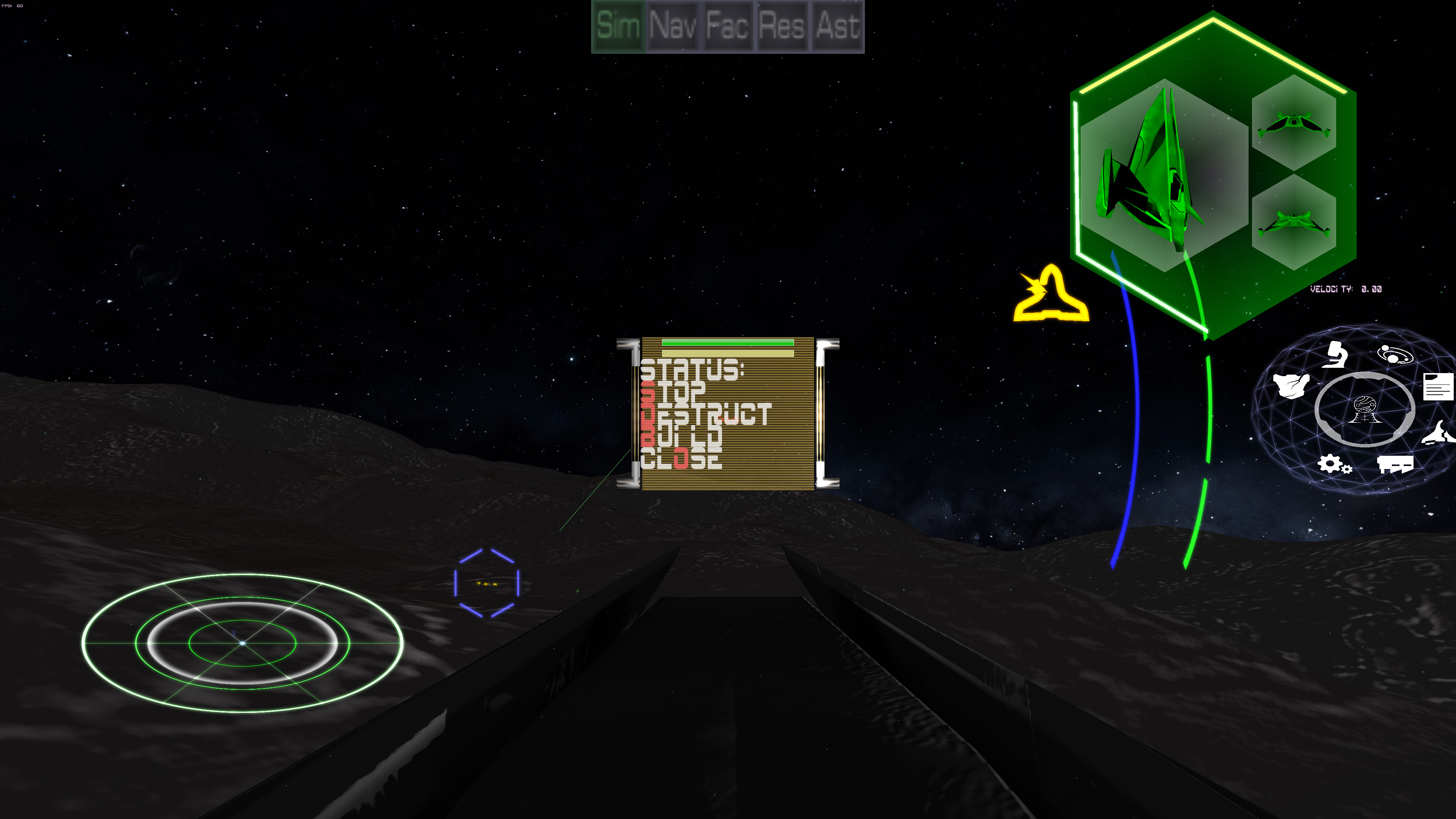
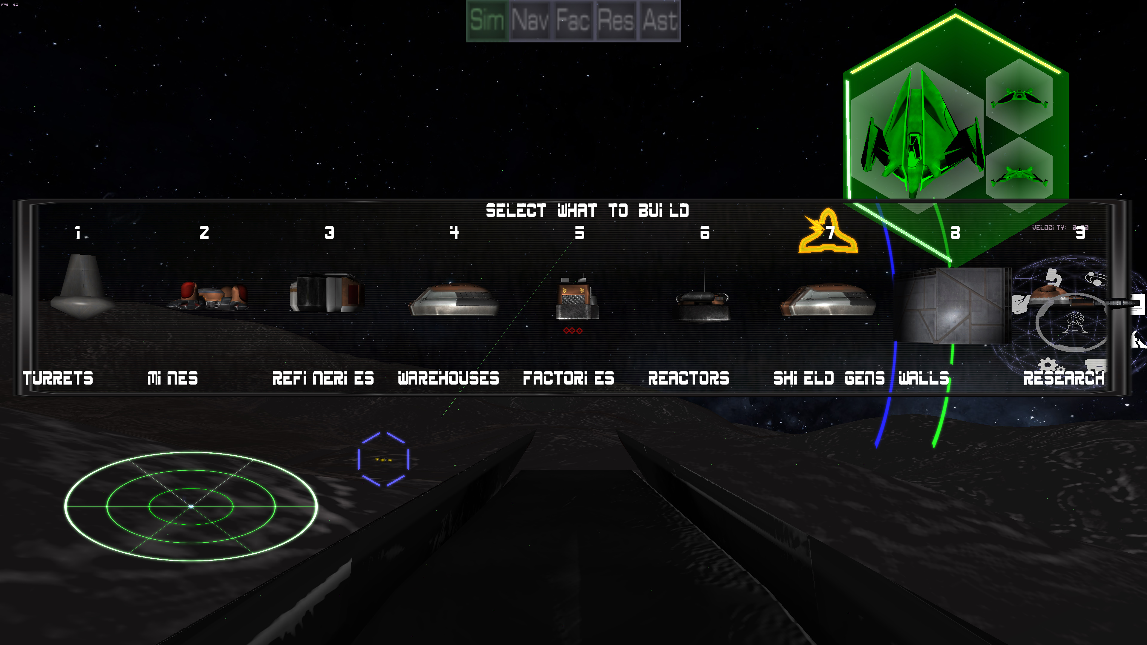
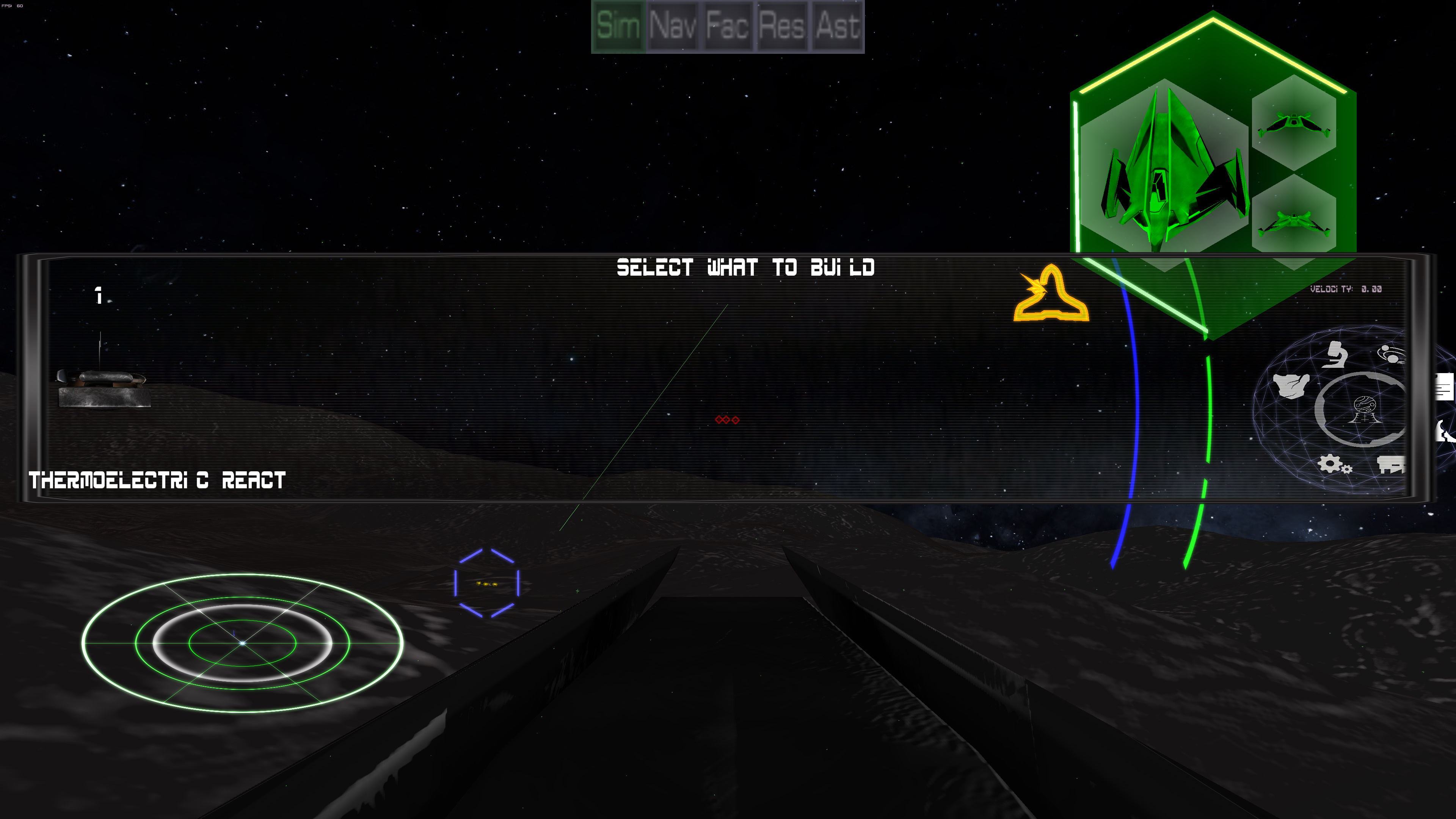

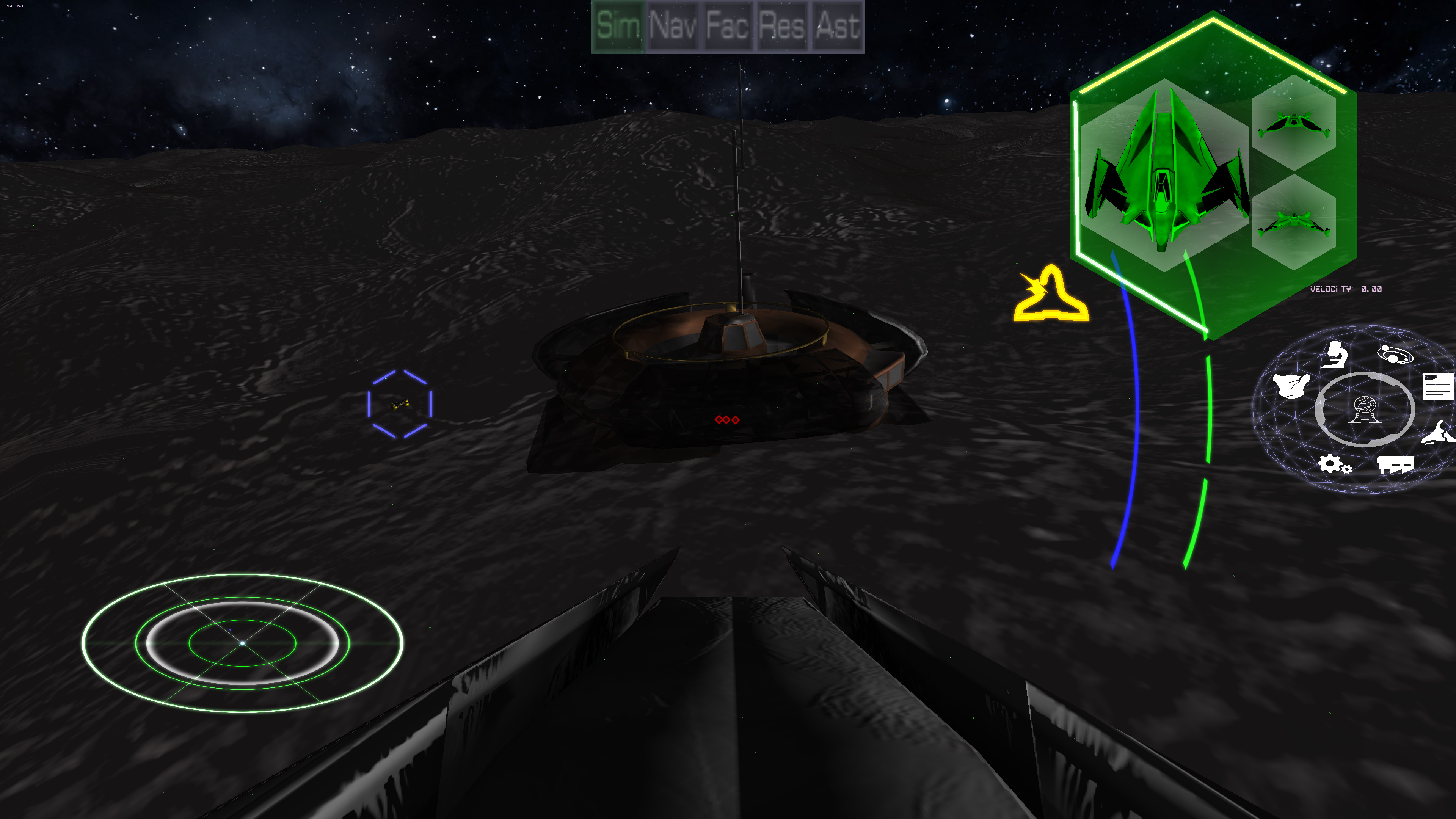
The current push is to get the single player running by mid-March for the GDC/Game Conection demo. So the idea is to start from the beginning of the player's journey and make sure all the pieces are in place to go all the way through the main game loop. So that journey of course, starts on the planet and starting to build a city. So the start of that is to order the builder bot to build a building. While this worked before, it still was tied to the old system and was so old it didn't take into account if the player actually had the building itself researched or not. Not to mention a lot of other problems. So the solve was to rebuild the menu display system in the "new way." While the initial menu is still the old system, that seems to be more stable. As you can see by the screen capture progression, building under the new system works fine.
Another issue has been addressed in the load/save/network system involving the terrain itself. The terrain is randomized each run of the game. Now it is saved to a file and loaded from there so the terrain is now locked in place. This will eventually allow for more hand crafted "random" terrain that should look far better.
Please check out our YouTube Channel, discord, and Twitter.
UI/UX Artist: Further Refinements to the Ledger
Feb 12th
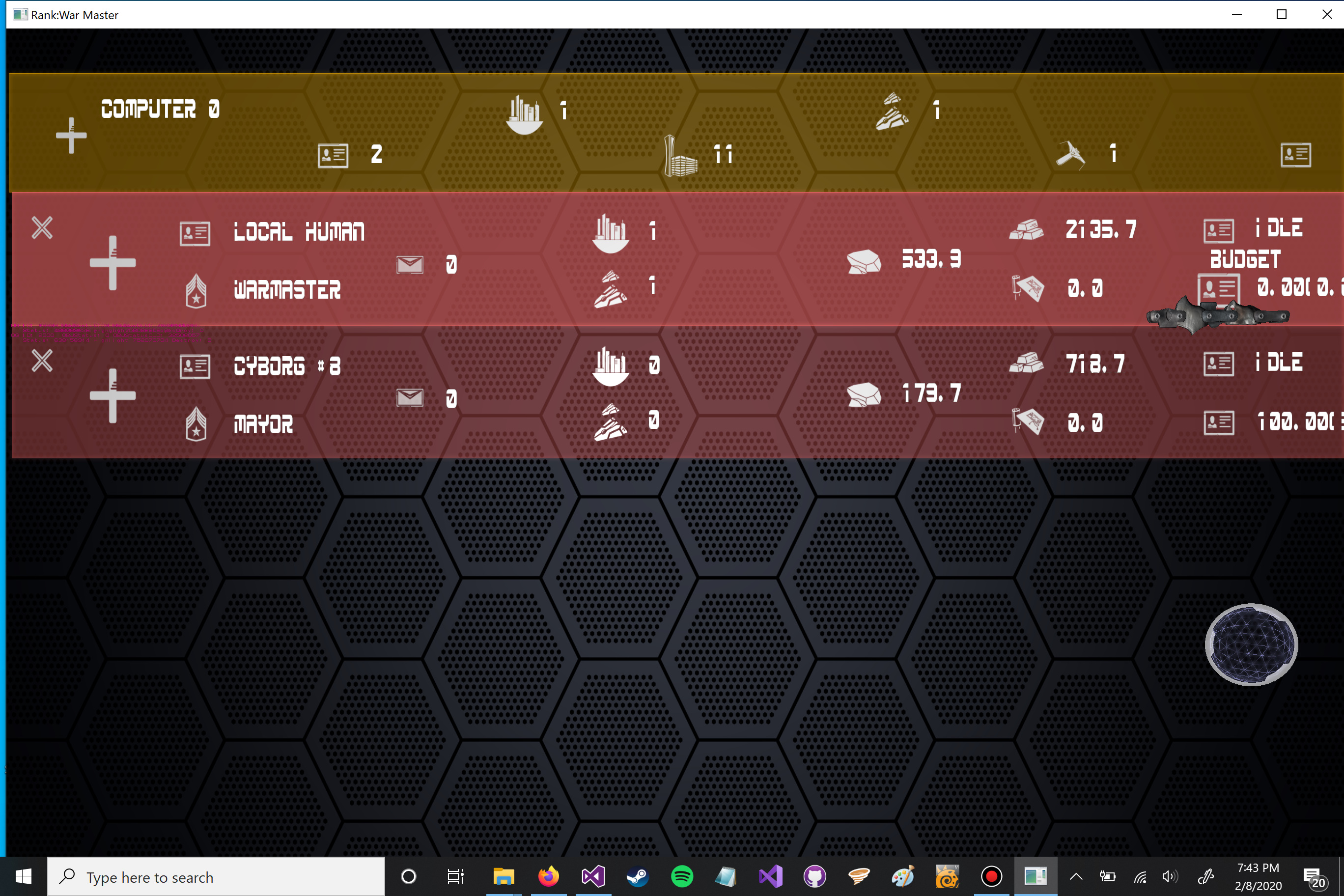
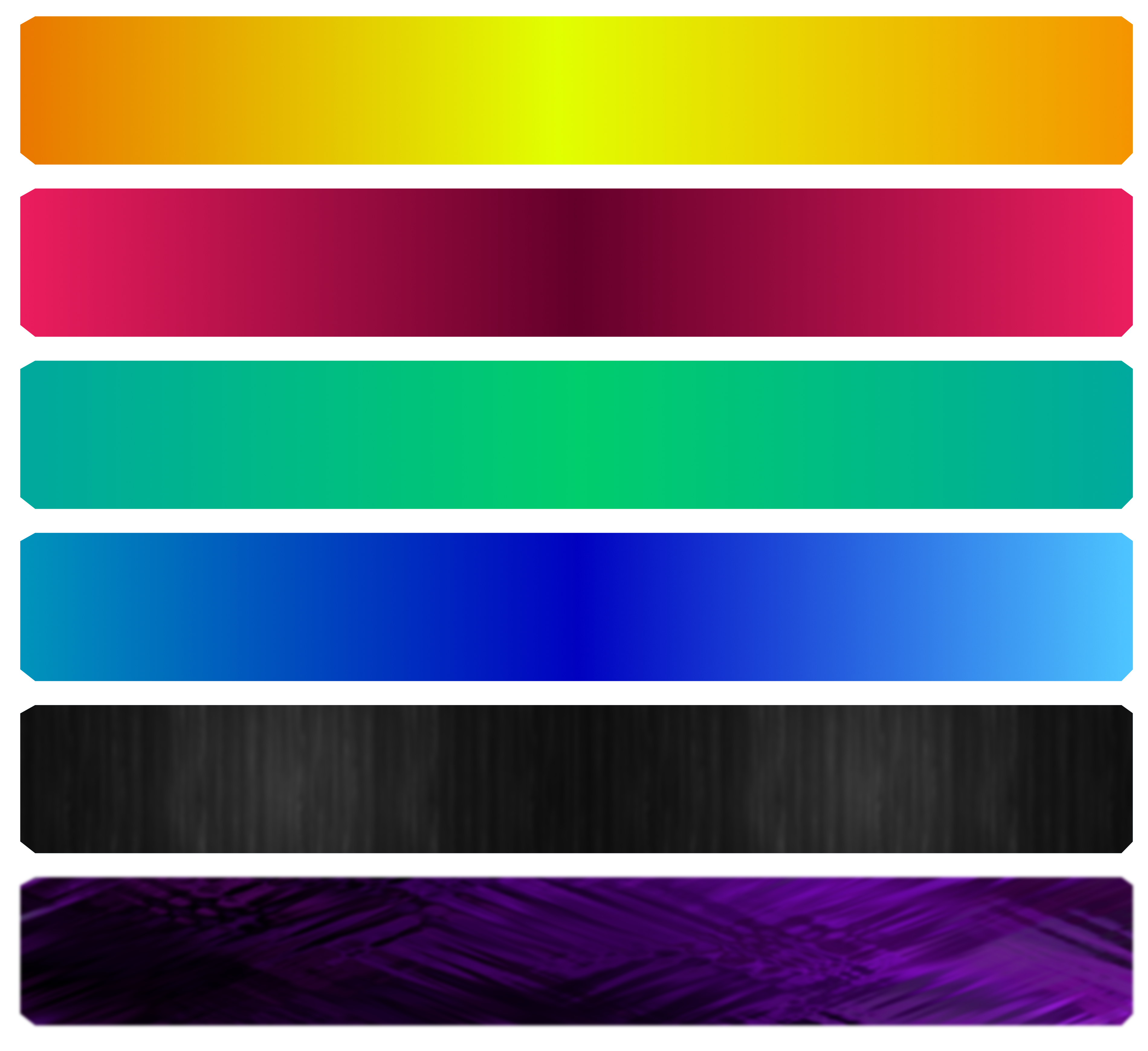
Hello all. This is your UI/UX designer Paul here. For this week I have the newest, most zeroed-in "look" of the Asset Screen!
My last post showed the experimentation phase. Now the style is coming together. To make each bar holding the player's assets pop and self-distinguish, a gradient matching each bar's color scheme was devised.
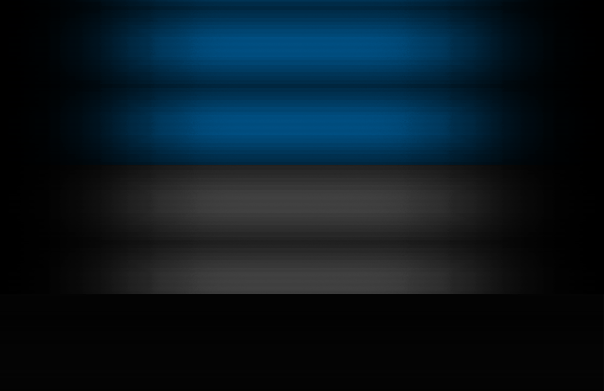
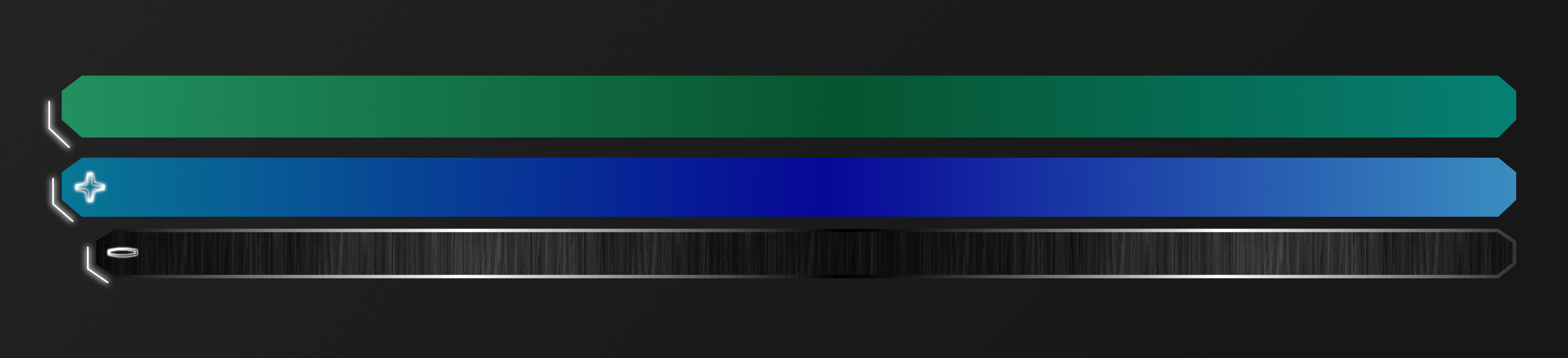
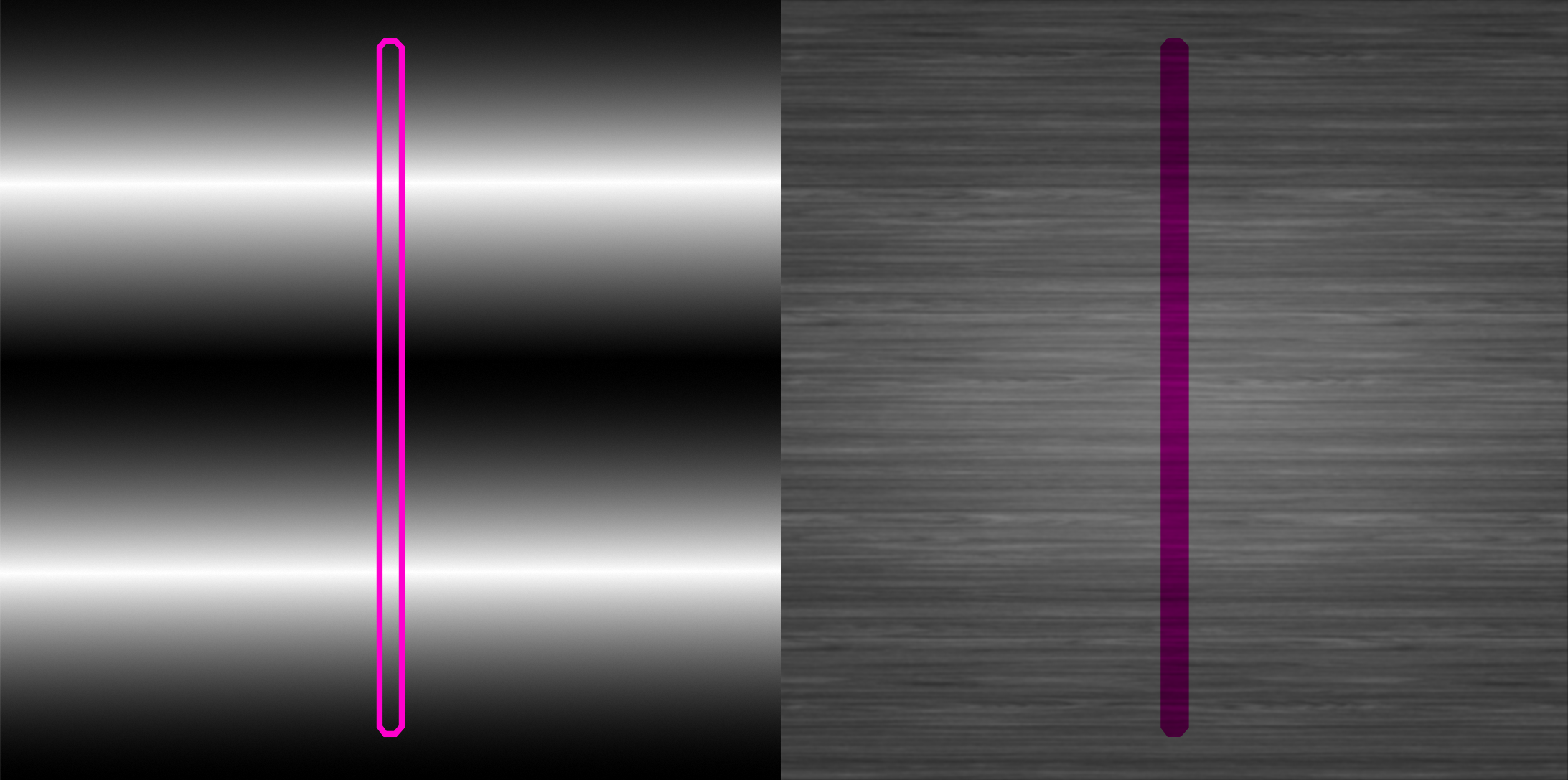
A new "scan line" background was made for the actual fill of the Asset Screen's bars. The image above shows how it was made and how each step builds off the last one. A flat high-resolution backdrop of black and gray lines creates the "digital screen" look (bottom row.) Next, a white gradient overlaying that creates the gradual fade going out to the edges (middle row.) This white gradient is a separate object and thus its color and opacity (which here translates to brightness) can be readjusted as needed. Lastly a colored rectangle overlaying everything else gives customizeable color to that now gradiented screen (top row.) In this case, the blue bar fill is being applied.

The gradient that makes the outline and the composited scan line piece are placed into a single artboard. With the customizeable elements on top, both the outline and the screen can be colorized in a few clicks. This saves time and allows for non-destructive edits of the texture files.
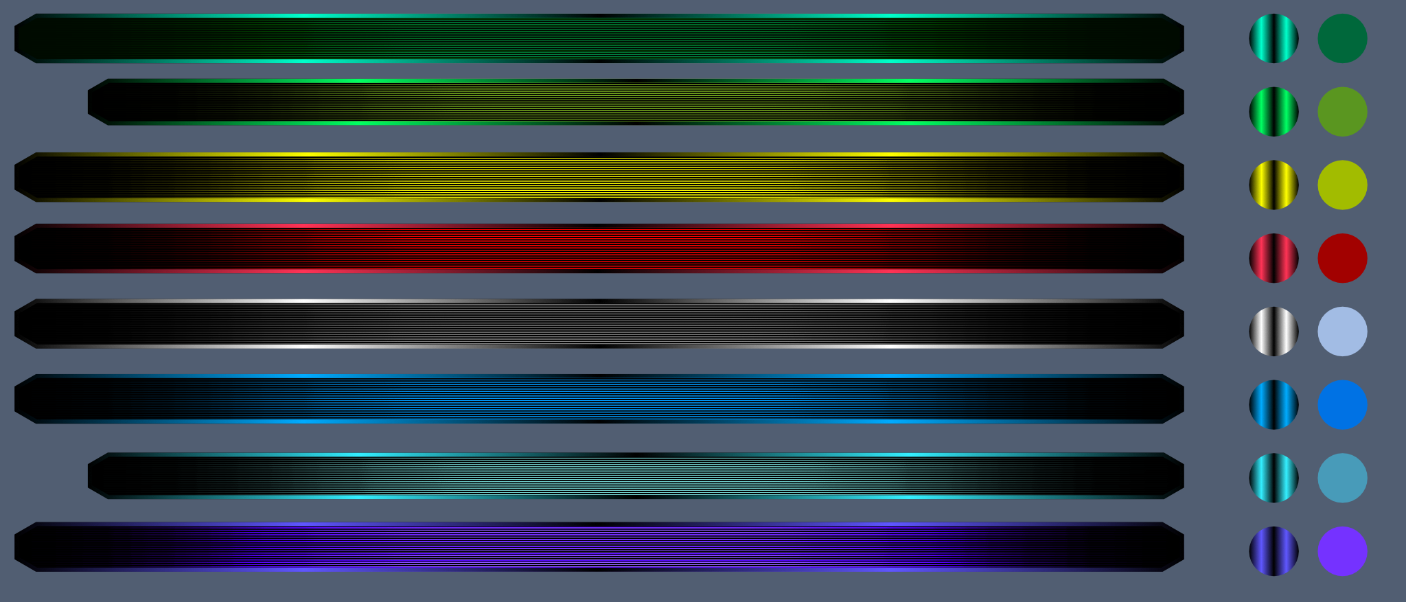
Here is how it all comes together. The circles adjacent to the bars contain samples of the gradient and the fill of the outline and the body. Those can be copied and pasted onto the side-by-side image from before and just like that they are ready to be exported out to the 3D software application for UV mapping. Further touch ups will be needed as some bars will be taller than others, hence the need to have an "ez-export" project file to churn out updated texture maps as needed.

Different Music for Different Things
Feb 10th
Instead of having a soundtrack that runs in the background throughout the entire game, we have been experimenting with music for different kinds of activity, like combat music, peaceful music, and menu music. Here is a look at one of the different menu tracks! I was experimenting with using vocoders on instruments (rather than on voices), and this is what I came up with.
Full story »Creating Controls
Feb 8th

Every video game needs controls: "OK" or "Cancel" buttons, dropdown or popup menus for selecting from a list of options, scroll bars, and so forth. In the image above we can see a popup menu in action, allowing us to select a rank for one of our AIs. Since we're using a completely custom game engine, all of our controls need to be created from scratch. Fortunately, our most clever programmers (Hi, Arthur!) built us a tool to make this as easy as drawing shapes on the screen.
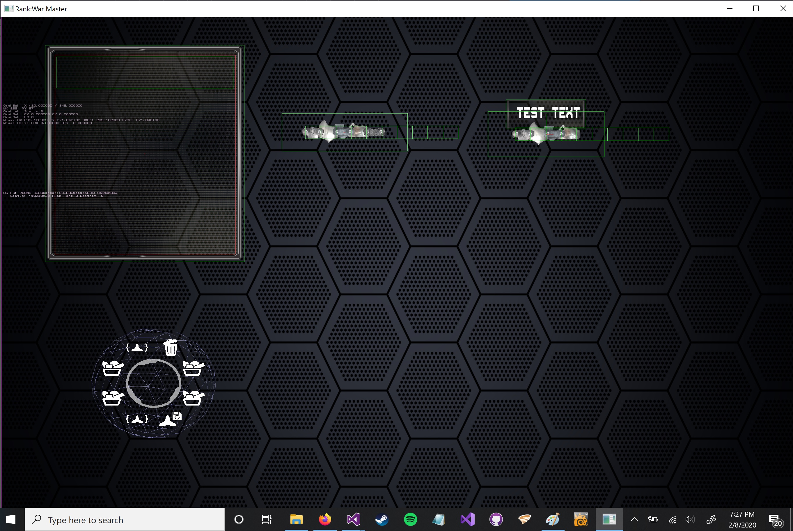
The screenshot above is our tool, ScreenMaker, in action. We draw each control as simple shapes, with or without attached images, that can be connected to one another to form a complete control, and then imported right into the game. Here we have our popup menu, a gauge control that we're using as a scroll bar, and the newest asset screen control, a qty selector for when we want to give some amount of a resource to a teammate or AI.
Below, we can see a gauge scroll bar in action.

UI/UX Artist: Asset Screen Update!
Jan 31st
Hi everyone! This is your UI/UX Artist Paul. It's been a while since I posted, so without further ado, here's the update!
As mdcode, one of our programmers, has introduced, the Asset Screen is the digital ledger where all of the player's assets from personnel to ships to cities are displayed with contextual information regarding quantity and status. As more and more of the in-game screens are breaking the surface of functionality, I've been working on giving them a fresh new face that is both loyal to the style of the game, pleasing to the eye without being distracting, and also functional. As is always the case in graphic design, this meant doing more with less, and in a densely-packed environment like the Asset Screen, this was particularly true.
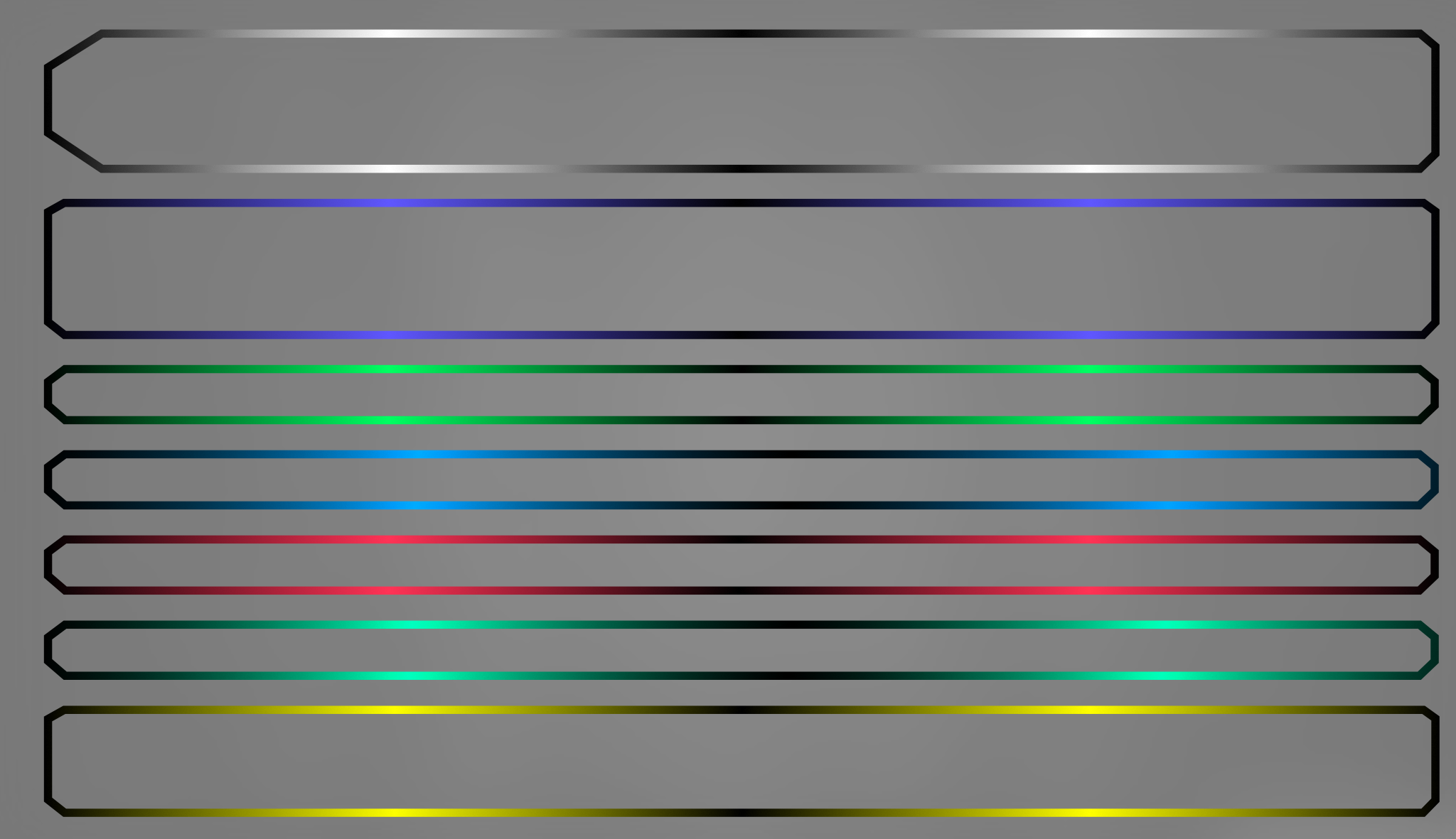
The first thing I tackled was the issue of the bars that text is displayed on. As a kind of business ledger, this screen mostly consists of wide swathes of narrow horizontal space that serve no other purpose than to contain text. That doesn't leave a lot of room for drastic design changes. In this case, cutting corners wasn't a form of laziness. Truncated edges proved to be both a subtle aesthetic touch and also a practical visual aid, making it easier to "hook" the eye onto the start of a bar and thus distinguish the layers more readily.
To better distinguish the different bars (which hold different information) color coding was implemented and then combined with texture overlays. Several experimental models were created to test how far a feel could go before it began to clash with the overall vibe of the game itself. The main point is to allow players to know what they are looking at in as little time as possible.
In order to scale with high fidelity, these bars exist as three-dimensional polygons in space, and as such will have textures applied to them. This adds complexity but also allows more freedom in how colors and other effects are handled. One nifty trick is the fact that in 3D, a single solid piece of geometry can have its corresponding texture map moved independently. Here's how this was applied to the outline of the bar seen at the top of this post.
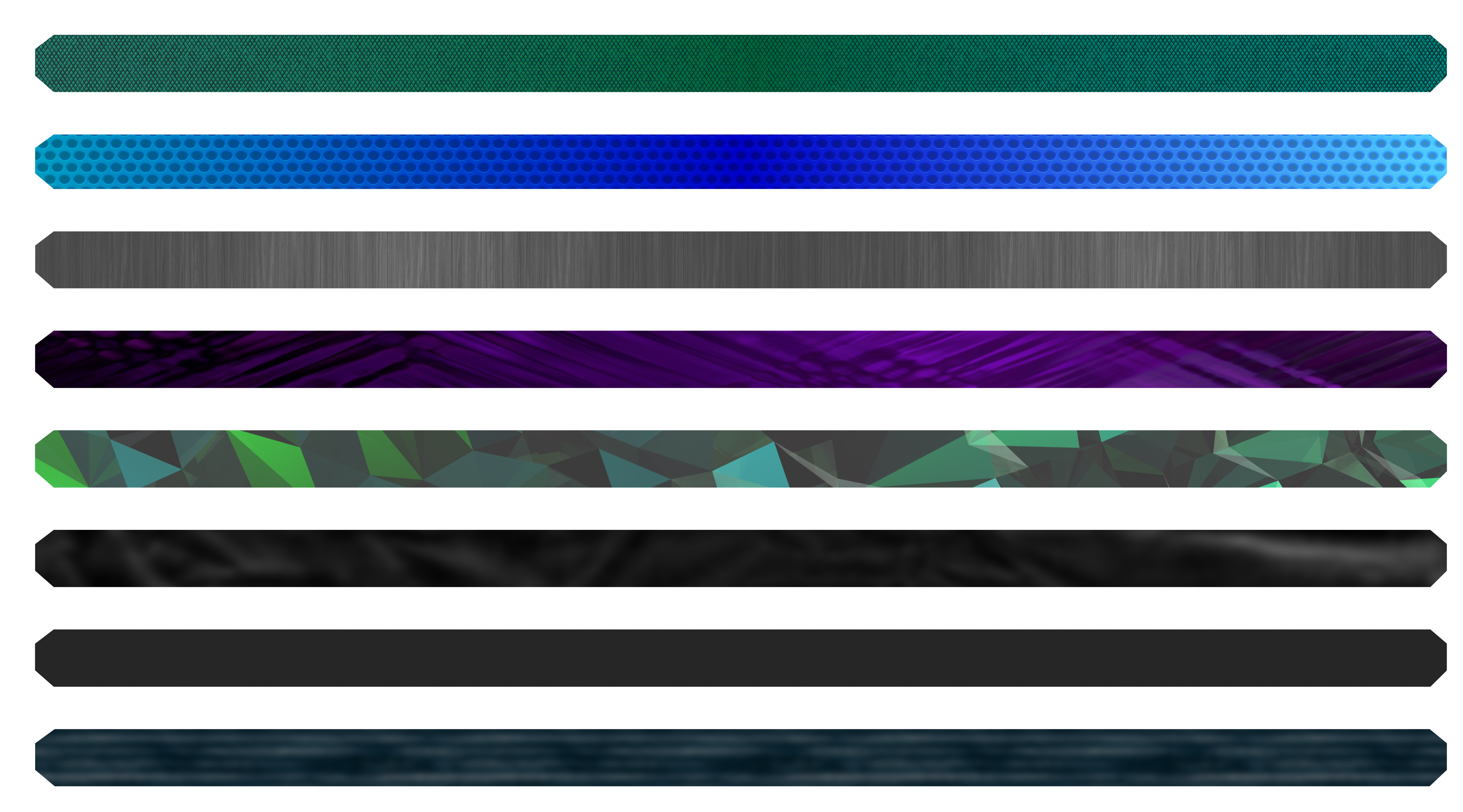
The texture image is split in halves: one containing the gradient that will be mapped to the outline, and another containing the textured background that will "fill" the space of the bar. A false-color mockup of the bar is overlaid here in bright purple to show how this geometry will be align with respect to the image.
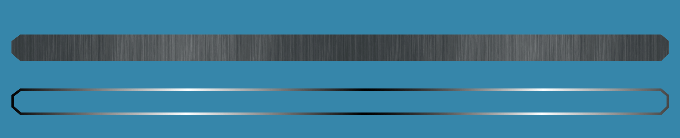
With that done, the two separate texture look like this. Note that mockups from before were vertical whereas these are horizontal. This is an example of how the "uv islands" of a polygon object can be moved and rotated independently from how the actual object will appear when rendered.
![]()
The previous image illustrated the fact that the outline and the fill can be handled independently. But they are still actually joined parts of the same single-piece 3D mesh. It is only how portions of that mesh are remapped to the texture that is separate. This is how the bar will look in-game. The whole point of doing this way is that now we can apply shader effects and other graphical changes to one part without it affecting the other. Maybe the outline will glow? Maybe the gradient on the outline will strobe? Maybe the fill can have different color overlays or filters applied? We can play around with it now and see what works!