
UI/UX Artist: Asset Screen Update!
Hi everyone! This is your UI/UX Artist Paul. It's been a while since I posted, so without further ado, here's the update!
As mdcode, one of our programmers, has introduced, the Asset Screen is the digital ledger where all of the player's assets from personnel to ships to cities are displayed with contextual information regarding quantity and status. As more and more of the in-game screens are breaking the surface of functionality, I've been working on giving them a fresh new face that is both loyal to the style of the game, pleasing to the eye without being distracting, and also functional. As is always the case in graphic design, this meant doing more with less, and in a densely-packed environment like the Asset Screen, this was particularly true.
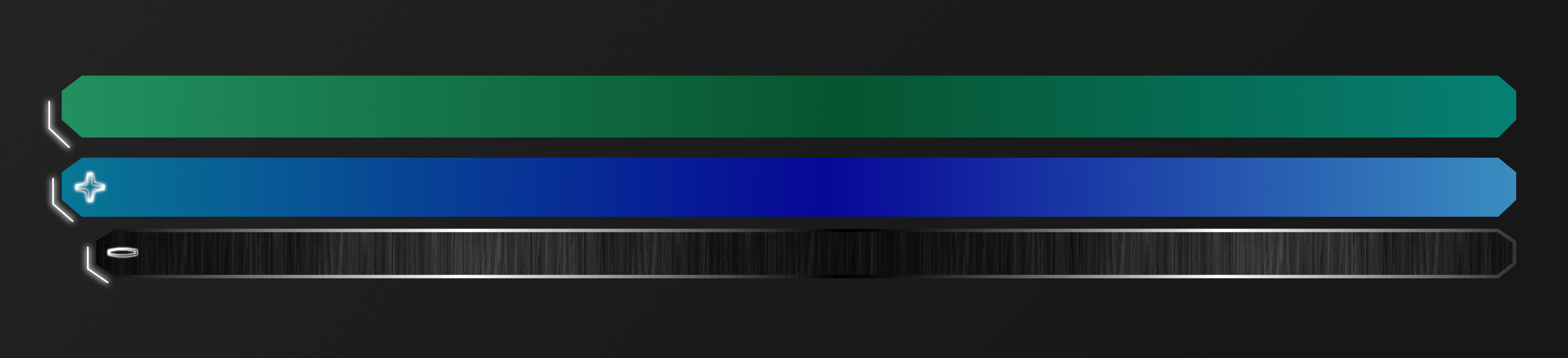
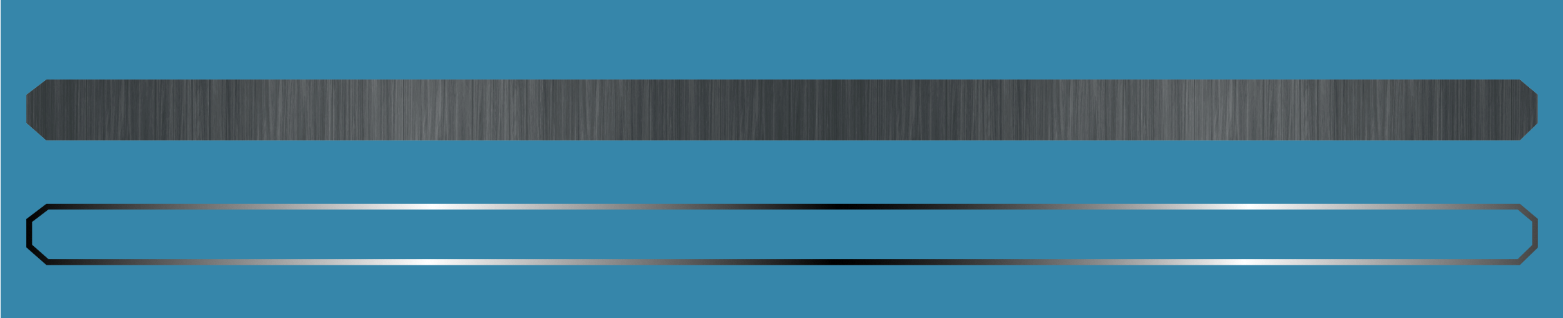
The first thing I tackled was the issue of the bars that text is displayed on. As a kind of business ledger, this screen mostly consists of wide swathes of narrow horizontal space that serve no other purpose than to contain text. That doesn't leave a lot of room for drastic design changes. In this case, cutting corners wasn't a form of laziness. Truncated edges proved to be both a subtle aesthetic touch and also a practical visual aid, making it easier to "hook" the eye onto the start of a bar and thus distinguish the layers more readily.
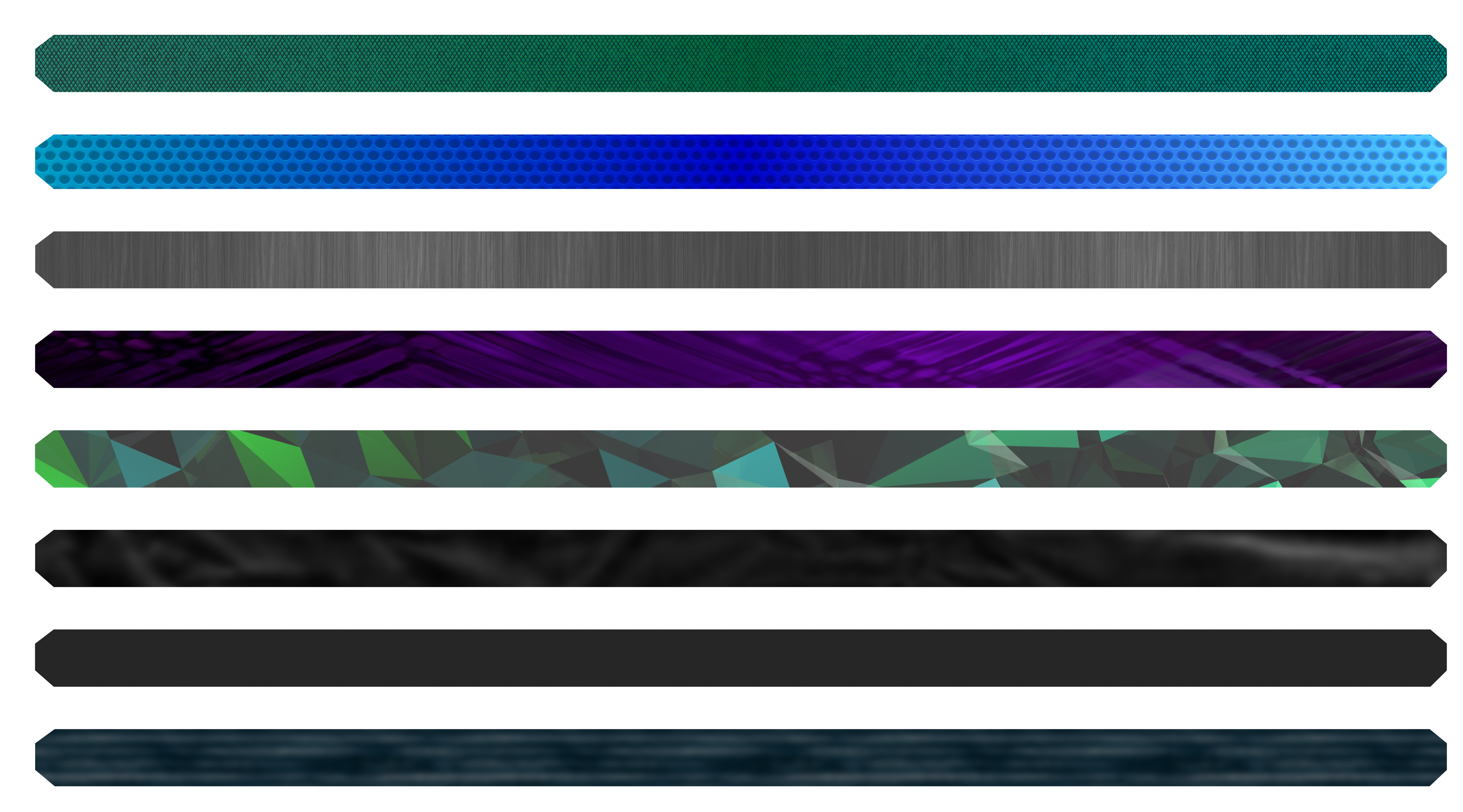
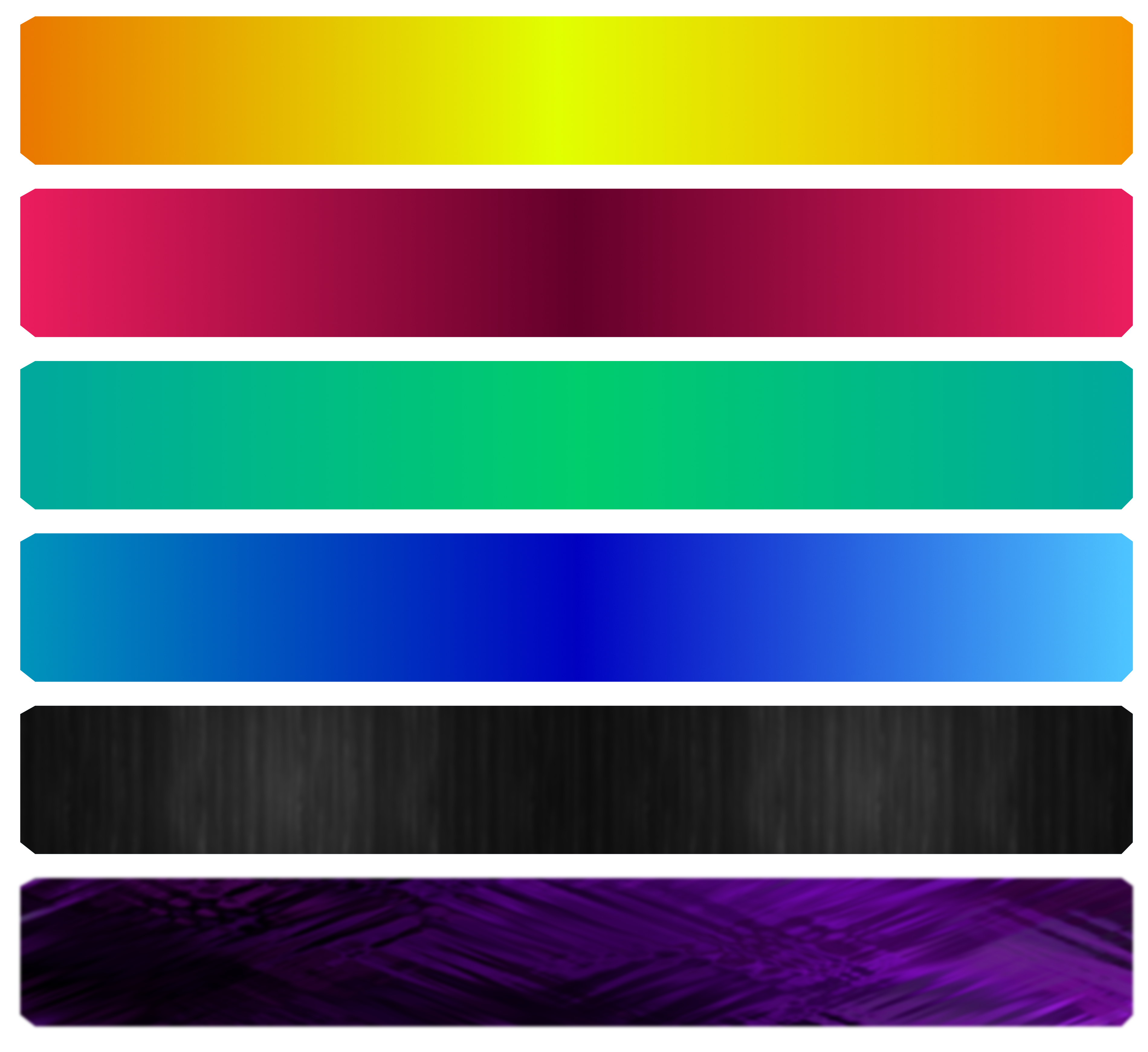
To better distinguish the different bars (which hold different information) color coding was implemented and then combined with texture overlays. Several experimental models were created to test how far a feel could go before it began to clash with the overall vibe of the game itself. The main point is to allow players to know what they are looking at in as little time as possible.
In order to scale with high fidelity, these bars exist as three-dimensional polygons in space, and as such will have textures applied to them. This adds complexity but also allows more freedom in how colors and other effects are handled. One nifty trick is the fact that in 3D, a single solid piece of geometry can have its corresponding texture map moved independently. Here's how this was applied to the outline of the bar seen at the top of this post.
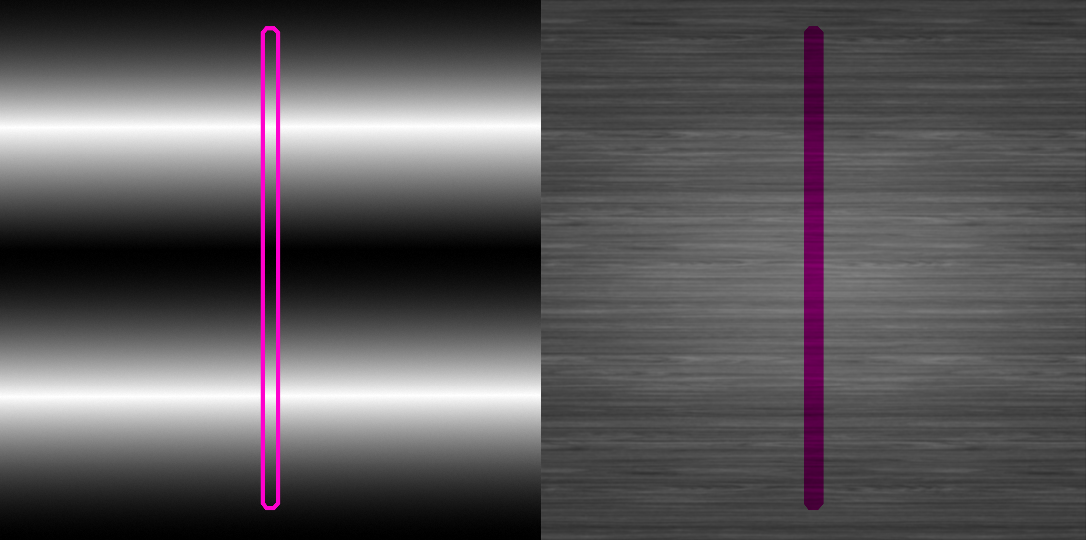
The texture image is split in halves: one containing the gradient that will be mapped to the outline, and another containing the textured background that will "fill" the space of the bar. A false-color mockup of the bar is overlaid here in bright purple to show how this geometry will be align with respect to the image.
With that done, the two separate texture look like this. Note that mockups from before were vertical whereas these are horizontal. This is an example of how the "uv islands" of a polygon object can be moved and rotated independently from how the actual object will appear when rendered.
![]()
The previous image illustrated the fact that the outline and the fill can be handled independently. But they are still actually joined parts of the same single-piece 3D mesh. It is only how portions of that mesh are remapped to the texture that is separate. This is how the bar will look in-game. The whole point of doing this way is that now we can apply shader effects and other graphical changes to one part without it affecting the other. Maybe the outline will glow? Maybe the gradient on the outline will strobe? Maybe the fill can have different color overlays or filters applied? We can play around with it now and see what works!
| Print article | This entry was posted by paulb413 on 01/31/20 at 12:05:00 pm . Follow any responses to this post through RSS 2.0. |
-

Random photo
