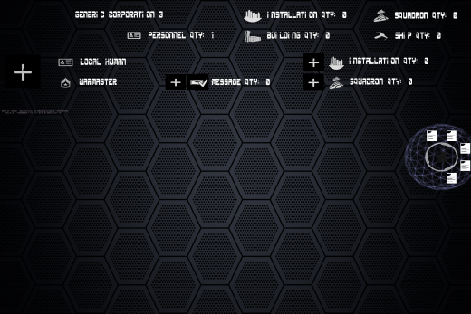
Asset Screen #2: Humble Beginnings
This is the beginning of the new asset screen. It doesn't look like much yet, but quite a lot of work has gone into it already behind the scenes.
In order to see just the data in this screen shot, an entire workflow had to be developed to allow the computer to create each record, automatically detect each piece of data on any given record, determine whether it should be displayed, format it, place it in the correct spot, and mark it as either visible or invisible (which means that there are actually a number of records that exist but that you can't yet see because no one has clicked to open them).
It's a humble beginning, but now that we have this much working, adding new elements won't be nearly as difficult as adding these first few was, and further progress should be much more rapid. In the coming weeks, I'll be focusing on making this more visually appealing, on adding more elements, and on adding a lot of behaviors (e.g. many of these elements will be clickable).
| Print article | This entry was posted by mdcode on 09/27/19 at 05:19:00 pm . Follow any responses to this post through RSS 2.0. |


