Category: "R:WM Dev Blog"

UI/UX Artist: Statuses, Statuses Everywhere
Dec 29th
Hi all, this is your UI/UX Artist Paul. Given the craziness of the holidays I have a small update. Introducing the Universal Status icon.
There are a lot of things to keep track of in the game, a lot of things with ongoing statuses. After finding ourselves looking for what to click on for X status or Y status it dawned on us that an icon that simply meant "Status" sans context had never been made. And so, here it is! Keeping inline with the preexisting status icons as variations of the common "Power" symbol, the Status icon was designed to be abstract ring glyph interpretable as both an inbetween of all the other status conditions at once, and also a donut graph which itself is reminiscent of a level reading.
In the lower portion of the preview image a mockup shows the icon juxtaposed with its target's corresponding current status. Additionally making an appearance, the updated Tool Tip Bar is visible, showing the text readout that appears when the player mouse-overs the two icons.
UI/UX Artist: New Icons!
Nov 17th
Hi all. This is the UI/UX Artist Paul. This week I have a few new cursors to showcase.
The first set are new additions to the Sim Screen aka the cockpit. With the cargo system nearing completion, enemy ships will have an "inventory" of items. What are they hiding in there? That's what scanning is for. But with a gnat swarm of ships darting about it became necessary in playtesting to find out at a glance which ships have been scanned and which are unchecked. Hence, the scan icons!
Next, for the Nav Screen we have a new icon for the Cancel Orders function. This will free up the placeholder icon used for a new function in the Nav Screen, the Hold Command order, which allows players to pause their squadrons' actions without "losing" their current task.
Full story »
New Trailer!
Nov 8th
Hey everyone! It's Jorden! You read the title so, yeah, we're working on a new release trailer for the game. It's not out at this moment, but it's been written and recorded and even voiced! So I thought I'd share a bit about the process, since it's nearing completion.
Naturally, the trailer starts with me writing a script. This took some time as we were trying to learn some lessons from the reception for our last trailer, as well as figuring out what we wanted this newer trailer to accomplish. Ultimately, I ended up going with "One day in the life of the Director." I wrote this trailer in an attempt to showcase what playing our game would feel like. Even that concept went through a few revisions.
I wanted to introduce potential players to the characters of Ares and the Director (in case I forgot to mention, the Director is the player. Director of Interplanetary and Deep Space Affairs is the official title you are given at the conclusion of the third tutorial). This called for voices, which was fine for Ares since Chris has already been voicing him for the tutorials as well as various alerts in the game. The Director is unvoiced in the game though, so I ended up doing the voice for the trailer. I've voice acted exactly once before, in high school, so I was pretty nervous, but Chris is a fantastic sound director and team mate and we managed to do the recording pretty quickly when he came to visit. There's even some bloopers we're hoping to release after the trailer.
After recording the voice lines, we had to shoot the actual footage for the trailer. This took quite a bit more time than we were expecting but that has partly to do with the level of honesty that I was aiming for. All of the footage in both trailers is recorded game footage, nothing is pre-rendered, but that does take quite a bit of co-ordination and time to put together.
Now all that's left is for Chris to edit all the footage into a video and then we upload it to YouTube. Keep an eye out for it soon, it may even come with another special announcement!
UI/UX Artist: Discord Button!
Nov 3rd
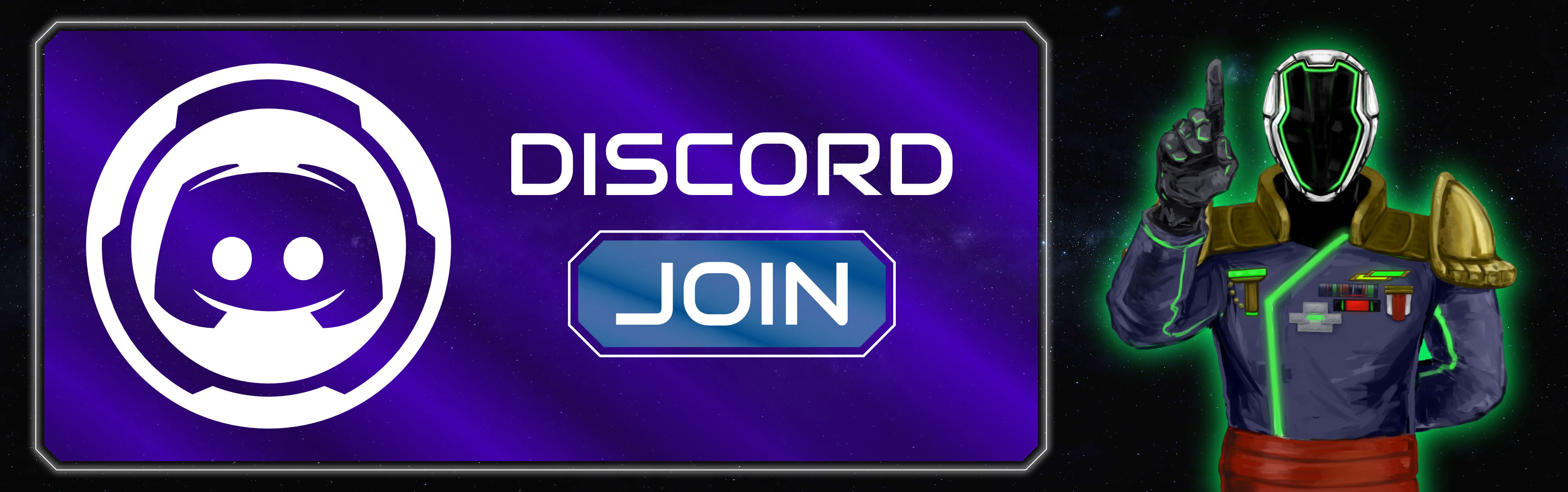
Hi all. This is the UI/UX Artist Paul. Lately I've been working on promotional graphics. This week I have a graphic for joining our Discord. I'll be putting together more graphics for our Steam page as well, but that requires more in-game screencaps and so will be forthcoming.
Full story »UI/UX Artist: Screen Review!
Oct 20th
Hi all. This is the UI/UX Artist. The game's screens are coming together nicely, so with that I thought it would be good to make a blog post compiling them all into a gallery to showcase how they all look now!
The glassy window with a glowing pinstripe is the game's official look and style for its window menu UI. Color codes give each sub screen their own look and feel, and also allows players to tell which screen they're in at a glance in the event of a botched mouse click or button press.
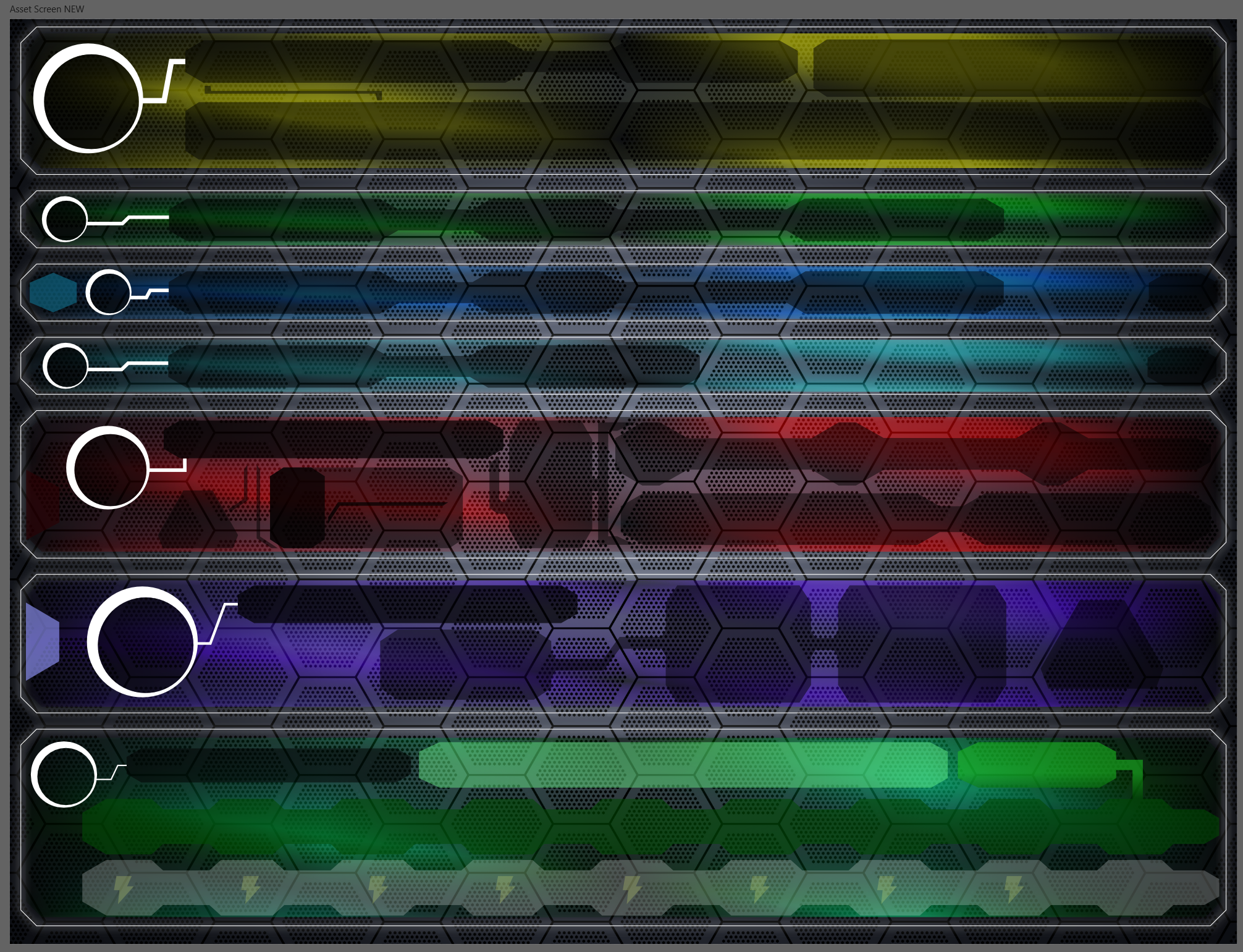
The above image shows the Asset Screen.
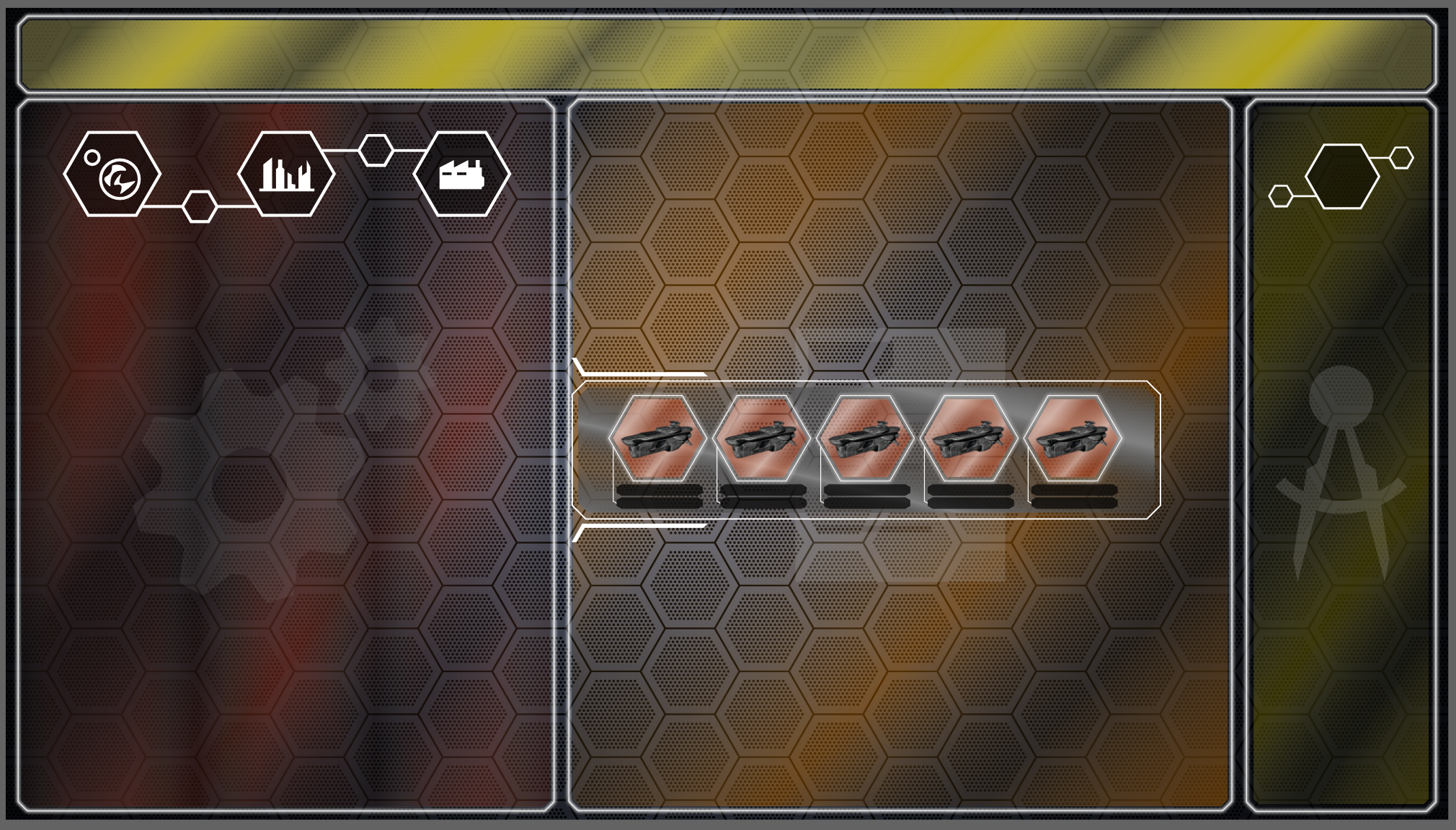
The Factory Screen
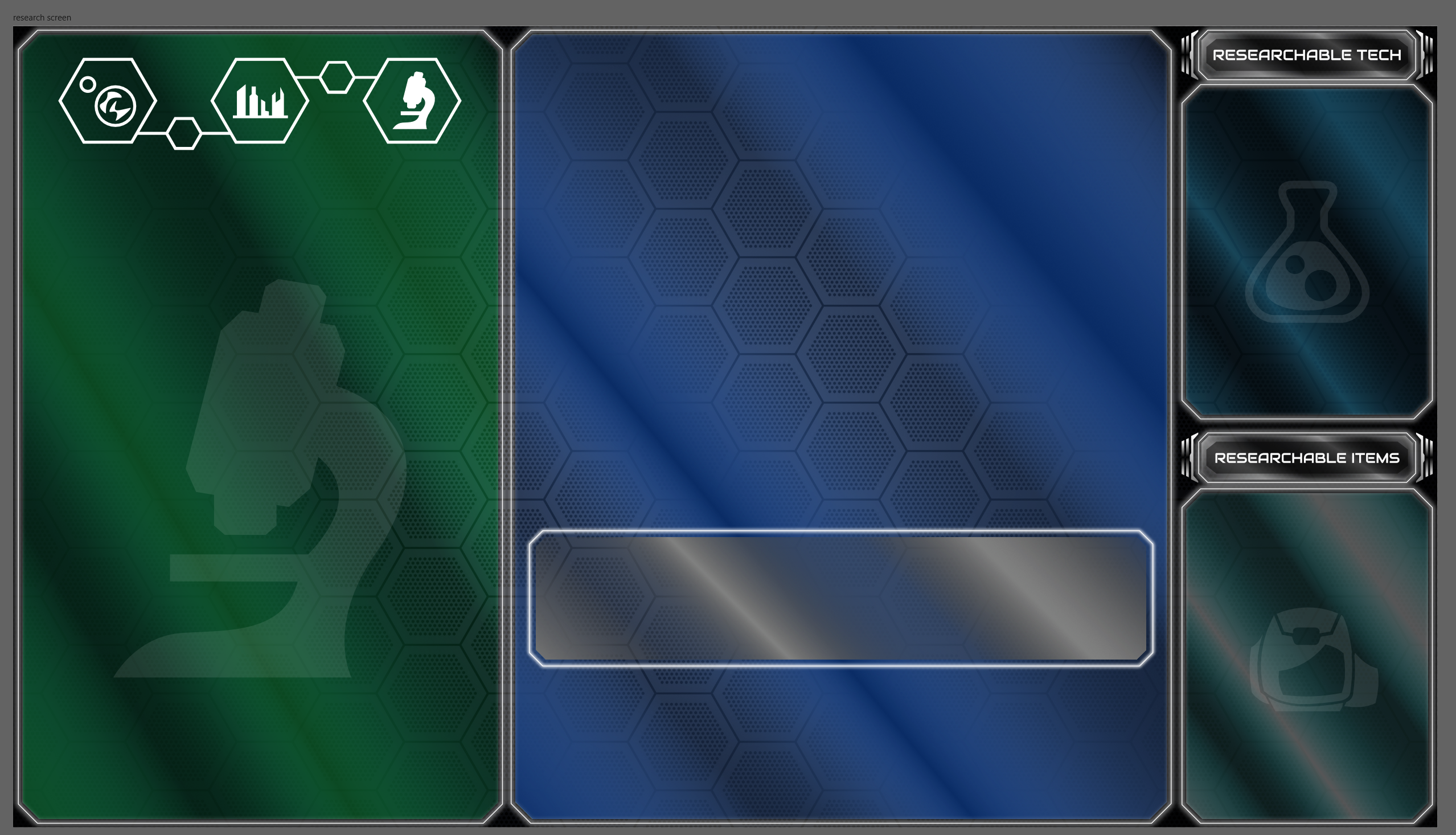
The Research Screen
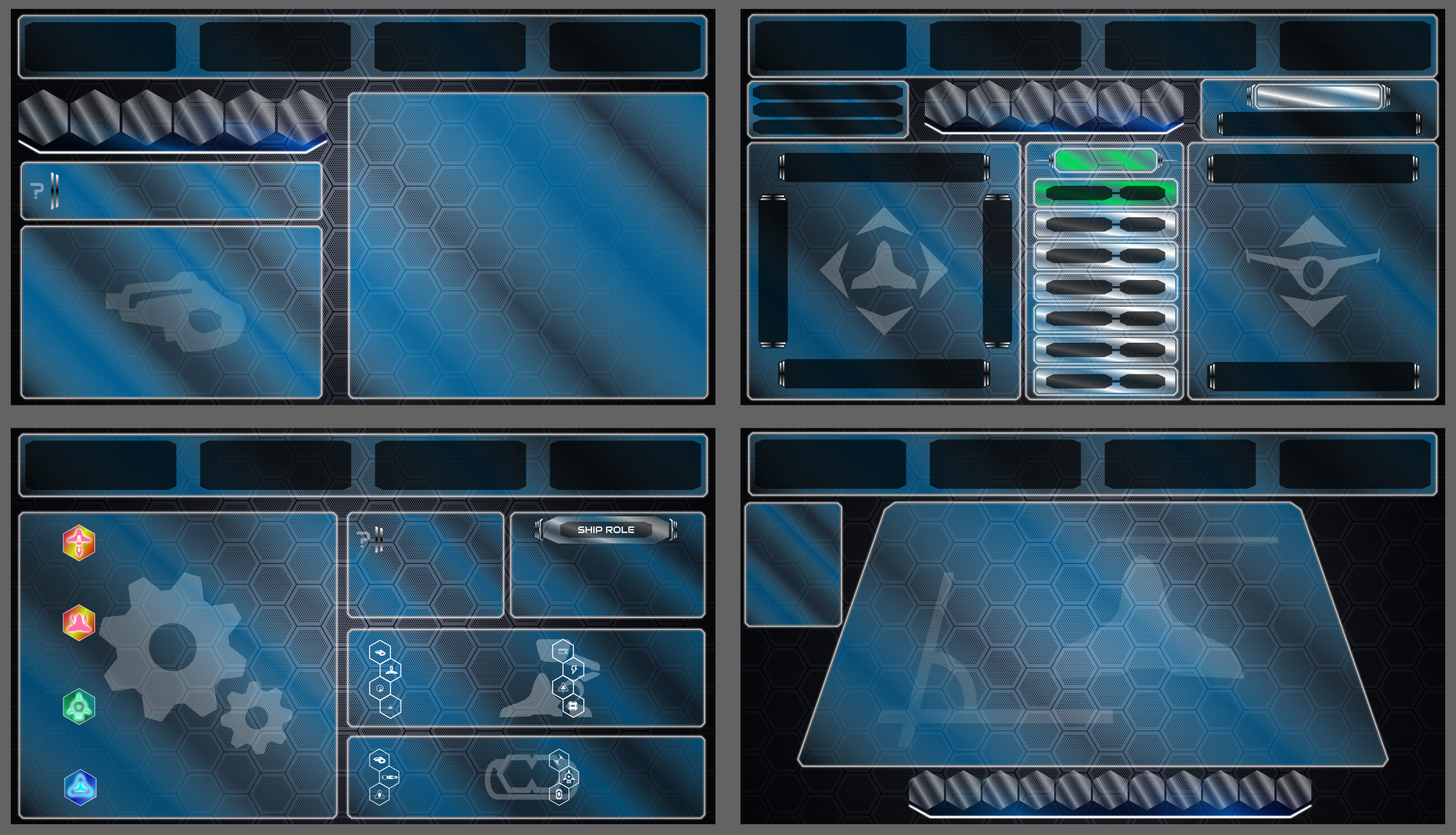
The Ship Builder Screens
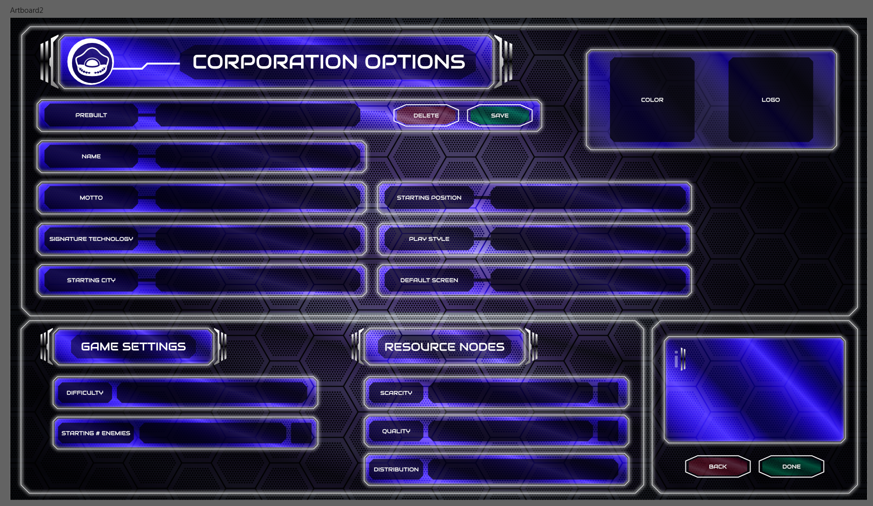
The Corporation Screen
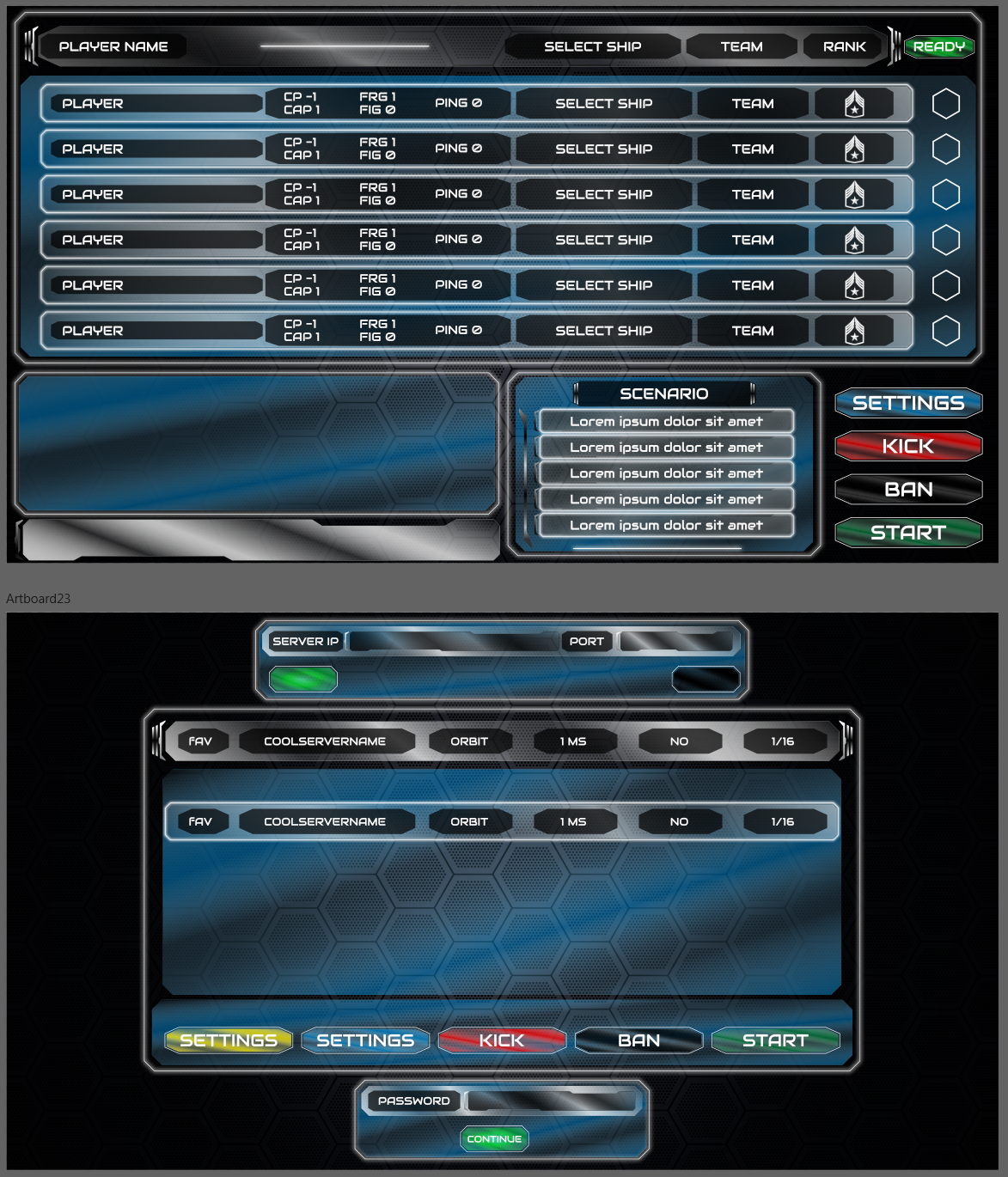
The Multiplayer Lobby
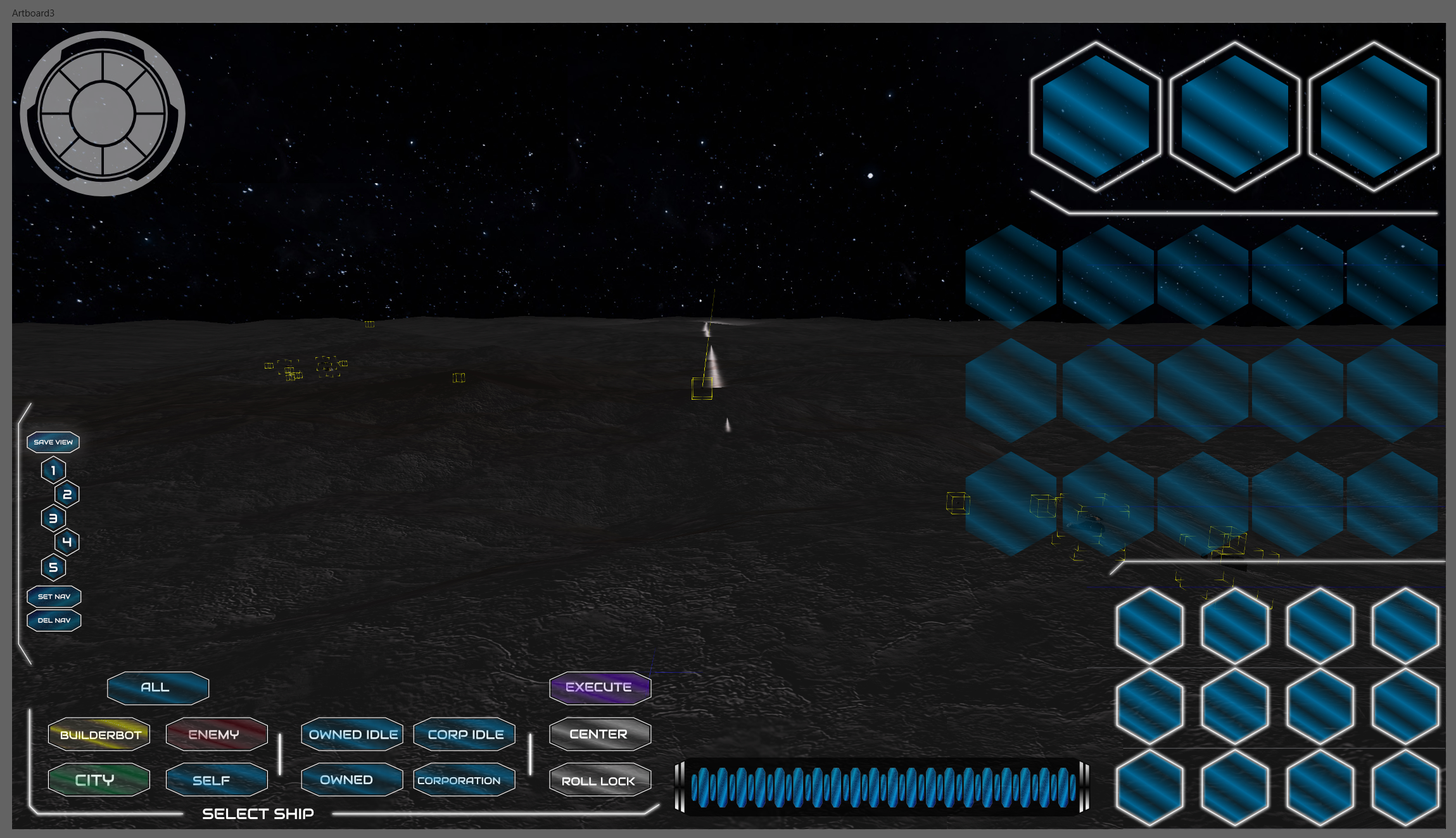
The Navigation Screen
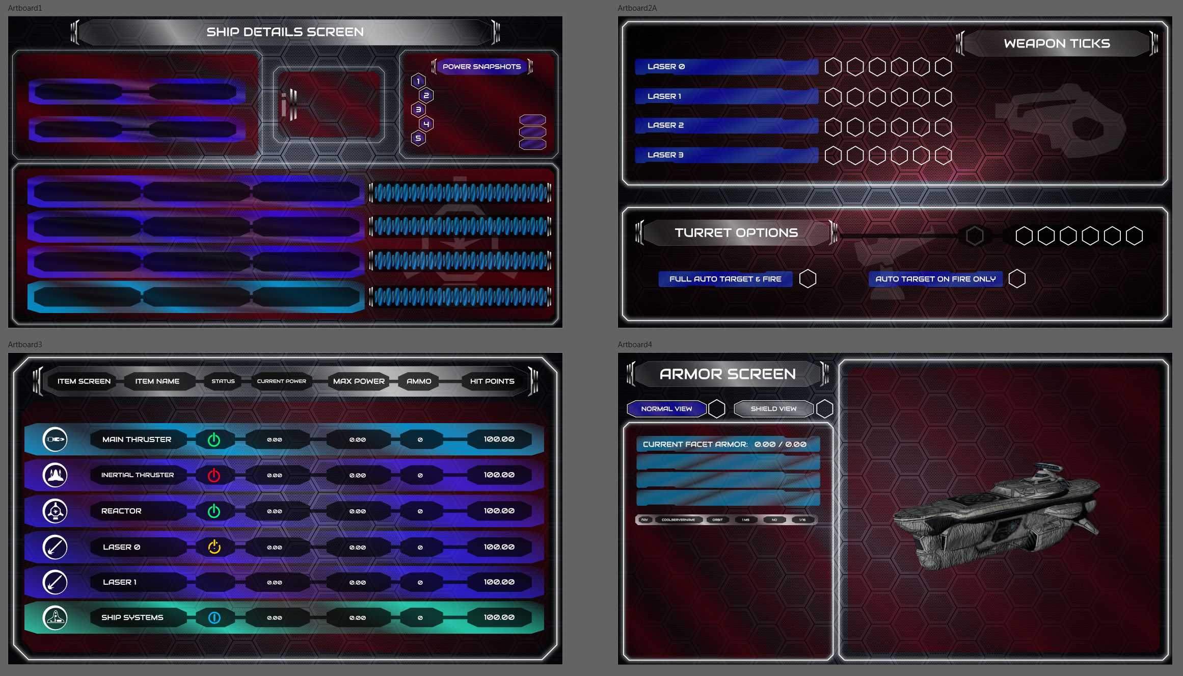
The Ship Detail Screen
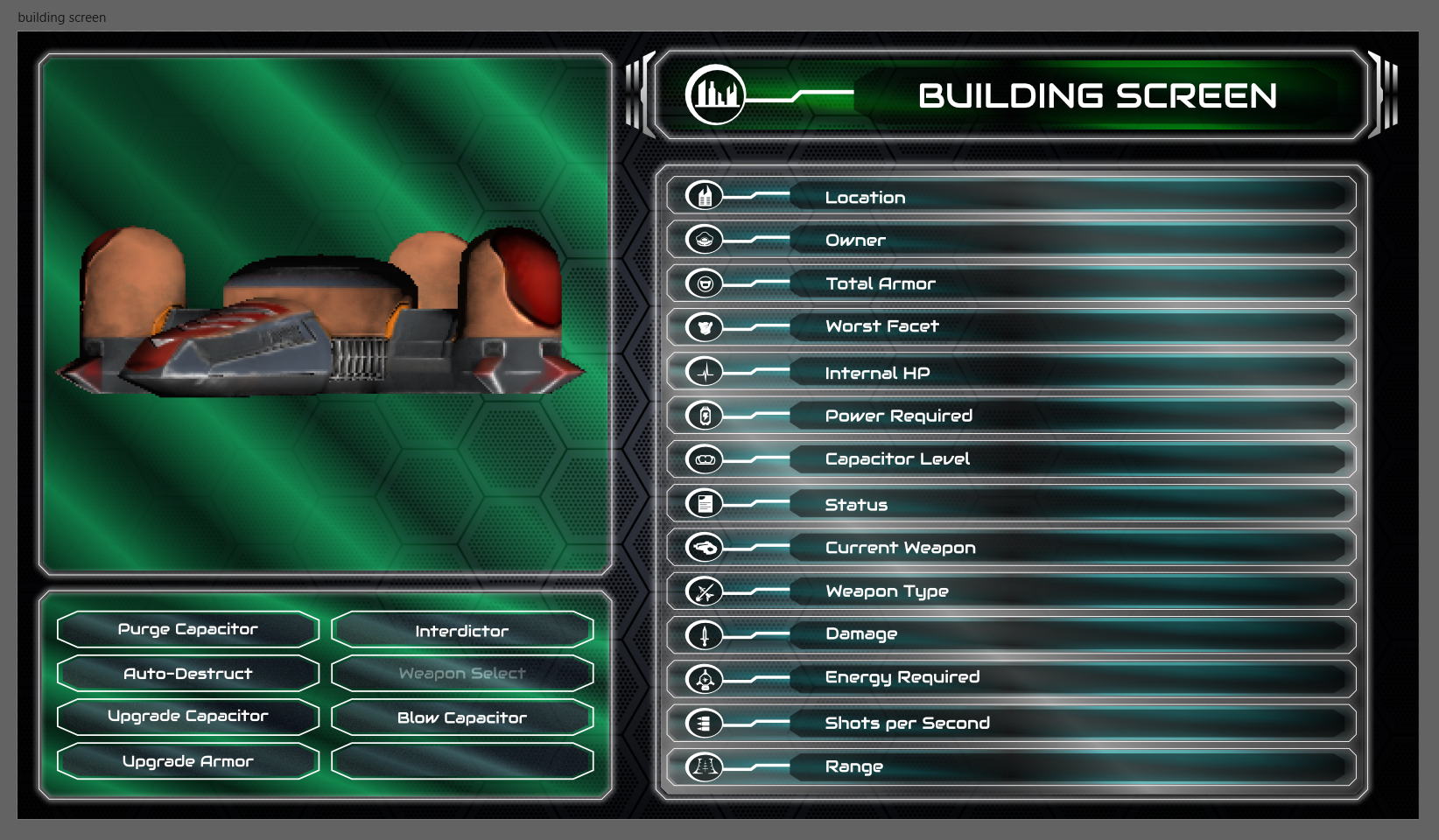
The Building Screen
Writing the Larger Campaign
Oct 11th
Hey, everyone! Jorden, here. I skipped the last blog post because there wasn't really anything new to report. We're prepping for an early media release of the game, meaning a release for playtesters, journalists, and influencers, and therefore it's been all hands on deck making sure that whatever is going to be in the game for that release is stable. For Matt and I this means being submerged over our heads in the tutorials for the past several weeks. There will be more information on the media release in our Steam Newsletter tomorrow morning. For now, I wanted to talk a bit about what I've been working on that wasn't the tutorial, the campaign!
We've always known the rough details of Rank: Warmaster's story, and since I joined the team we've had a solid idea of how we wanted players to experience that story. In the past couple weeks, as my work on the tutorials starts to taper off (there's only so much writing you can do before all the work is just code implementation), I've been taking the time to actually outline the details of that story.
The campaign of Rank: Warmaster will be delivered in a series of longer scenarios, much like the ones I've described on this blog in the past. The current plan is for the campaign, and gameplay, to progress through seven sections, or zones. Zones 1 & 2 are both on Mars and serve to introduce players to the situation, taking place just after the completion of Tutorial 3. Zone 1 is, physically, a small area of Mars containing only two other corporations by default, as well as a handful of nodes to expand into. Progression from Zone 1 to Zone 2 is as simple as expanding outside of the initial area, at which point the whole of Mars if fair game. Getting out of Zone 2 is more complicated, requiring the player to discover their first Faster-Than-Light engine and travel to the moon. As the player progresses through each Zone they will also complete a campaign scenario, which will serve to advance both the narrative and the development of their corporate empire. As I just mentioned, Zone 2's campaign scenario will focus on the discovery of some form of FTL travel. Most of the scenarios will force the player into conflict with the other corporations in each zone. How exactly you deal with those other corporations is largely up to you.
As to more specific examples? Nothing is finalized just yet but I can tell you a bit about what I've planned out so far. The first campaign scenario revolves around the player establishing an orbital presence as they exit Zone 1. For the second, players will learn a little about the history of the Rank: Warmaster setting as they attempt to recreate the conditions which first lead to the discovery of the "Sling Drive", a very crude FTL engine which allows ships to cross vast distances by distorting space until they are flung towards their destination. It's a bit like snapping a rubber band across the room with your fingers, but the rubber band is space-time. Also, the rubber band takes you with it. If that sounds kind of dangerous to you.....Yes! In terms of gameplay, this first FTL drive will only allow ships to travel between large bodies such as planets and moons, or to circle those bodies quickly in high orbit. Like I said, this is by no means finalized and we're pretty far from ready for players to actually leave Mars, but I wanted to give you some insight into what I've been working on.
All that being said, I've probably over-shared with this post. But it's because I like you all. Keep it between us, okay? See you next time!
UI/UX Artist: Building Lights
Oct 6th
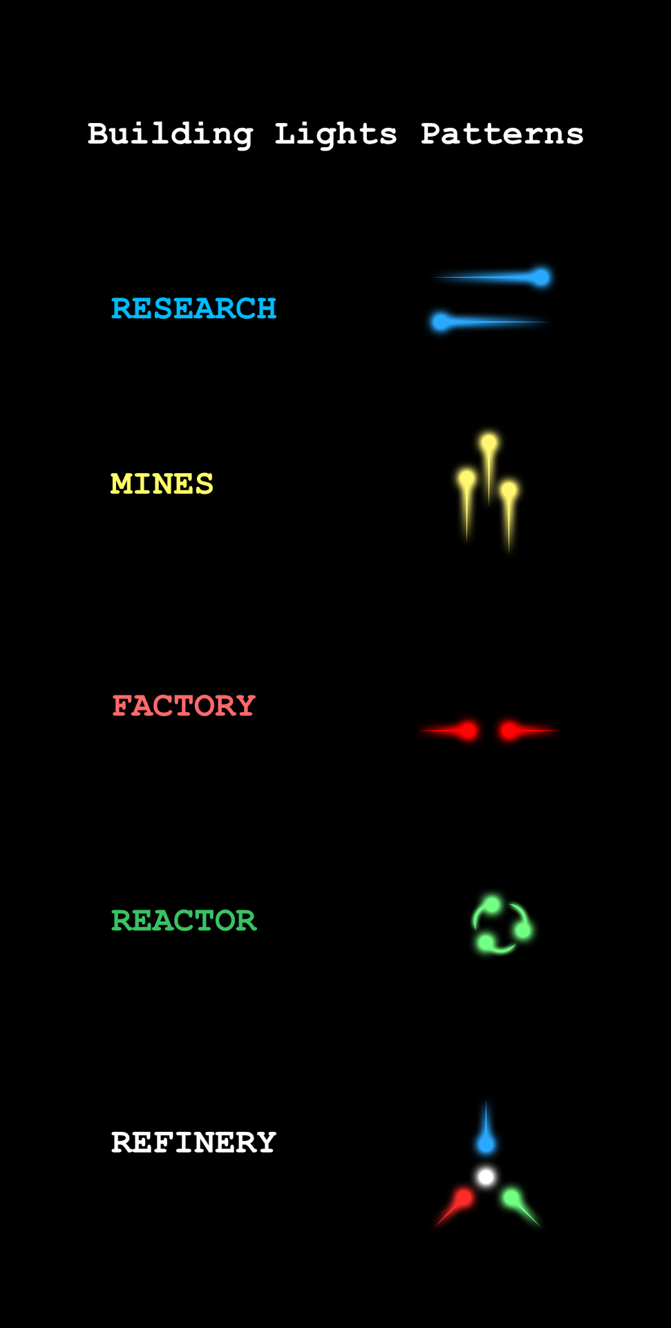
Hi all. This is a quick update. This week I have the current running mockup of the soon-coming Building Lights. These are "running lights" for your city's buildings categorized by type so one can tell at a glance what building does what. The lights themselves will be done in-game via the engine so for today I have just mockup samples of what the lights will be doing.
- The Research Building will have a blue back-&-forth horizontal strobe light reminiscent of pattern of eyes reading text & hence research.
- The Mine will have a series of yellow lights rising vertically to represent extraction of ore from underground.
- The Factory will have red, orange, white lights (whatever playtesting reveals is most visible given the Martian surface) coming together to represent components being assembled.
- The Reactor will have green lights cycling in a horizontal loop reminiscent of plasma in a tokamak reactor.
- The Refinery will combine red, blue, and green lights converging while turning to white, to represent disparate materials being processed into uniform substance.
- The Warehouse will have search lights only, no color or patterned running lights.
- The Turrets also will lack running lights. They may instead have a visible spotlight effect, red in color.
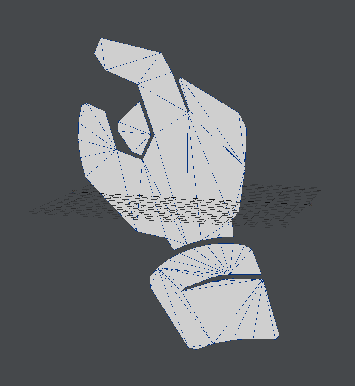
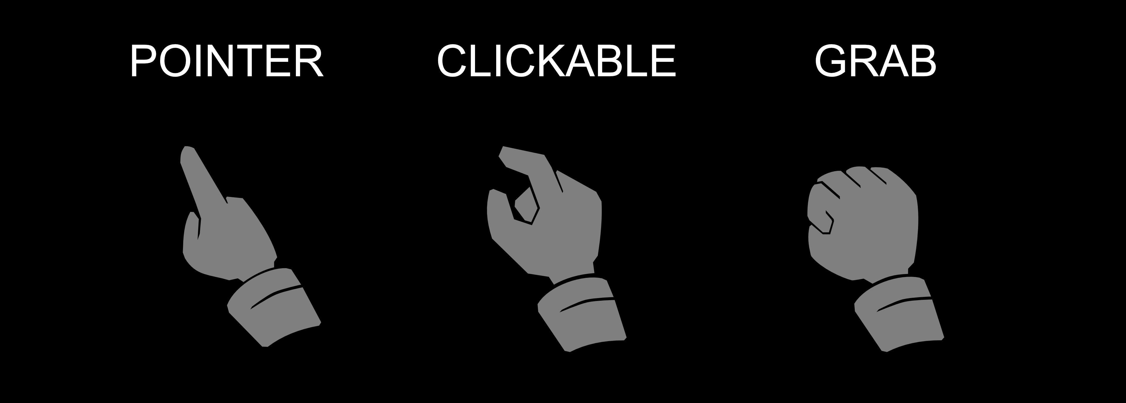
UI/UX Artist: Hand Cursor Part 3!
Sep 22nd
Hi all. This is the UI/UX Artist Paul here. This week I have updates on the Hand Cursors! Not a lot to talk about as is sometimes the case, so here's the showcase.
These cursors are the Pointer and the Grab versions of the hand cursor family. The Hover or Clickable cursor was shown in a previous blog post. These new one have a higher poly count due to the curvature of certain elements. This can be reduced in further revisions. Playtesting the mouse cursors in-game and seeing them at their rendered resolutions will produce feedback for subsequent edits.
With these cursors well underway, a human touch to a user interface otherwise filled with numbers, object icons, buildins, and ships is a welcome update.
Full story »Looking Back on the Project Thus Far
Sep 13th
Hey everyone! Tutorial 3 is done! *party noises*
Well, the first draft. Of the script. It still needs to go into Articy. It also needs revisions, and voice-over, and testing, and feedback...
Yeah, still a lot of work to do, but I'm proud of getting this far.
I joined the team a little over a year ago in July 2020, after hearing Art going on and on about the game at every opportunity for the entirety of the two years previous to that. At first, they just wanted me to do the dialogue for the tutorials, Chris was doing the level design, as it were. Then Chris passed the level design over to me so he could focus on the areas of the project that he was more suited for, and I also took on the task of writing more scenarios for the game to create greater variety in the actual gameplay. I finished the original versions of the first two tutorials and while I wasn't exactly "happy" with them, at least they were finished on time for what we thought our deadline was going to be at that point (I think this was May 2021). Then it became clear that the method being used to bring the tutorials into the game, basically "by hand", was too inefficient to actually implement them in a timely fashion. We pushed our deadline back, Arthur found Articy and showed me the information, and I spent the next week learning how to use it. Then I implemented a small segment of Tutorial 2 (the original) so Art could practice with it and I began drawing up an outline for Tutorial 3. Then Art saw a video about making modern tutorials for complex games, showed it to me, and asked me if I felt the tutorials we had were up to that standard. I told him that I didn't really think so, and that I already wanted to redo them eventually. Art decided that he wanted the tutorials made up to that standard now, since we needed them to be good in order to have a good first impression of the game by future players.
I told him I would see what I could do.
So I put the old tutorial scripts aside and started from the top with Tutorial 1, in June. All together it took me around 8 weeks of work to get the three tutorial scripts written, not including the time I also needed to handle other responsibilities and take a badly needed vacation to visit my family. Total time since I started on the new Tutorial 1 was about 3 months. The first drafts of the tutorials have come out to 25,685 words. Depending on who you ask, that's basically a small or mid-size novella selling for $1-3 as an ebook on Amazon. It's a lot of writing, and I'm pretty proud of that. I like these tutorials a lot better, as well. I feel that the information being given is less overwhelming, the character of Ares is less silly, though not without humor, and on the whole they feel much more refined. I do wish that I had more time to refine it further, I feel like I could really use another month of feedback and editing work to really make these tutorials shine, and in time I will hopefully get the chance. They're definitely a little rough around the edges but they're full of all of the passion I could pour into them.
Just like our team. We're a little rough, and we don't always get along, but we love video games and we love this project. We want to show you all the labor of our love, and we will.
Very soon.
Look forward to it, and I'll talk to you all in a couple weeks!
UI/UX Artist: Hand Cursor Part 2
Sep 8th
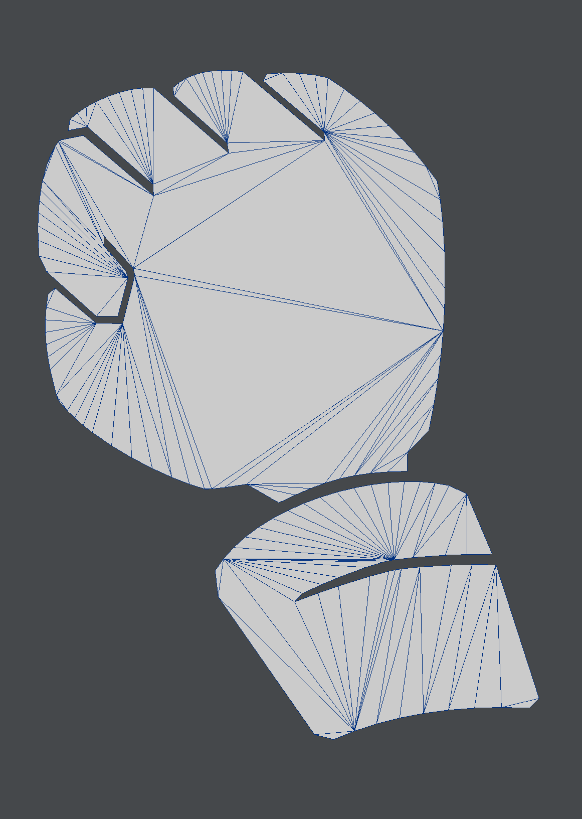
Hi all! This is your UI/UX Artist Paul and this week I have a humble update on the Hand Cursor I introduced a few weeks back. I'm back from vacation last week and suffice it to say one doesn't get a lot of graphic design work done while tent camping in a tropical storm. Nonetheless the cursor design has improved since last shown!
To ensure that the cursor looks crisp and clear, it will be treated like an icon and therefore exist as a 3D polygon object within the game engine. Above is a preview of the "Over Clickable" hand cursor in the 3D modeling environment.
As stated before (and worth re-emphasizing anyway,) hands are notoriously tricky to draw. Below are the current stages of the different hand cursor states. By no means are these finished. The Pointer is proving the most finnicky. Hand-drawn illustrations of hands are skill-demanding enough. Using a mouse to adapt that into a 2D vector that will look good while also being minimalistic enough to fit a low polygon count? This has been an excersize of the hands in more ways than one.
I will continue to update these while also adding finishing touches to the Corporation Screen. There's no easy way around some tasks, just to keep going forward.