UI/UX Artist: Build Menu
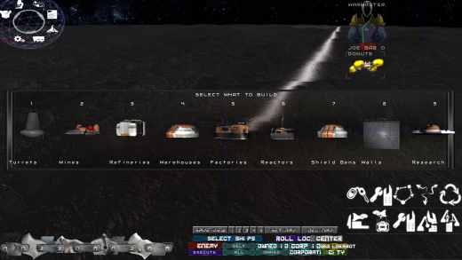
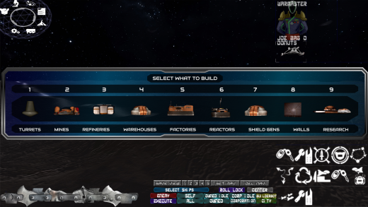
Hi all. This is your UI/UX Artist Paul here. This week I have an update for the RTS Screen: a more modernized menu backdrop for the popup Build Menu. The established theme of blue glass with transparency is being continued here, with further refinement on the way as we feel it out how much of the menu we want to be able to see through before losing sight of the icons displayed amongst the mess of the battle happening in the background.
| Print article | This entry was posted by paulb413 on 07/29/20 at 01:42:00 pm . Follow any responses to this post through RSS 2.0. |
No feedback yet
Leave a comment


