
UI/UX Artist: Installation Bar — Now With 80% More Greebles!
Hi all. This is your UI/UX Artist Paul. This week I have finer details to show for the Asset Screen. Specifically, the Installation Bar.
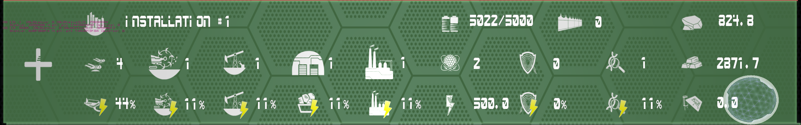
The Installation Bar is an overview of all the player's total "immobile" possessions and assets. Things like buildings, cities, mining sites, power plants, factories, research labs, raw & processed materials, components, and even defensive fortifications will be represented here, but not more "mobile" things like ships and personell. The above is the concurrent Installation Bar, showing the icons necessary to represent all pertinent information, as well as one possible layout for all of them.

This is a 1:1 retexture of the same layout shown before. The screen backdrop and gradiented outline from the other Asset Bar elements were once again brought in. A smaller set of background "runner" bands were placed behind the icons to both organize them into more clearly defined rows and make them stand out from the backdrop. The top band shows actual assets, while the lower band shows the power levels for each one in vertical correspondence. Redundent icons were removed in favor of having simply one icon, the lightning bolt to the left, indicate the entire row's purpose and prioritize the actual numerical data being conveyed. This mockup was a step in the right direction but it had its flaws. The two icons at the top, aptly named "I forget this one" and "This too. Wut do?" actually belonged in the "run" with the other icons. The lightning bolt the far left, though a good route to take, left no room for the Expand icon that would open the dropdown of specific assets. The box on the far right, showing raw, processed, & component materials was not associated with the run and therefore could have been resituated.
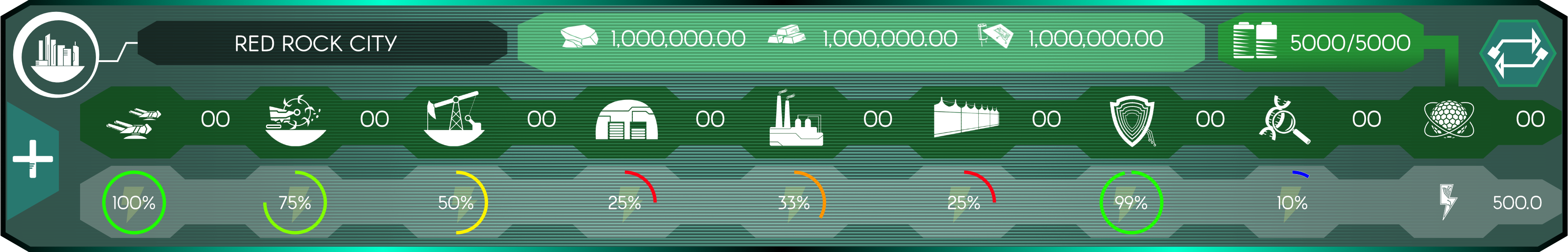
All of the above flaws addressed, we have the final Installation Bar. Proper transparency of the screen fill has been implemented. The Resources Box on the far right has been made into a row and moved to the top. The lightning bolt icon has once again been redone in the form of a part of the transparent backdrop for the lower runner band, clearly and unobtrusively denoting what the percentages overlaying it refer to. This gives room for the plus sign Expand icon. The battery icon, being a total power overall indicator, received its own band, with a visual connection to the reactor icon to denote meaning. The wall icon has taken its place in the run now that the resources no longer take up horizontal space. An off-center circle now occupies the top left as a holster for the Installation Icon, making it stand out from the other hexagon-themed backdrops. Lastly, a new "Transfer Assets" icon (the arrows in the hexagon top right) was designed to allow players an easy-access button to send assets to installations or personell.
| Print article | This entry was posted by paulb413 on 02/27/20 at 12:25:00 pm . Follow any responses to this post through RSS 2.0. |
-

Random photo
