UI/UX Artist: It Fights For Control...
Hi all. This is your UI/UX Artist Paul here. This week I have a smaller delivery, but nonetheless a very important tool given Rank: Warmaster's nature. And those are the Controls for the Asset Screen.
A minor tidbit of a graphical element set, but paralyzing to be without. In any game you have to be able to input data and easily denote quantities, even if it's just a matter of adjusting the in-game volume and screen brightness. In our case however, we have an empire to run, so being able to send resources to a recipient is absolute necessity. For that, a few simple mechanisms are needed: a text field to select the thing being transfered, a guage to input quantity, and a button to confirm the order. All of these things exist already both in code and raw graphical pieces, but bringing them together in a unified aesthetic was my task this time.
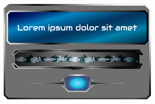
Diving into the deep end, the above teaser image displays the most complex of the Asset Controls. It combines all three mechanisms described earlier of a text window, slider, and activator button.
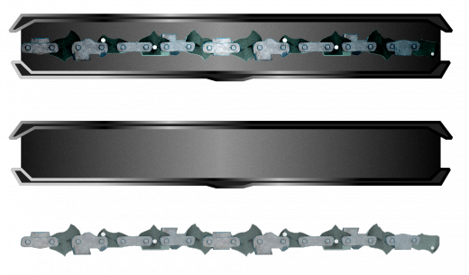
Here is a close up of the gauge slider itself, with an excised preview of the gauge chain bar shown below. Sometimes all you need is a slider bar, and the advantage of building the most complex backdrop first is that once you have that, you also have all the simpler elements as well.
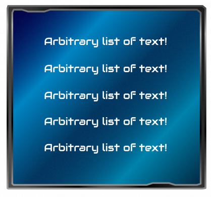
Lastly, here's a potentially optional wide text window. We are already using the individual text lines for lists, as demonstrated by the previous blog post. So this might not be implemented. However it was nonetheless one of the proof-of-concept pieces created along the way to the aforementioned text lines, and given the reflexive nature of design, there's no guarantee we won't see this element or some permutation of it somewhere else in the future.
| Print article | This entry was posted by paulb413 on 04/09/20 at 12:25:00 am . Follow any responses to this post through RSS 2.0. |


