UI/UX Artist: Screen Finalizations
This is the UI/UX Artist Paul. As artistic refinement of existing graphical elements converges to a singular vision, I find I have less unique milestones to present, at least until new content comes up demanding visuals. For now, I've been focusing on the tedium of ensuring all graphics meet a standard of transparency values, line thickness, glow intensity, color consistency, gradient angle, and so forth.
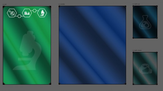
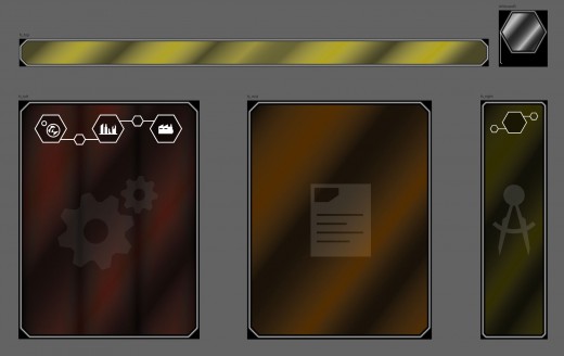
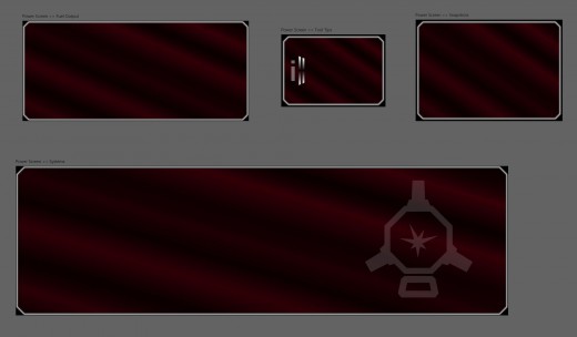
One useful trick I've found was the idea of doubling the thin white outline, increasing its thickness, and using that as an "erasure" layer in the vector art program to erase part of the inner colored glass window. This allowed me to set the gap between the glass and the outline (previously a source of constant frustration) as an exact numerical measurement using the erase layer's stroke thickness as an improv smart tool. The result: I can make an in-game window with any proportion and guarantee its body and border have the same detailing as all others without eyeballing it.
A minor little accomplishment, but time-saving and human error-removing life hacks like this are worth noting (and being self-contented with.) All the windows shown here have received this "smart line" treatment. I am still unifying the glass gradient angle and direction, but that won't take long either.
| Print article | This entry was posted by paulb413 on 03/10/21 at 01:47:00 pm . Follow any responses to this post through RSS 2.0. |


