
UI/UX Artist: Screen Review!
Hi all. This is the UI/UX Artist. The game's screens are coming together nicely, so with that I thought it would be good to make a blog post compiling them all into a gallery to showcase how they all look now!
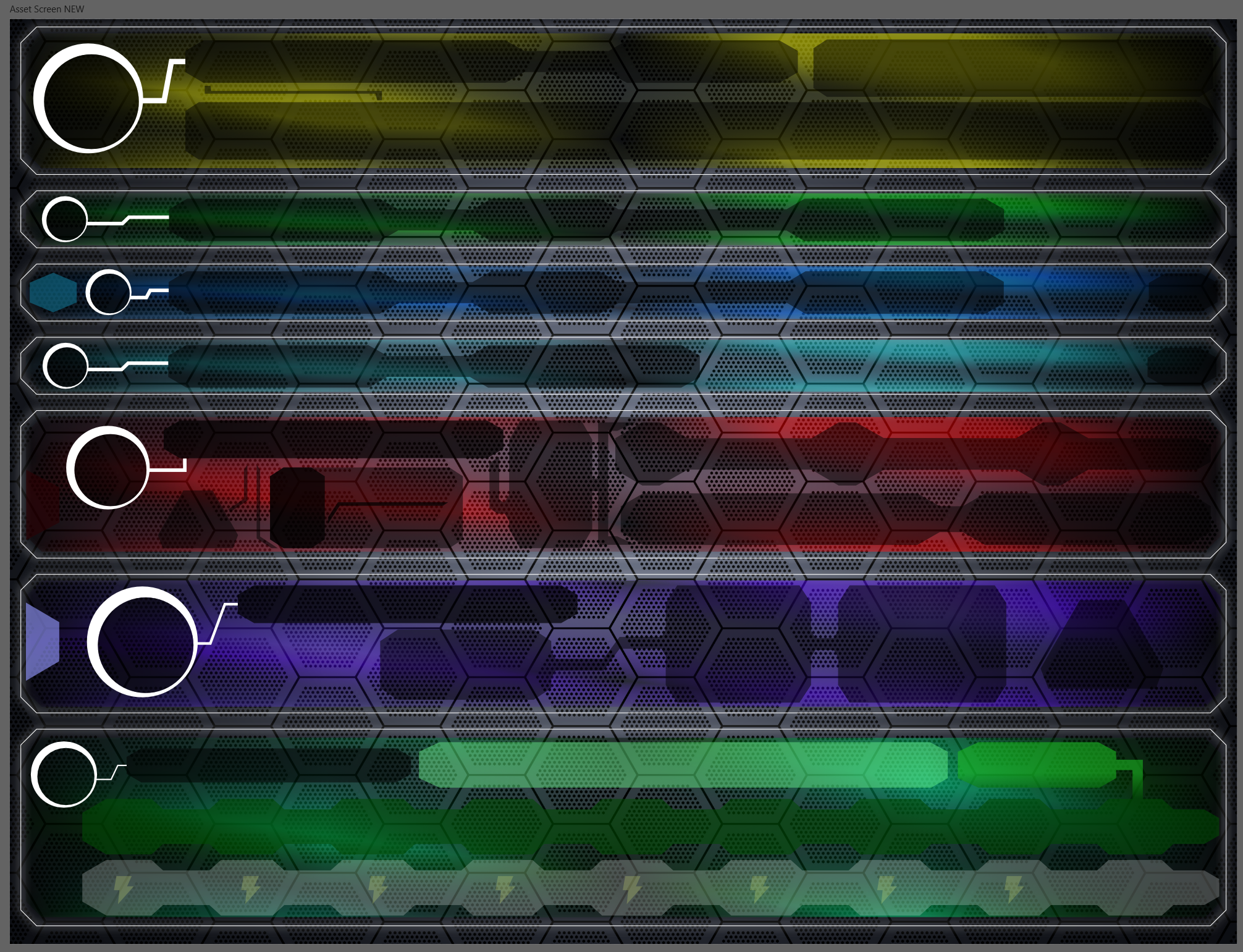
The glassy window with a glowing pinstripe is the game's official look and style for its window menu UI. Color codes give each sub screen their own look and feel, and also allows players to tell which screen they're in at a glance in the event of a botched mouse click or button press.
The above image shows the Asset Screen.
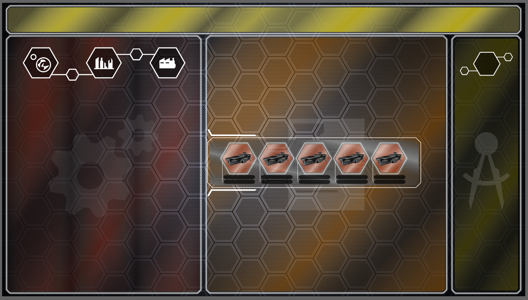
The Factory Screen
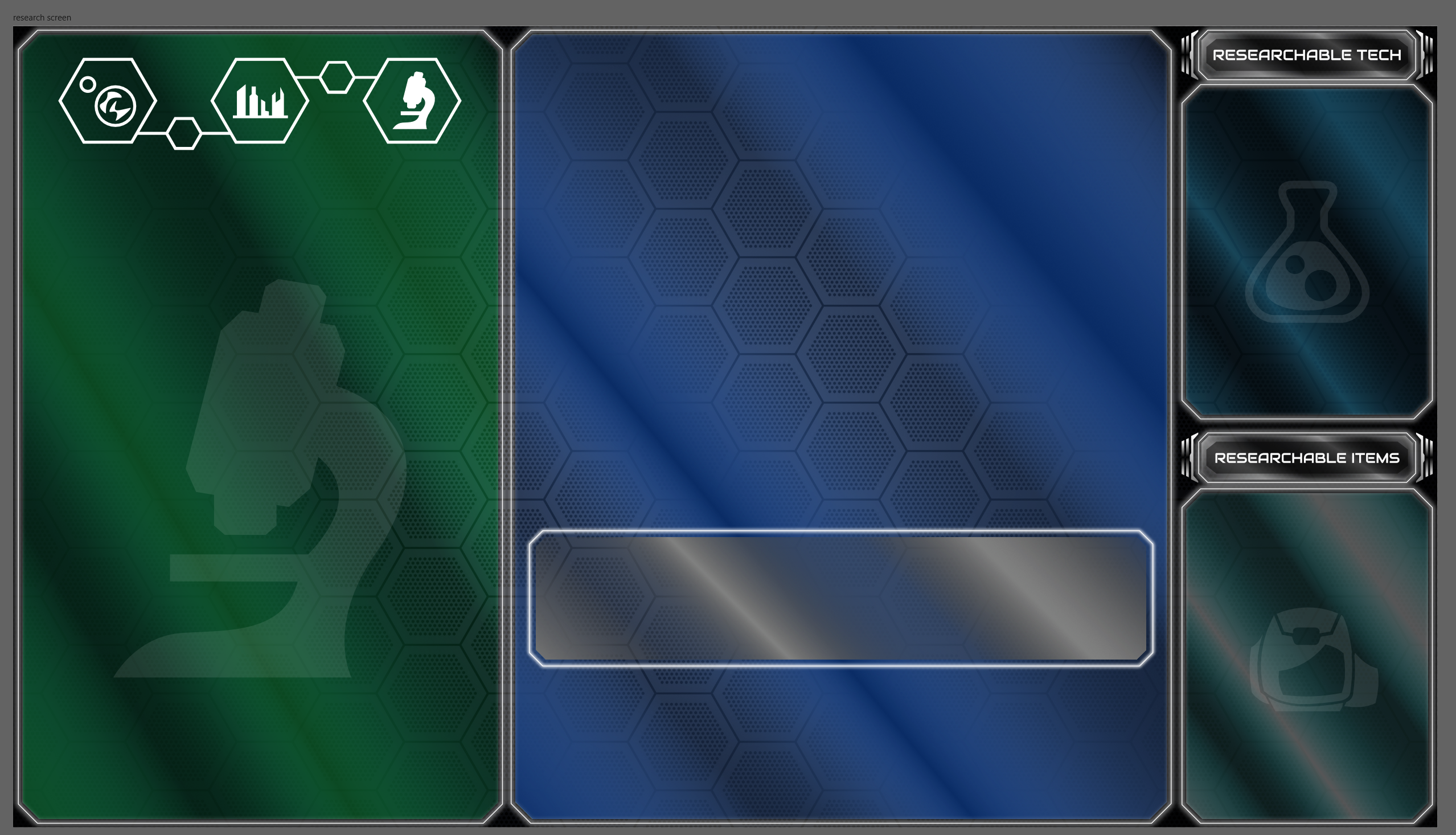
The Research Screen
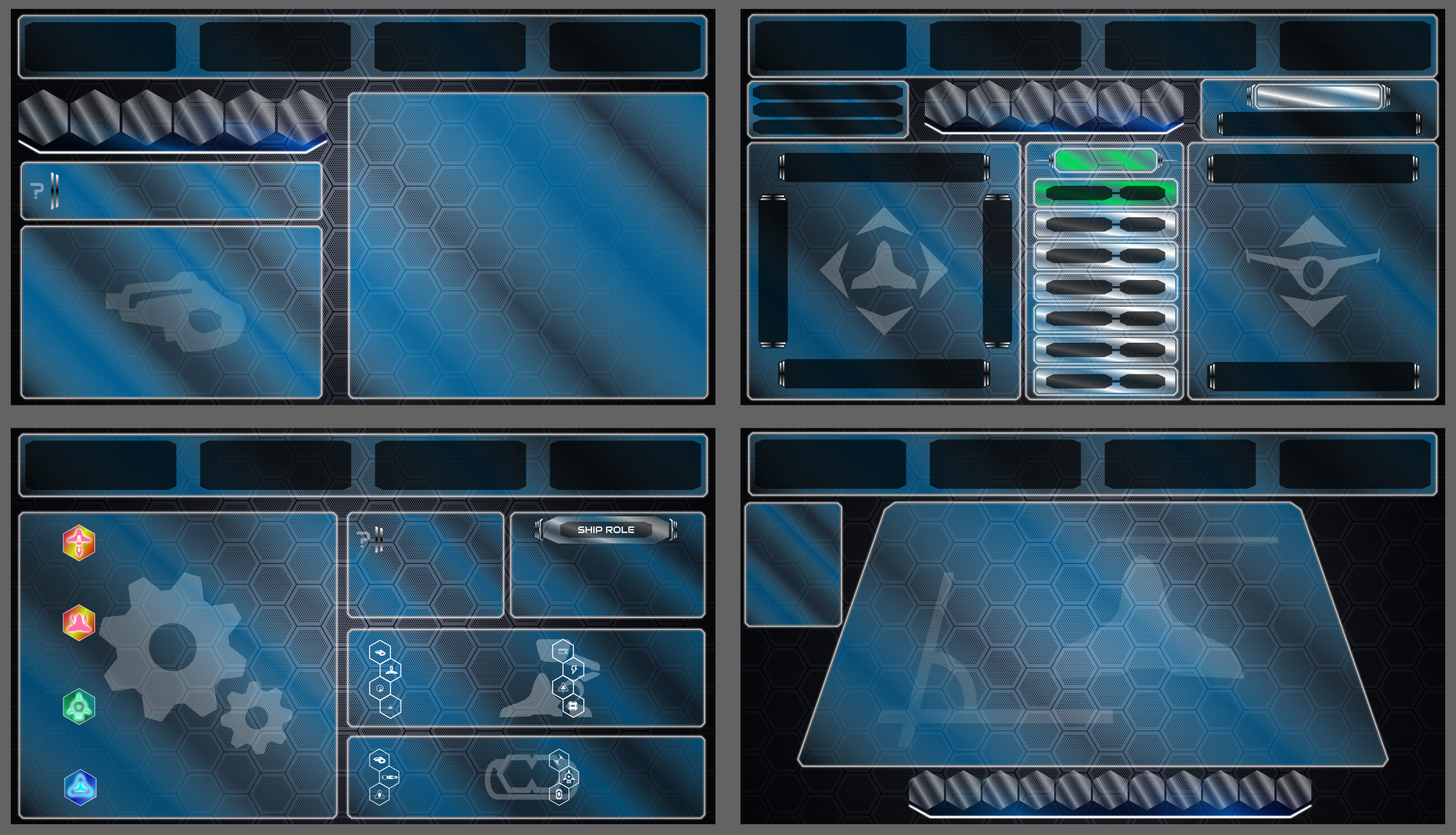
The Ship Builder Screens
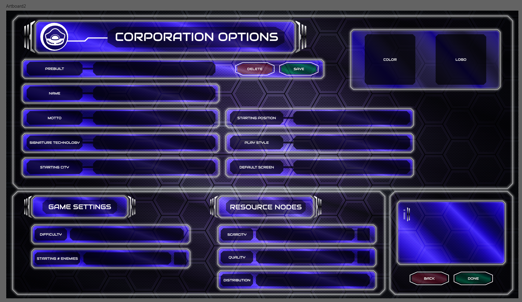
The Corporation Screen
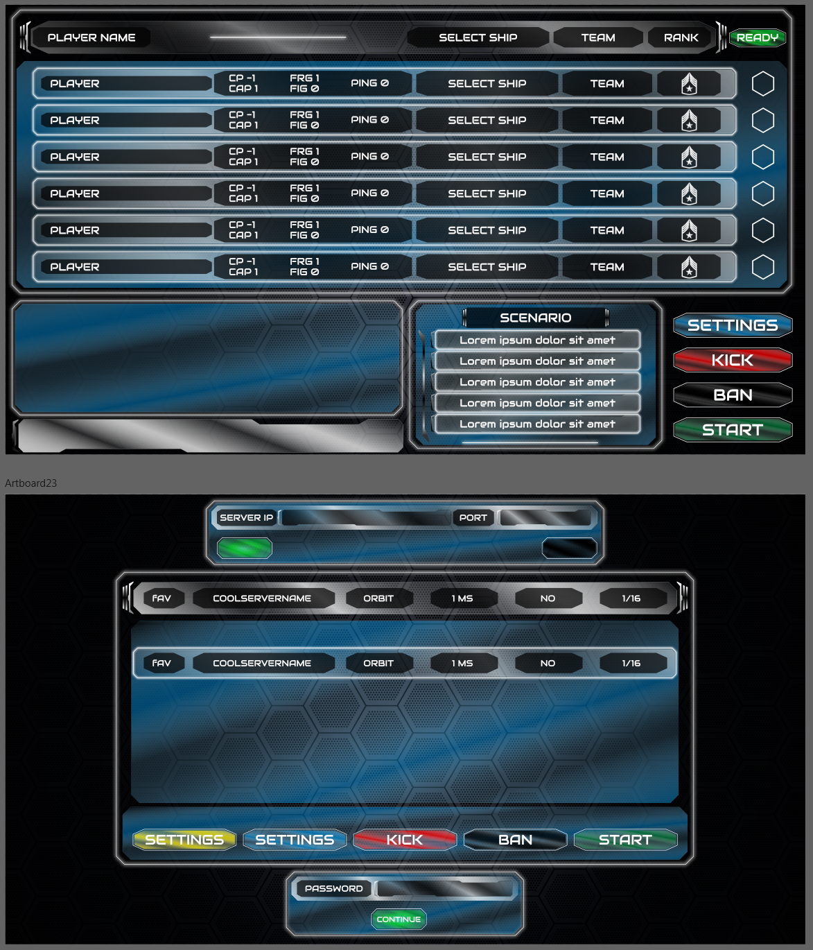
The Multiplayer Lobby
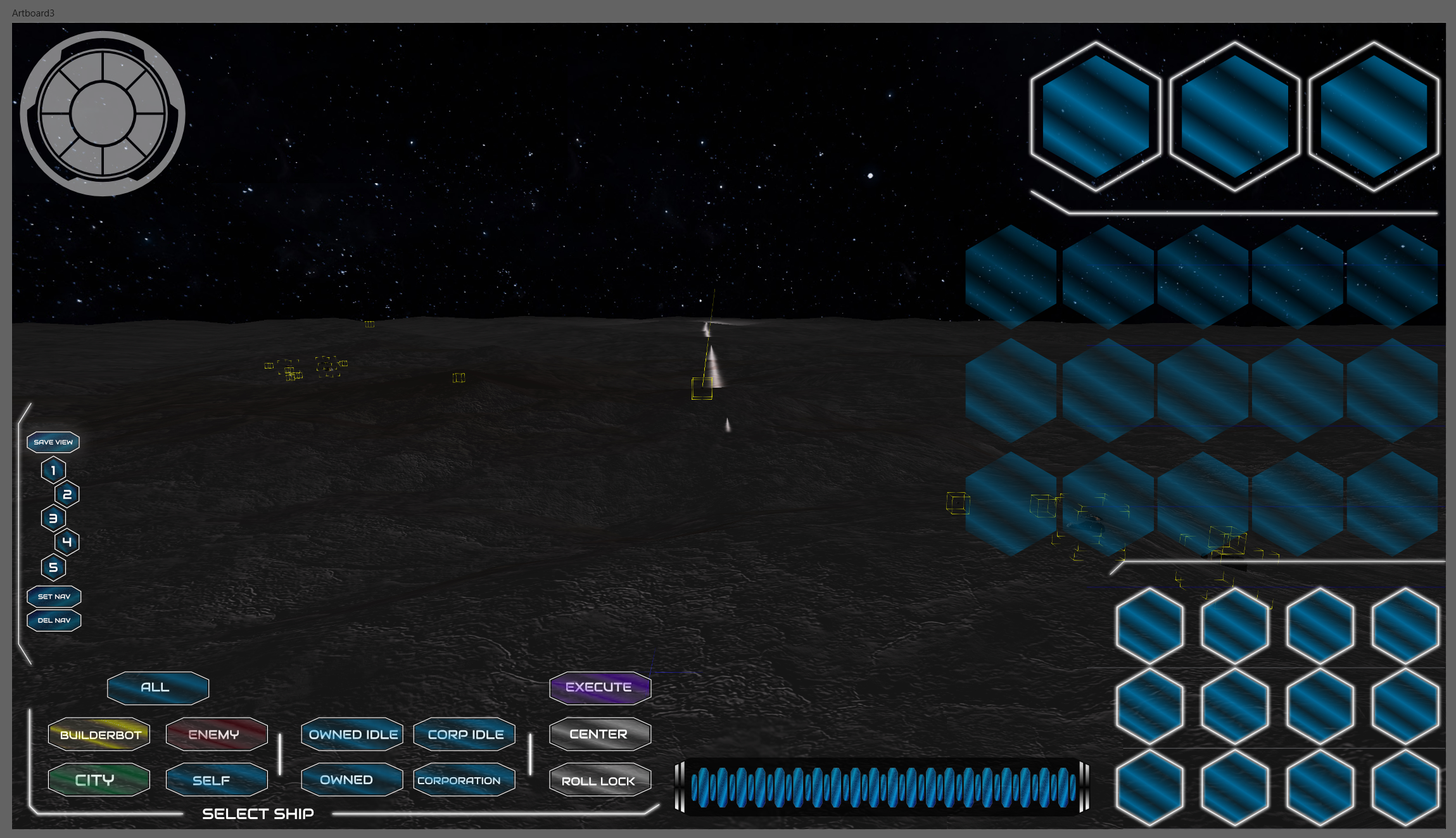
The Navigation Screen
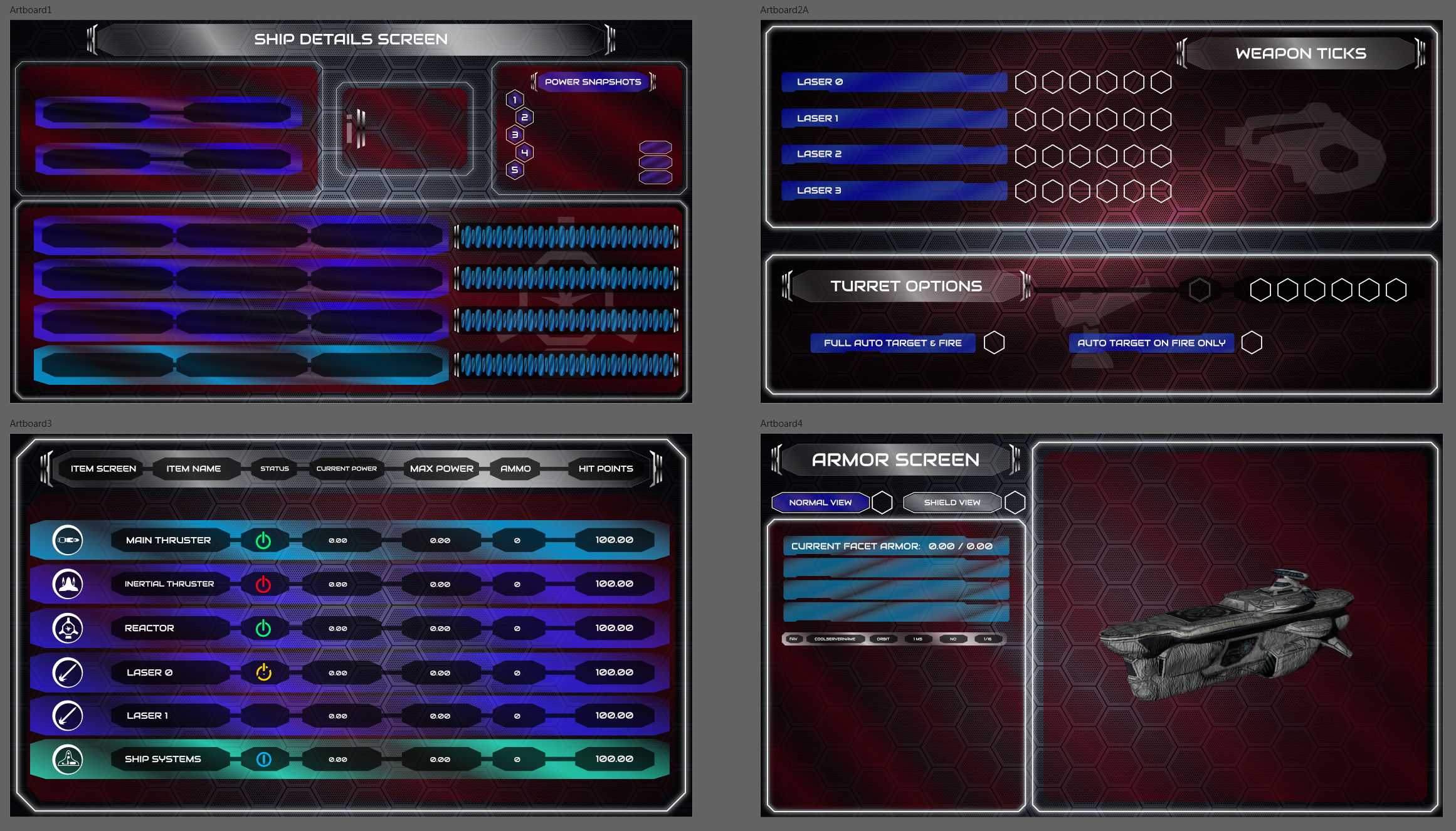
The Ship Detail Screen
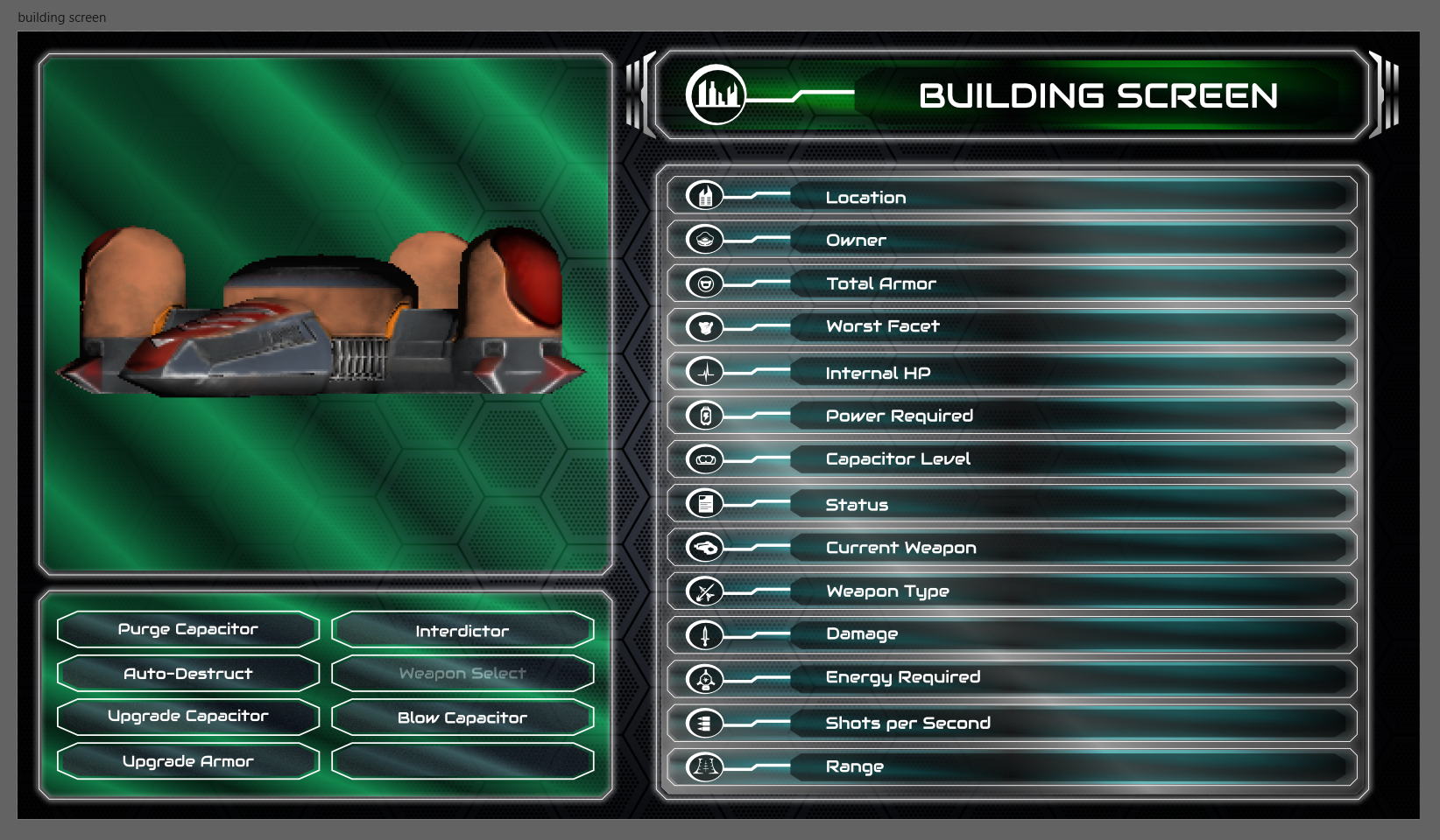
The Building Screen
| Print article | This entry was posted by paulb413 on 10/20/21 at 02:05:00 pm . Follow any responses to this post through RSS 2.0. |
No feedback yet
Leave a comment
-

Random photo
