HUD Advancements
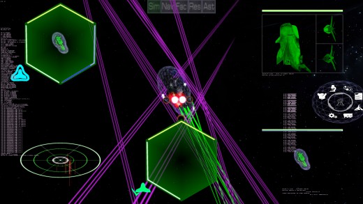
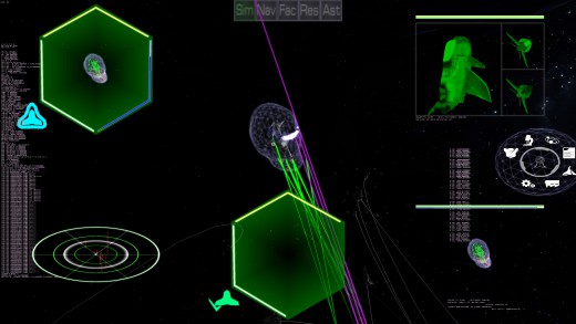
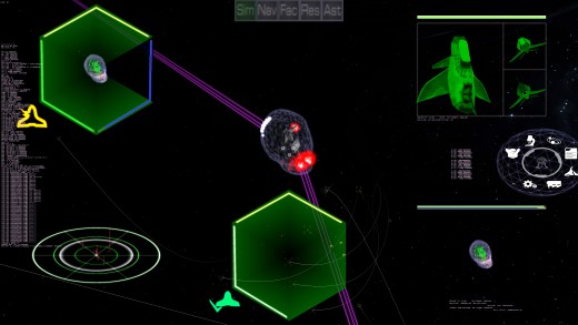
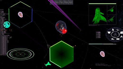
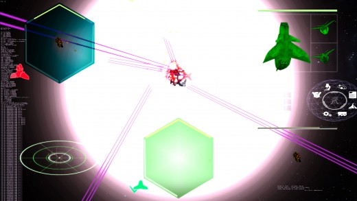
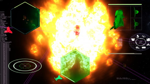
Along with fixes to the multiplayer (second live stream this Tuesday!), work is being done to update the HUD graphics and functionality. In the screen shots, you can see the new "targeted ship" monitor in the upper left, with the old one for comparison in the lower right. The Damage bars for Shields (Blue), Armor (Green) and Items (Yellow), have been shifted from a horizontal bar that is hard to read, to a hexigonal shape, with dual colors representing the highest percentage armor of a single facet (if applicable), and the total hit points of that type. Generally, the facet goes to zero long before the total hit points of that type does (such as sheilds or armor). So the lighter color is the facet, with the darking being the total. Items don't have dual colors, and just are yellow. Also added is a status icon, showing the status at a glance rather than words (see the old monitor). The different statuses are: Shields Up, Shields Down, Powered Down, Hull Ok, Hull Breached, Jumpless, Weaponless, Immobile, Disabled (Reactor destroyed), Dead (pilot is dead because the cockpit was destroyed), and wreck (the ship is exploding). The last of the current updates to the monitor is the background of the monitor actually represents, at a glance, the status of the front, back, left, right, top and bottom armor as a whole. Currently, it shows the worst facet, but I haven't decided if this is useful or not, and more play testing with feedback will likely make it more useful and functional.
| Print article | This entry was posted by Arthur M. on 11/30/19 at 09:06:00 pm . Follow any responses to this post through RSS 2.0. |
