UI/UX Artist: Quick Designer Update — Power Ratios!
Hi all. This is your UI/UX Artist Paul and this week I'm previewing the addition of the Capacitor Window to the Quick Designer. Recent gameplay refinement has made Reactors large and heavy, and tightened space restrictions on your ships. This forces players to be more conservative with how many power plants (reactors) they throw into their little flying boxes before construction, and thus makes wise usage of Capacitors all the more important. For this reason, a screen to control what ratio the components of your ship are being fed power from the reactor or discharging from capacitors.
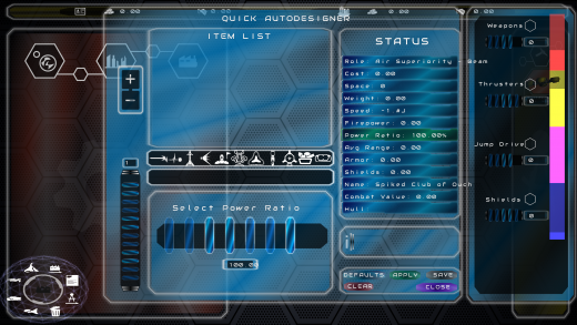
Below is the current functional build of this gameplay mechanic, showing red, yellow, pink, and purple bars on the far right side of the screen.
These vertical bars represent the ratio of capacitor-to-reactor and thus communicate/dictate what priority each system receives power from the reactor, which cannot supply everything 100% all the time. The taller bar represents capacitor power since it is possible for a component (engine, weapons, etc) to run on just battery power. The smaller bar within represents the reactor power recharging that capacitor. The fuller the reactor power, the faster that capacitor recharges because it is being allotted more energy. Because these are ratios however, this means the more reactor power given to one component, the less there is for the others.
Current graphical updates are exploring better way to render this interface. A solid color system with icons would accomplish the brute nature of the end goal. A texture overlay packs a better visual punch though. As this new system receives further refinement, more design changes and integrations are bound to happen. This is very much an exploratory stage (hence why "Weapons" is repeated in the above demo.)
| Print article | This entry was posted by paulb413 on 08/25/21 at 02:09:00 pm . Follow any responses to this post through RSS 2.0. |


