UI/UX Artist: Building Screen 2
Hi everyone. This is the UI/UX Artist Paul with another update on the Building Screen.
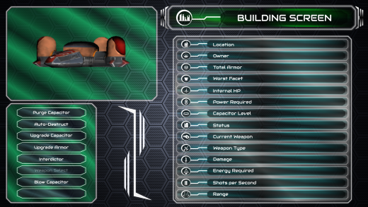
The list on the righthand side has been expanded to include all 15 lines of text display so that everything will be visible at once without needing to scroll. A backdrop has also been added to "hold" the text fields themselves. More icons have had to be added for the extra info being displayed. Many preexisting icons were sufficient for this end, however other fields prompted the necessity of new icons.
A spacer element was also added to separate the information display on the right and the action buttons on the left. This will likely evolve as further ways of organizing this screen follow through.
The building screen is a simple one-horse show. There are no additional subscreens and its function is relatively straightforward, so that's that for this post. Next time I'll have the Corporation Screen made more presentable to show!
| Print article | This entry was posted by paulb413 on 06/16/21 at 12:27:00 pm . Follow any responses to this post through RSS 2.0. |


