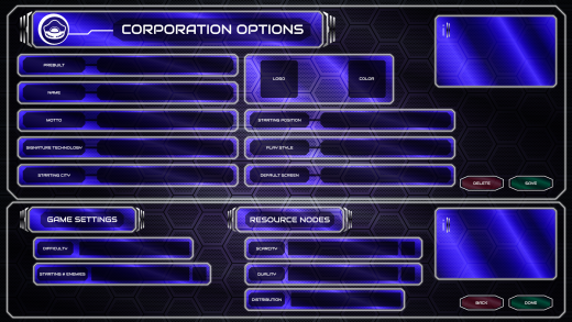
UI/UX Artist: Corporation Screen Mk II
Hi all. This is your UI/UX Artist Paul again. I have another update on the Corporation Screen. Once again, this isn't so much a verbal demo but a visual one. The design has been refined further and this is the result. Glowing white outlines are the standard for all text runner elements now, and the Corp Screen has received the appropriate refitting. Other screens made previously will be touched up to conform to this standard.
Bit by bit the look of Rank: Warmaster is coming into focus!
| Print article | This entry was posted by paulb413 on 07/15/21 at 03:01:00 am . Follow any responses to this post through RSS 2.0. |
No feedback yet
Leave a comment


