UI/UX Artist: Cursor Development
Hi all. This is your UI/UX Artist Paul with more bit-by-bit developments on the new upcoming mouse cursors.
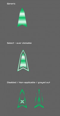
The mouse cursors in-game are going to be (like all cursors really) context sensitive and therefore change appearance depending on the situation. For now, the main contexts are basic, over-clickable, and over-disabled. This is once again an exploration into minimalism, as the cursor will never be too large. Below are some examples of the "default" cursor in its "inactive" state (just existing), when it's hovering over a clickable item in-game, and when it's over an item that has specifically been grayed out or made non-available. The latter has two conceptual forms to get a feel for how to convey a button has been disabled. An "X" is universal, but making the cursor implode or "shrink away" might be another visual element to consider.
Further work on this is to come out with feedback from development team members.
| Print article | This entry was posted by paulb413 on 04/07/21 at 01:20:00 pm . Follow any responses to this post through RSS 2.0. |


