UI/UX Artist: Nav Screen Graphical Updates
Hi all. This is your UI/UX Artist Paul. I've been busy tackling the Navigation Screen's visual design overhaul. Facelifting this screen is proving tricky. This screen more than any other will be subject to an overwhelmeing level of visual activity due to its nature as a real-time 3D RTS screen. For that reason I have a few experimental prototypes, and further evolutions of the look and style will be inevitable. On one hand the interface has to be visually legible so that it doesn't blend in with the action happening in the displayed worldspace. At the same time it can't get in the way either. Stylized UI and minimalist UI need to be balanced particularly well in this case.
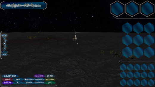
One prototype reuses the hexagon theme, albeit at the cost of being the clunkiest model.
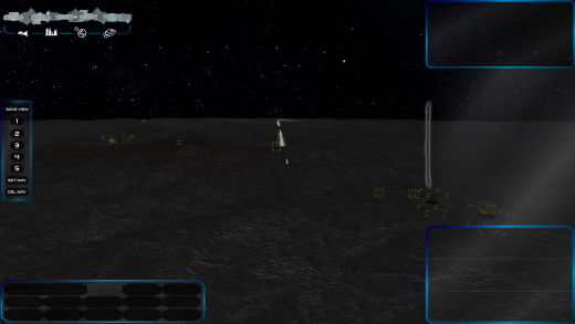
Another opts for a mirror reversal of the previous backdrop screens, highlighting the bezels in glass blue (of which there won't be a lot of on Mars) while letting the screen fill sink into ambience with a soft transparent gray.
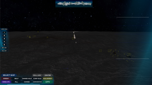
The most minimalist of the prototypes forgoes borders and shapes completely, and uses light gradients to backdrop the various ingame grids.
| Print article | This entry was posted by paulb413 on 07/15/20 at 02:58:00 pm . Follow any responses to this post through RSS 2.0. |


