UI/UX Artist: Scouter Reticle & Other Tweaks
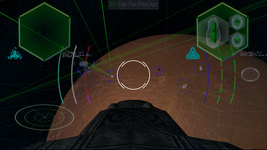
Hi all. This is your UI/UX Artist Paul here. This week I have a few minor updates to share. The first is a preview of the Scouter Reticle we are adding. The Scouter (seen above as the pair of broken up thin white circles) is a toggleable targeting interface that appears fixed in the center of the pilot's viewport (when flying one's ship directly) that will display metadata about whatever object it passes over. This will allow for instant targeting of whatever ship or building the player is looking at, without having to cycle through the entire list of enemy/friendly ships/buildings, which will get quite cluttered as game progress goes on. Minimalism was key here as its purpose is entirely practical, and it stands in the middle of what is essentially the driver's windshield when it is activated. The above preview is a mockup; the actual in-game implementation will be constructed in shader code to ensure graphical fidelity.
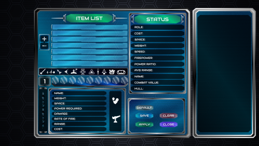
Further updated is the Quick Designer. A slide-out side window that will provide additional contextual information is being added. This will appear and recede as needed in a sidebar menu-like fashion. Minor update visually speaking, but important gameplay-wise.
Additional minor updates include adding a "Cancel Orders" button to the RTS screen to call off all ships in one's squadron, as well as further color-code balancing of the Armor Assigner sub-screen.
| Print article | This entry was posted by paulb413 on 09/23/20 at 02:02:00 pm . Follow any responses to this post through RSS 2.0. |


