UI/UX Artist: Text Fields & Research Screen!
This is your UI/UX Artist Paul and tonight I have two updates. First, I've been working on making text backdrops. Second, I've begun modernizing the Research Screen!
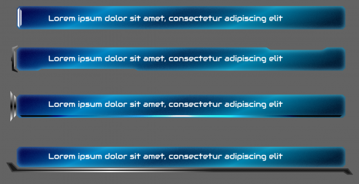
We've had window art for a while now, as evidenced by the variety of screenshots shown already. What we've been needing however were more "slim line" holders for situations where only individual lines of text are present, for example when loading a save file. These had to be distinguishable from their container window, and not clash with its pattern.
In this case a glassy pane look would form a nice contrast with the previously established "scanline" aesthetic, and thus ensure visibility over such a detailed background. This is somewhat important considering that text has to be legible. There are several different minor "flavor" additions that can be explored, and blue isn't a hard necessity, but for now simply having a dedicated text field is its own achievement!
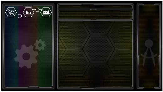
Next up was the facelift of the Research Screen. There is practicality in similarity, and so the overall layout was taken from the pre-existing Factory Screen.
For context, this is an approximation of the Factory Screen, sans minor updates.
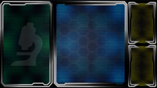
And here we have the adapted Research Screen!
The right side window has been split into two as needed for different content; the Factory Screen held a simply vertical scroll list there, whereas this will serve other purposes. Color changes go a long way in distinguishing this screen from that the Factory. Further refinement is underway (such as the line thickness and gradient on the screen bezels), however the overall format works.
| Print article | This entry was posted by paulb413 on 03/26/20 at 01:55:00 am . Follow any responses to this post through RSS 2.0. |


