UI/UX Artist: The Self-Damage Screen Continues
Hi everyone. This is your UI/UX Artist Paul with another update on the Self-Damage Screen.
As the various screens come together I have been reviewing the previous sets and am now working toward a more consisten & ubiquitous design theme. Along this journey new ways of presenting and displaying informations and controls had to be innovated however now with the full suite of subscreens achieving completion, that trial of "what if we did this?" is coming to a close. That being said, the Self-Damage Screen is seeing itself assembled with a formal style guide in mind. There's still some wiggle room, being the last set of screens to be put together.
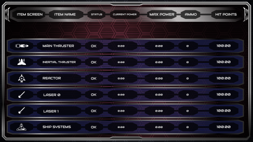
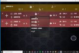
The first image shown is the Items List Screen. It's almost a second Asset Screen, but for physical components rather than faction economics. Interactive tie-ins with the other screens will be implemented here.
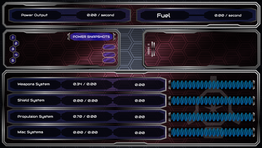
The Power Screen allows players to control how their ships internal power supply is distributed to its onboard systems. If you're a Trekkie and ever wanted to say "All power to the engines" in a space combat game, this screen is where you can do just that, via the "Power Snapshots" subwindow, which exists to provide such quick commands. Further refinement and layout of that subwindow will be forthcoming.
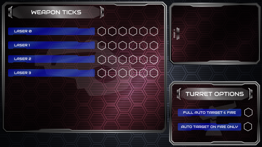
The Weapon Ticks Screen allows you to refine how your weapons operate. More refinement on this screen will be underway.
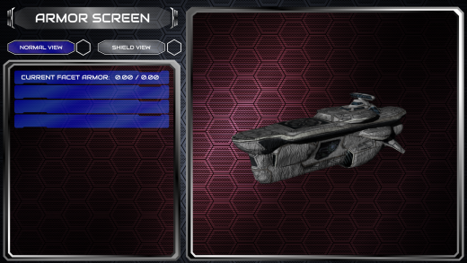
The Armor Screen is rather self-explanatory. Get an upclose look at how much punishment your ship has taken.
Further updates are forthcoming. I am looking to find places to insert the names of each subscreen, and in screens like Power and Items List where there are a lot of subwindows to display, this is complicated, but nonetheless will be worked out.
| Print article | This entry was posted by paulb413 on 10/21/20 at 02:39:00 pm . Follow any responses to this post through RSS 2.0. |
