
UI/UX Artist: We Have a Logo!
Hi all! This is Paul, your UI/UX designer. It is with great pride that I announce that we at Laser Beams & Particle Streams Inc officially have ourselves a logo for our indie game dev start up! We finally have a face to put to the name! All done by hand by yours truly (minus some font at the end.)
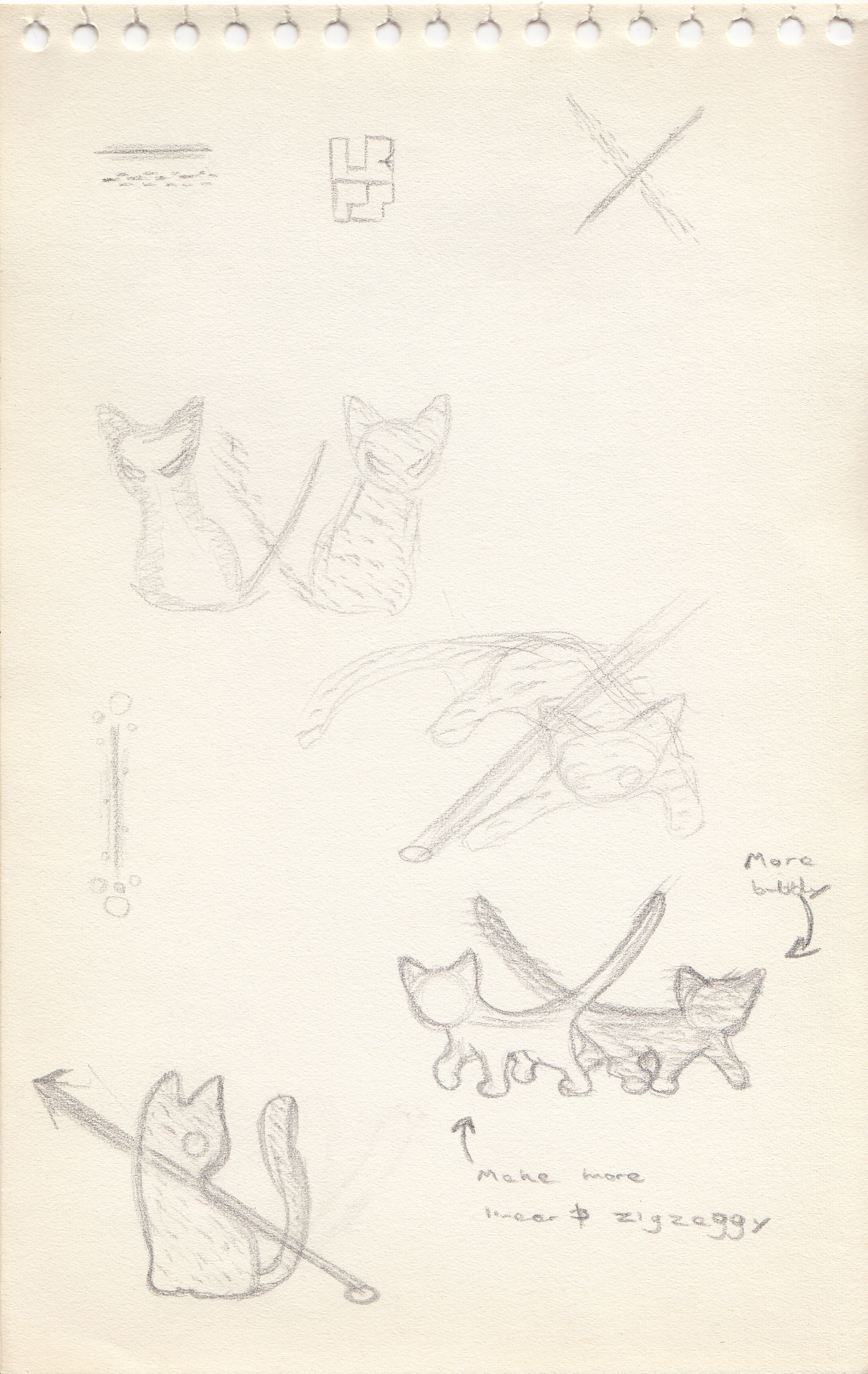
The start of any artistic endeavor consists of "scribble random stuff until you accidentally make something that looks good." I make my initial concept art sketches in pencil & paper. Not having an "undo" command available helps keep me moving forward. At first a "cat theme" was explored, owing to several dev team member's fondness for them, and the suggestion by one that the company might do with a mascot. Hence, a particle cat playing with a laser beam was among the first ideas treaded upon. This direction was ultimately not pursued in favor of a more energetic and literal visualizations.
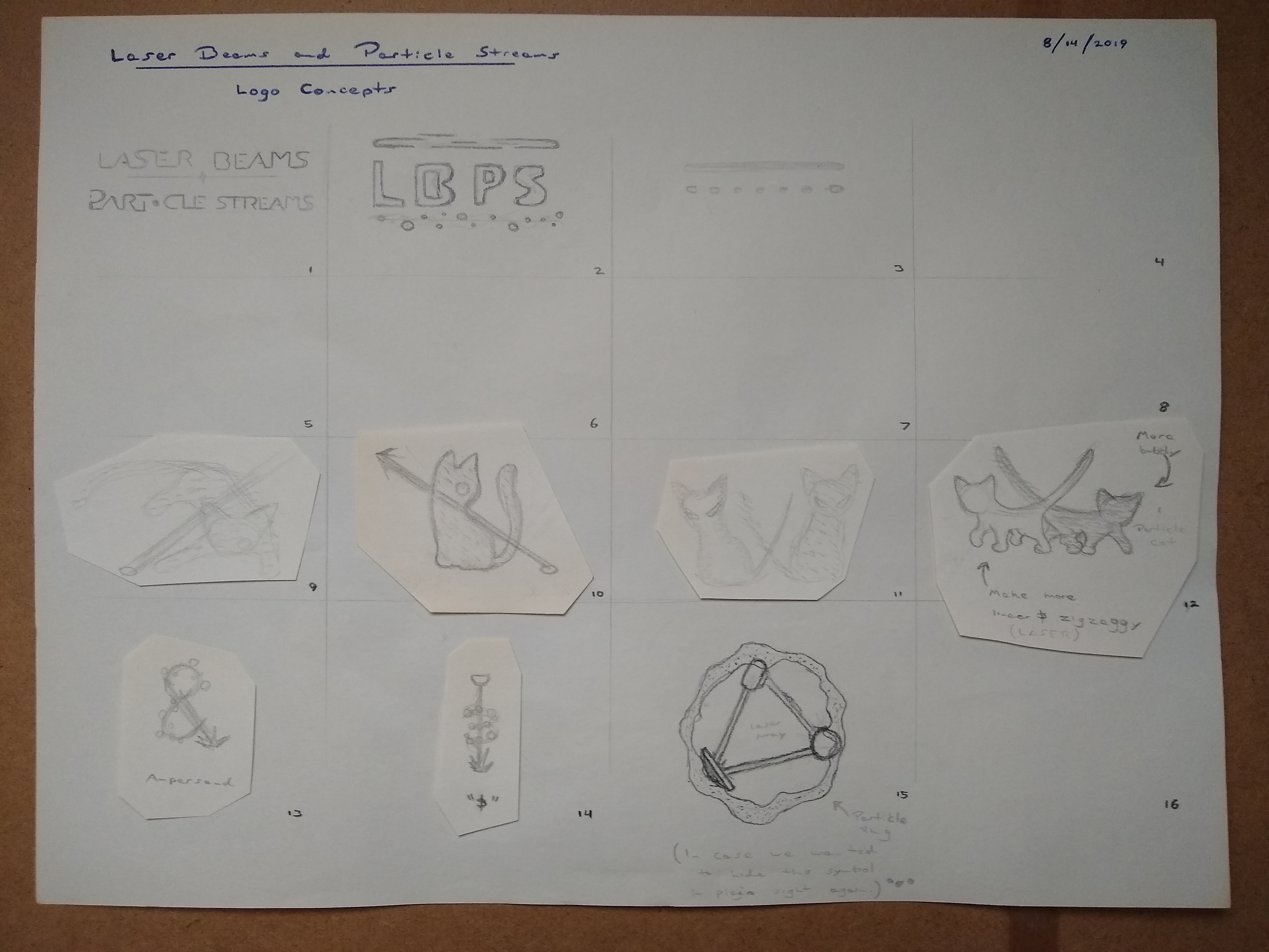
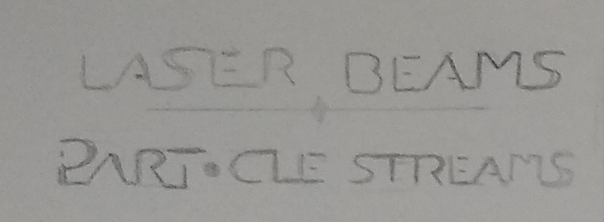
Still in pencil & paper, more literal renditions of lasers and particles were experimented with, as well as an interplay with typography. Ultimately type from square #1 was chosen.
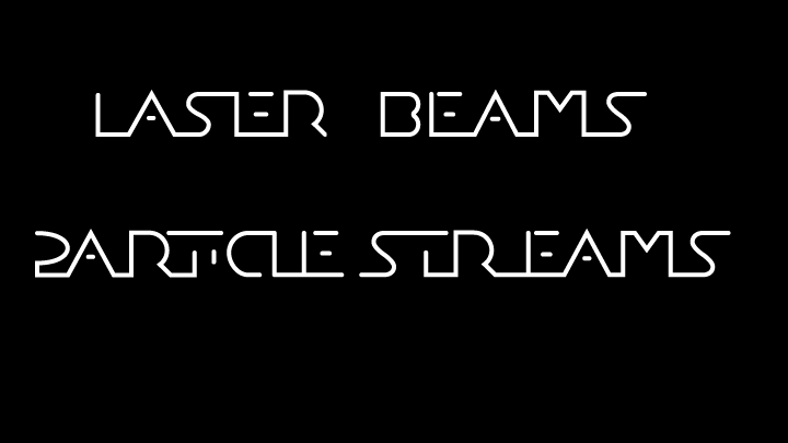
At this point vectorization took over. The hand-drawn lettering for "Laser Beams & Particle Streams" was redone digitally. It was decided that a laser beam would shoot between the two lines of typography, being transformed into a particle stream halfway through by the ampersand that would go at the very center.
![]()
The laser beam was either going to be red or yellow. It had to look either aggressive or energetic. Yellow was selected for its brightness. The beam was made out of progressively brighter vector lines encasing one another, transitioning from pure white to yellow from the center out.

The particle effect was accomplished by drawing dashed lines that were then blended and given a glow effect. A cool blue was chosen to contrast the "heat" of the laser. Having multiple lines in varying shades of blue help give the impression of depth and dimension to the particles.
The vectorized typography was given its full graphical enhancement: a bold outline, a metallic gradient, and a carefully drawn "&" symbol to both figuratively and literally tie it all together. The laser and particle elements were brought in behind. A lense flare was added for extra "pop." The font used to spell out "— Software Inc — " is Acherus Grotesque Regular, used under the The Fontspring Desktop Font EULA.
And thus, we have the finished product!
| Print article | This entry was posted by paulb413 on 09/11/19 at 07:22:00 am . Follow any responses to this post through RSS 2.0. |
-

Random photo
