UI/UX Artist: Config Screen Visual Update
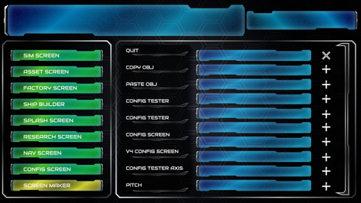
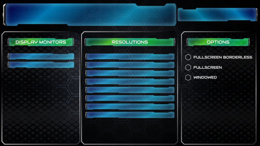
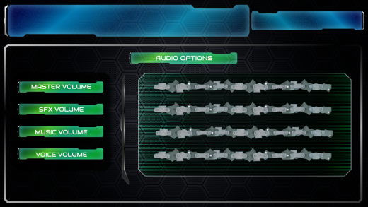
This is your UI/UX Artist Paul. I've been touching up the visuals on the Config Screen, which we've just seen from our coder Matt. Without further ado, here are a couple of preview screens:
Extrapolating from the blue glass text field motiff, a simple recolor was a nice way to make umbrella categories stand out from specific data fields.
Experimenting with new backdrop patterns. A subtle "crosshatch" is showing some promise. More textures will be tested out.
A little gradient transition can go a long way. It's an interesting excersize making a screen backdrop for a window with relatively little in it compared to a lot. What do I fill in empty screen real estate with? Negative space is an artistic tool in and of itself. ;)
| Print article | This entry was posted by paulb413 on 04/22/20 at 10:06:00 pm . Follow any responses to this post through RSS 2.0. |
No feedback yet
Leave a comment


