Update on the User Interface!
Hello all! It has been two months since the last blog update, but the dev team has been hard at work. Here is a snippet of most recent state of the UI/UX Library. We are now officially progressed to the point where sectioning them into their respective sub-screen categories. From now on all upcoming icon update will be presented in this contextualized manner. So with that, here are the updates from your UI/UX designer!
The first image base icons show the root level of the radial interface, as well as a few of the immediate sublevels and some "particle" icons that specify further actions with the same category.
The second image presents the newest set, the Ship Builder screen icons. These are the icons for the controls used when building and customizing player-made ships.
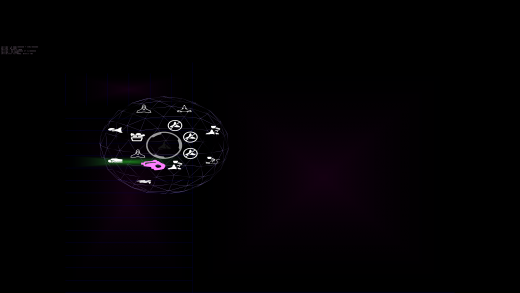
The third image shows the radial interface in its expanded secondary ring form, along with several of the new icons placed within (several are dummy repeats for the sake of spatial referencing.)
| Print article | This entry was posted by paulb413 on 09/20/18 at 03:19:00 am . Follow any responses to this post through RSS 2.0. |


