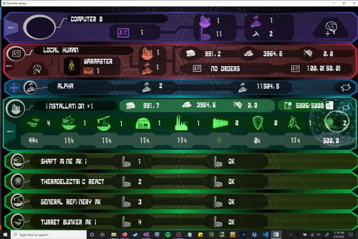
Always Room For Refinement
Every piece of art has a moment when it's complete, when we have to move on to work on something else. Until then, we keep polishing, keep refining; for an interface, that means making things easier to see, more distinctive, more of a pleasure to look at. We've added some of these details to the asset screen: selected icons are now highlighted in a color that matches their bar type, ranks now have their own unique icons, and building bar icons match their building type. Simple changes when taken individually, but put them together and they add up.
| Print article | This entry was posted by mdcode on 05/03/20 at 12:09:00 pm . Follow any responses to this post through RSS 2.0. |
No feedback yet
Leave a comment


