UI/UX Artist: Config Screen Update and a Touch Up on the Factory!
Hi all. This is your UI/UX Artist Paul with further updates to the Configuration Screen.
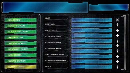
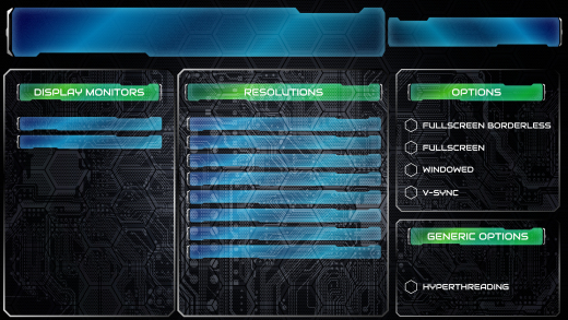
A backdrop has been agreed upon. The circuit board pattern fits the general theme of adjusting the in-game settings, and so it is now the official backdrop of all Config subscreens. The Resolutions Subscreen has received an additional subwindow for other more general options such as the Hyperthreading shown in the preview.
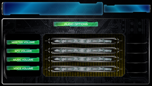
The Audio Subscreen has additional background effects, in this case a loosely tiling rounded block pattern, gradiented to resemble audio levels, an effect that worked out quite nice. Additionally numerical slots have been added to the right of the sliders to allow for precise digital readout of the current level setting.
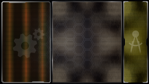
Lastly, the Factory Screen has been given a brief update, with color palette coded to its over theme of manufacturing and construction. As the aesthetics of all the screens come together, each one is emerging with its own distinct color style. This is both artistically pleasing but also practical, allowing even a blurry glance at the screen to communicate which one is being viewed without reading any text. In the case of the Factory Screen, colors of Martian red-brown and construction equipment yellow dominate. The Config Screen by contrast, is a mostly white-gray, reflecting the colorless machine settings it is devoted to.
| Print article | This entry was posted by paulb413 on 05/07/20 at 02:07:00 pm . Follow any responses to this post through RSS 2.0. |


