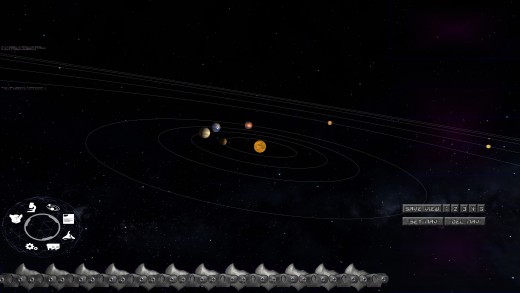
First Look at the New Navigation Screen!
The Navigation screen is really the RTS element to the game. The old version was never ported, and this new one already looks a lot better in the new framework. This will be my focus for the up and coming weeks. The gauge at the bottom allows scaling from seeing the whole solar system in its entirety to zooming into a single ship up close very quickly. With the new gauge functionality, it works far smoother and better than the original already. Certainly the look is far better already too. There are place holder button on the right as the updated button are designed. This will be an ongoing process of course. I am looking forward to how this will end up working and looking. :)
| Print article | This entry was posted by Arthur M. on 02/19/19 at 05:44:00 am . Follow any responses to this post through RSS 2.0. |
No feedback yet
Leave a comment


