UI/UX Artist: Graphical Overhaul Continued >> Factory & Research Screens
The graphical overhaul of the remaining screens continues. There's not much to say here, as these improvements are visual.
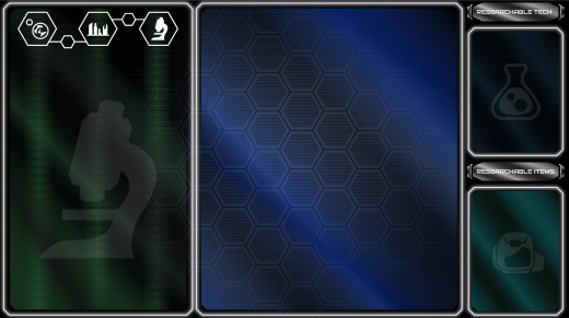
This is the "old" Research Screen, dated March 25th. This was back from when "gradiented silver bezels" were the aesthetic.
And here's that same screen in our modern, clean "colored glass with glowing white outline" look!
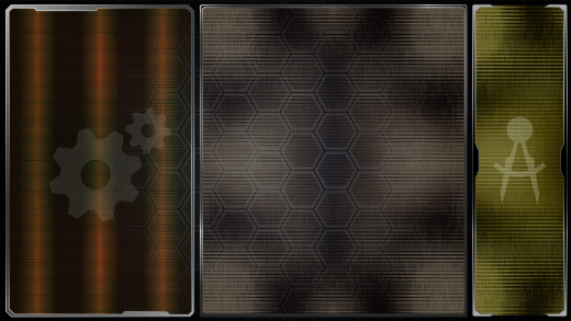
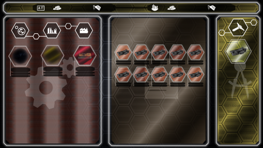
Another example of an older look, this time the Factory Screen.
And once more viola! Same layout, new standard. (With quite a bit more in the way of shown greebles and interactables.)
| Print article | This entry was posted by paulb413 on 12/16/20 at 12:34:00 pm . Follow any responses to this post through RSS 2.0. |
No feedback yet
Leave a comment


