UI/UX Artist: Nav Screen Improvements
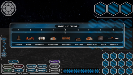
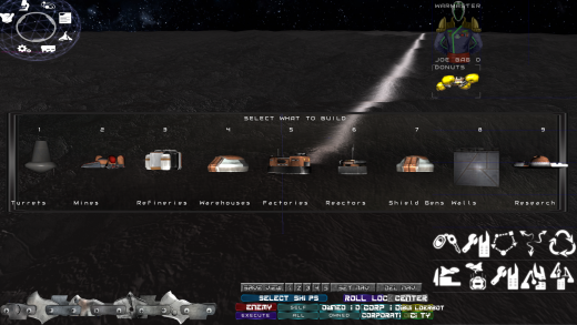
Hello all. This is your UI/UX Artist again. This week I have some updates to the Nav Screen! This screen is recieving heavy attention under the hood code-wise, which means it's a good time to make sure it's up to date graphically. For context, here's a look at the current Nav Screen:
This is what the Nav Screen currently looks like in-game, using older assets that were repurposed for the sake of play testing functionality. This new update brings the Nav Screen up to the current "glass standard" that we've converged on.
Another quick one for you today, but it's another check box filled in bringing Rank: Warmaster to a unified artistic style!
| Print article | This entry was posted by paulb413 on 02/10/21 at 02:09:00 pm . Follow any responses to this post through RSS 2.0. |
No feedback yet
Leave a comment


