UI/UX Artist: Quick Designer Facelift
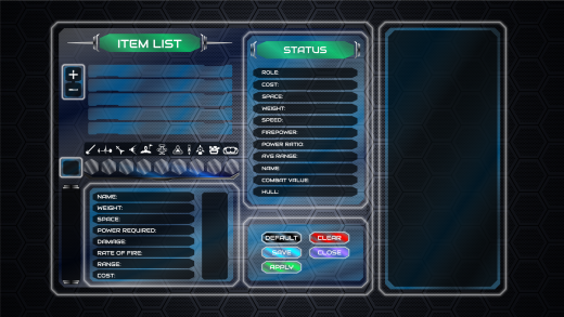
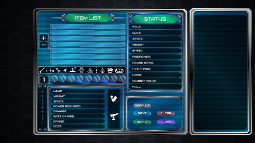
Hello all! The ongoing progress with the graphical overhaul ...progresses? This time around I have the facelift of the Quick Designer! As last time, not much to say. Here are the before and after pictures:
Featured above is the "new new" look, bringing the glassy windows and thin glowing white outline to this collection of subscreen elements.
For comparison's sake, here's the "old" quick designer, with the scanlines and silver bezel element. These are the graphical motiffs being distanced from.
All in all, a small update, but nonetheless a benchmark of all the game's various subscreens converging on a unified aesthetic.
| Print article | This entry was posted by paulb413 on 01/27/21 at 02:01:00 pm . Follow any responses to this post through RSS 2.0. |
No feedback yet
Leave a comment


