UI/UX Artist: Oy Those Bloomin' Bloom Settings
Hi all. This is your UI/UX Artist Paul here continuing the ongoing progress of the various Screen uplifting.
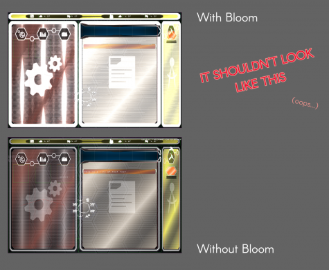
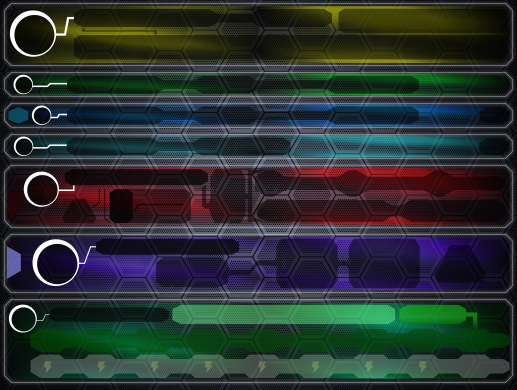
The above image shows one of the primary stumbling blocks that I've encountered is that the game engine's bloom function is, to put it a certain way, overly eager? If color levels are above a certain threshold, the graphic holding them will have bloom applied it it. This creates a complication when you use white as a kind of subtractive platform to create a glassy texture that can be recolored easily as needed.
With a little bit of tinkering I was able to deduce that switching the color mode from RGB to HSL for the glassy white texture and setting the white to a very light shade of gray solved most of the bloom issue, but as you can see a little bit of erroneous bloom still happened. This seemed to result from the overlapping layers of off-white elements.
Further toning down of white layers solved the glassy window bloom.
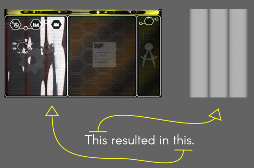
What I've learned from the Factory Screen overhaul project, I can apply to other screens! Above is the concurrent model of the Asset Screen, from the "gradiented colored outline" and "heavy scan lines" days.
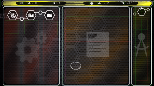
Here is the same collection of windows redone in the glassy window & thin white outline aesthetic.
| Print article | This entry was posted by paulb413 on 12/30/20 at 01:56:00 pm . Follow any responses to this post through RSS 2.0. |
