
UI/UX Artist: Rose-Tinted Glasses?
Hi everyone. This is your UI/UX Artist Paul here. This week I'm covering a more in-depth look at the aesthetic direction of Rank: Warmaster!

We've arrived at a unified aesthetic with our transparent glassy windows and thin white glowing lines that was initially developed as an unobstructive UI for the Navigation Screen. And thus I've been uplifting the other screens to fit this aesthetic.
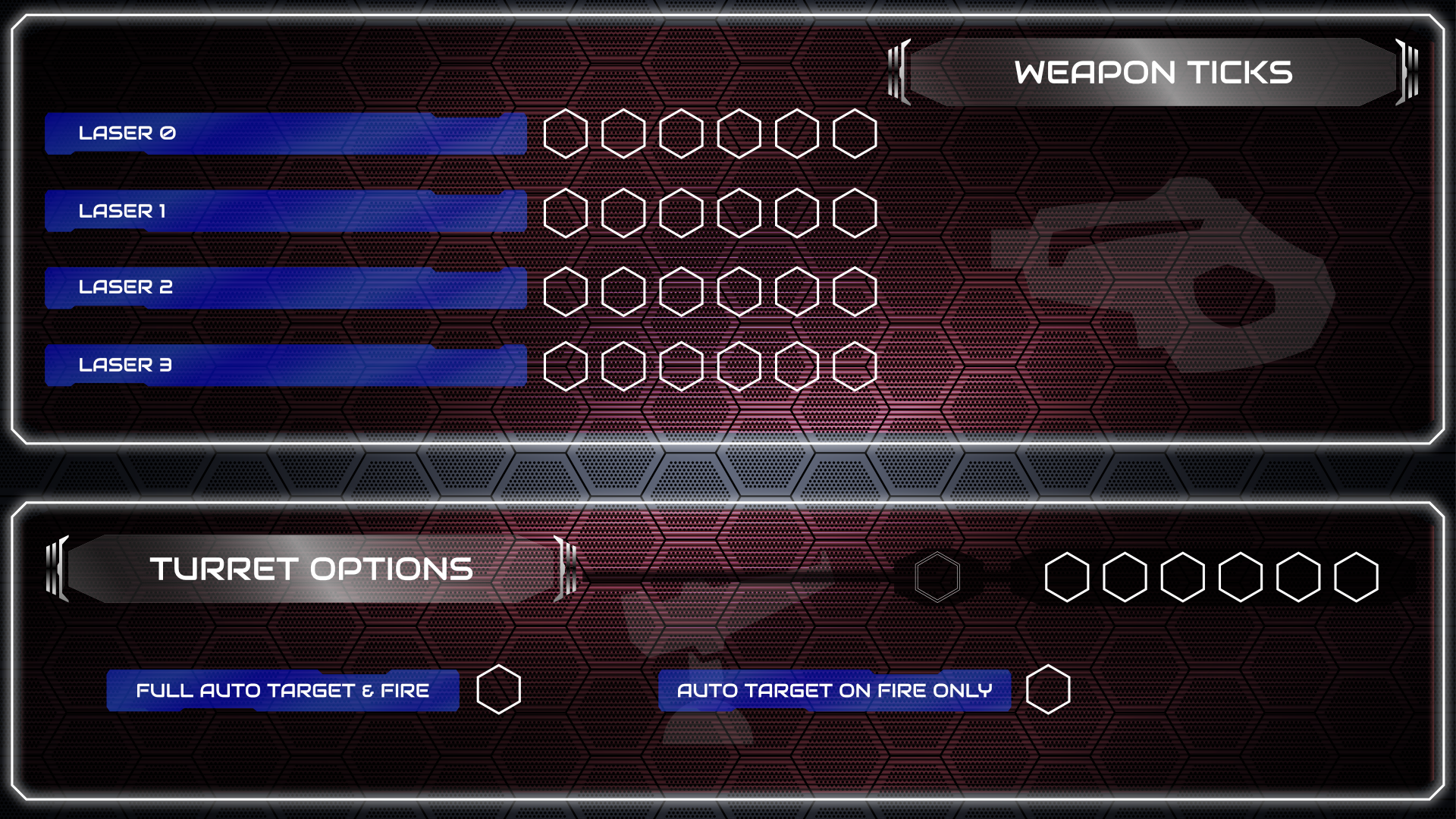
I'm starting with Self-Damage Screen since it's been my current assignment. Here is what it recently looked like, when gradiented silver screen bezels were the motiff. The new aesthetic incorporates the glassy window and outline look into the pre-existing color scheme. You can see it in action in the teaser image to this post. But for this post I thought it would be prudent to show how I'm creating these graphical elements.
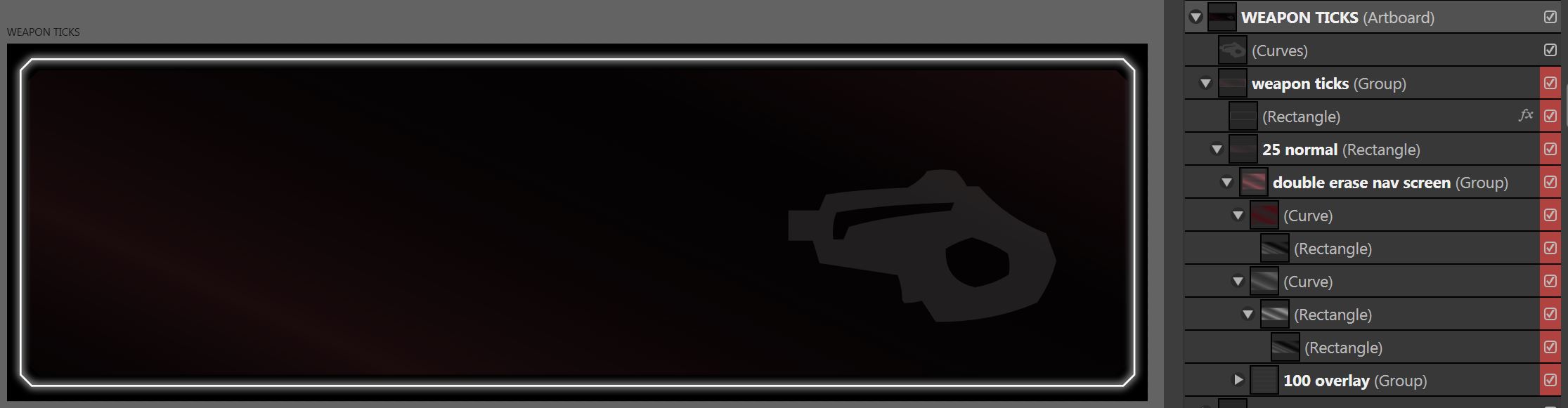
This is a screencap of the graphical element in its original vector program, showing the various layers with names referring to their opacity and even blending modes. (The artboard was temporarily colored black to show the white outline and glow, which would be hard to see with the default background.) In the program I'm using, Affinity Designer, the transparency/opacity of a layer controls its alpha channel. This is what allows the graphical element to have its "see-through" properties. But that's just the start of it. Look at the layer titled double erase nav screen as you'll see a streaky red object and a matching streaky gray object. These are what create a truly dynamic glassy texture. I'm not only giving the layers transparency, I'm varying the transparency itself. Here's how it looks in action...
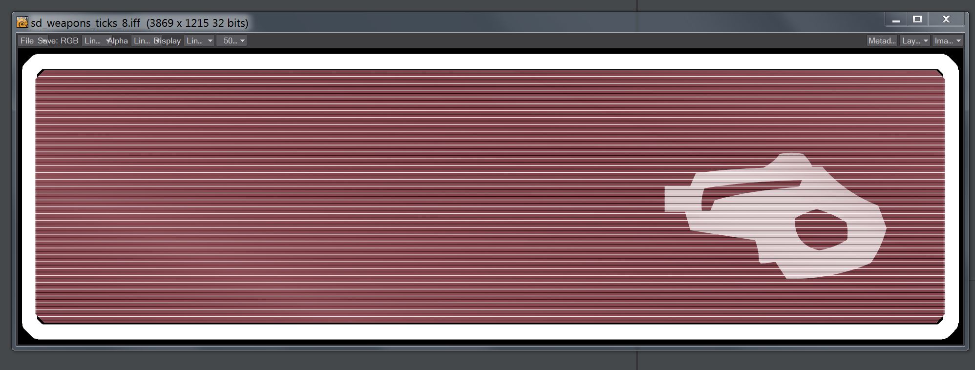
This is the image once it's been imported into LightWave, which converts the image to the IFF format that RWM's engine natively handles. Shown here are the image's red-blue-green color channels. Note how it looks completely solid and the glow is lost to a massive solid white. An error? Nope!
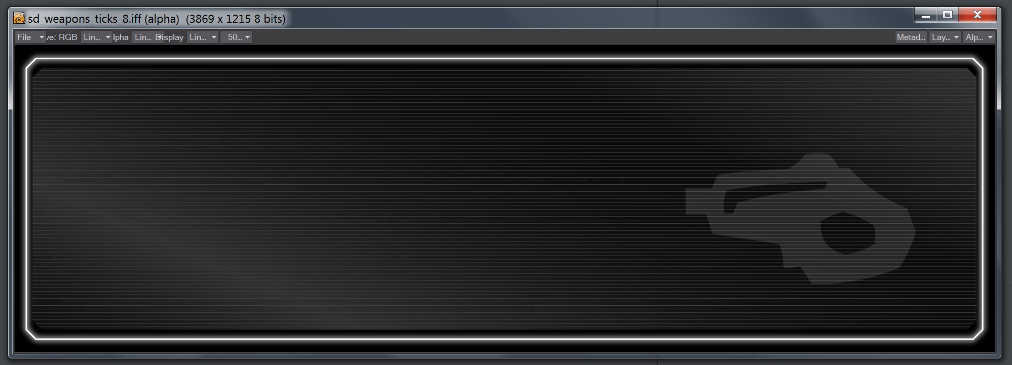
This is the same exact image's alpha channel. This is where the magic happens. Look how the glow comes through from the thin outline properly. And, note that the glassy gradient effect comes through in shades of gray. This is how the transparency is done. Darker shades of gray are more see-through, lighter shades are less. Black would be totally invisible, and white (the outlines) would be completely solid.
This is the art of non-destructive graphical editing. Not only do I have a glassy window effect that works in layering, I can swap out that color layer for any other color I want! The Self-Damage Screen will have rose-tinted UI windows, but other screens will have their own color theme. And all I have to do is resize the windows and use the color picker tool in-program to reset the color scheme.
| Print article | This entry was posted by paulb413 on 12/02/20 at 11:38:00 am . Follow any responses to this post through RSS 2.0. |
-

Random photo
