UI/UX Artist: Screen Refinement
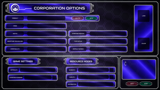
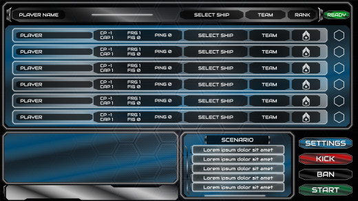
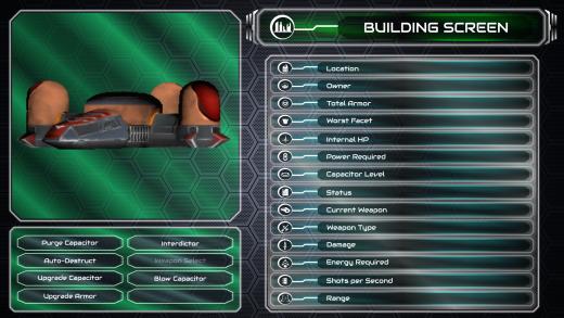
Hi all. This is the UI/UX Artist Paul. This week I've just got some minor touch ups on various screens. Mostly just a few further rearrangements of subscreen windows and generally making sure everything conforms to the aesthetic standard that we have arrived at as so far in our journey. In this case, that means making sure all text containers have a thin white glowing pinstripe around them, and going through each window subset to verify that the glassy texture works properly and has its gradient correctly aligned. This is a meticulous and tedious task which admittedly isn't too exciting, but nonetheless necessary. The human eye catches a lot more than one might think, so ensuring that nothing that looks "off" is a high priority.
| Print article | This entry was posted by paulb413 on 07/28/21 at 02:12:00 pm . Follow any responses to this post through RSS 2.0. |
No feedback yet
Leave a comment


