UI/UX Artist: The Asset Screen Comes Together
Hi all. This is your UI/UX Artist Paul. I'm proud to say that the Asset Screen is coming together nicely!
First is the Corporation Bar. This is more or less your "View Totals" header. This allows the player to view the overall standing of all of one's assets in one place: all personnel, installations (cities), squadrons, and ships. This bar also functions as the master dropdown for the Asset Screen, as selecting the categories will open the main bar for that item (i.e., choosing the "Installations" icon will open up the familiar-sounding the Installation Bar.)
Next we have the Personnel Bar. This bar allows the player to view their direct underlings and their pertinent information such as their Rank, Message Inbox, Current Orders, Budget, and what Resources, Cities, & Squadrons they own. This bar also gives the player control over each underling. One can grant their underling tactical advantage in the form of additional resources with the Transfer Assets icon, or "fire" them from one's employ completely via the "Delete AI" icon.
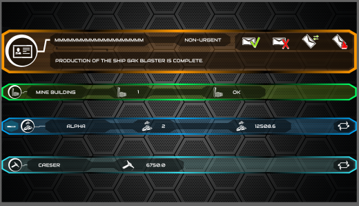
And lastly, a collection of smaller bars. Here we have the Messages Bar, the Buildings Bar, the Squadron Bar, and the Ships Bar, in descending order. The Messages Bar is a subset of the Personnel Bar, and displays in-game messages from the player's underlings. The Buildings Bar is a subset of the Installations Bar, displaying information about a certain specific building, such as a research outpost or a reactor. The Squadron Bar displays codified groups of ships, how many ships make up a given Squadron, and the total combative force that squadron presents. The Ships Bar is a subset of that Squadron Bar, displaying information about specific individual ship within that squadron.
| Print article | This entry was posted by paulb413 on 03/11/20 at 11:39:00 pm . Follow any responses to this post through RSS 2.0. |


