UI/UX Artist: "We're In The Lobby, Where Are You?"
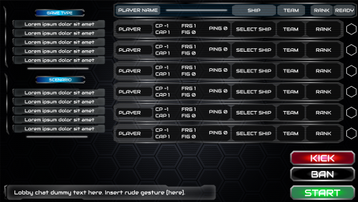
Hi all. This is your UI/UX Artist Paul. This week I have the Multiplayer Lobby screen to show off for overhaul. This time I borrowed design elements from an older screen I had made, the Asset Screen, for its wide bands of tightly clustered horizontal text frames. Keeping in with the Config Screen, the Multiplayer Lobby isn't exactly a "themed" screen as the in-game screens such as the Factory, Research, and Asset Screens are, and so a neutral, machine gray was selected for the text backdrops.
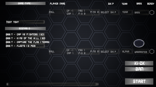
Below is the old version of the lobby, scheduled to be replaced once the new one has been finalized. There are still finishing touches to be added, but over all, the new face of the Multiplayer Lobby is coming along nicely.
| Print article | This entry was posted by paulb413 on 06/04/20 at 12:06:00 am . Follow any responses to this post through RSS 2.0. |
No feedback yet
Leave a comment


