UI/UX Artist: Further Refinements to the Ledger
Hello all. This is your UI/UX designer Paul here. For this week I have the newest, most zeroed-in "look" of the Asset Screen!
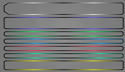
My last post showed the experimentation phase. Now the style is coming together. To make each bar holding the player's assets pop and self-distinguish, a gradient matching each bar's color scheme was devised.
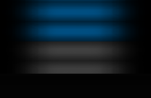
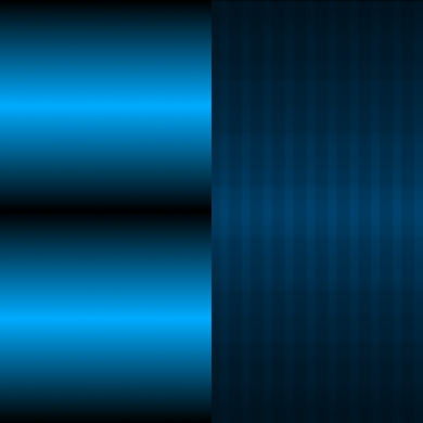
A new "scan line" background was made for the actual fill of the Asset Screen's bars. The image above shows how it was made and how each step builds off the last one. A flat high-resolution backdrop of black and gray lines creates the "digital screen" look (bottom row.) Next, a white gradient overlaying that creates the gradual fade going out to the edges (middle row.) This white gradient is a separate object and thus its color and opacity (which here translates to brightness) can be readjusted as needed. Lastly a colored rectangle overlaying everything else gives customizeable color to that now gradiented screen (top row.) In this case, the blue bar fill is being applied.
The gradient that makes the outline and the composited scan line piece are placed into a single artboard. With the customizeable elements on top, both the outline and the screen can be colorized in a few clicks. This saves time and allows for non-destructive edits of the texture files.
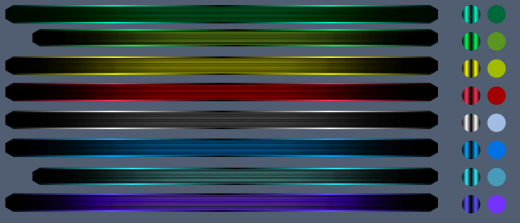
Here is how it all comes together. The circles adjacent to the bars contain samples of the gradient and the fill of the outline and the body. Those can be copied and pasted onto the side-by-side image from before and just like that they are ready to be exported out to the 3D software application for UV mapping. Further touch ups will be needed as some bars will be taller than others, hence the need to have an "ez-export" project file to churn out updated texture maps as needed.
| Print article | This entry was posted by paulb413 on 02/12/20 at 05:49:00 pm . Follow any responses to this post through RSS 2.0. |


