UI/UX Artist: More on the Glass Standard
Hello all. This is your UI/UX Artist Paul. The progress with the screen overhaul chugs on.There isn't so much to talk about as there is to show. Further graphical refinement is taking place and more and more the various in-game screen assets are being updated to reflect a single, cohesive vision.
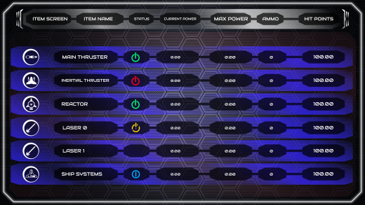
Starting out with the Self-Damage Screen. After a lot of trial and error, the correct levels of transparency and color have been worked out to make the background of the subwindows show against the background and not interfere with the elements overlaying it. Shown is a sample of the Self-Damage Screen's Item Sub Screen.
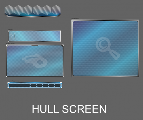
Onto further beasts however, is the task of overhauling the Ship Builder set of subscreens to meet the new standard of glassy windows and white outlines. Shown here is a sample of the old aesthetic, with the thick bezels and faint hint of digital screen lines within.
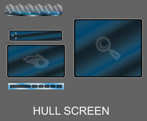
Here we have a demo shot of the same collection of windows in the new style, with a false black backdrop to show the lines. All windows of the Ship Builder are going to receive this overhaul, and with that the new standard facelift will be almost complete!
Rank: Warmaster is rapidly maturing into a properly fitted, well dressed playable game.
| Print article | This entry was posted by paulb413 on 01/13/21 at 01:40:00 pm . Follow any responses to this post through RSS 2.0. |


