
UI/UX Artist: New HUD Concept Art!
Hello everyone! This is your UI/UX Designer Paul. Recently I've been working on the design elements for the in-game Heads-Up Display!
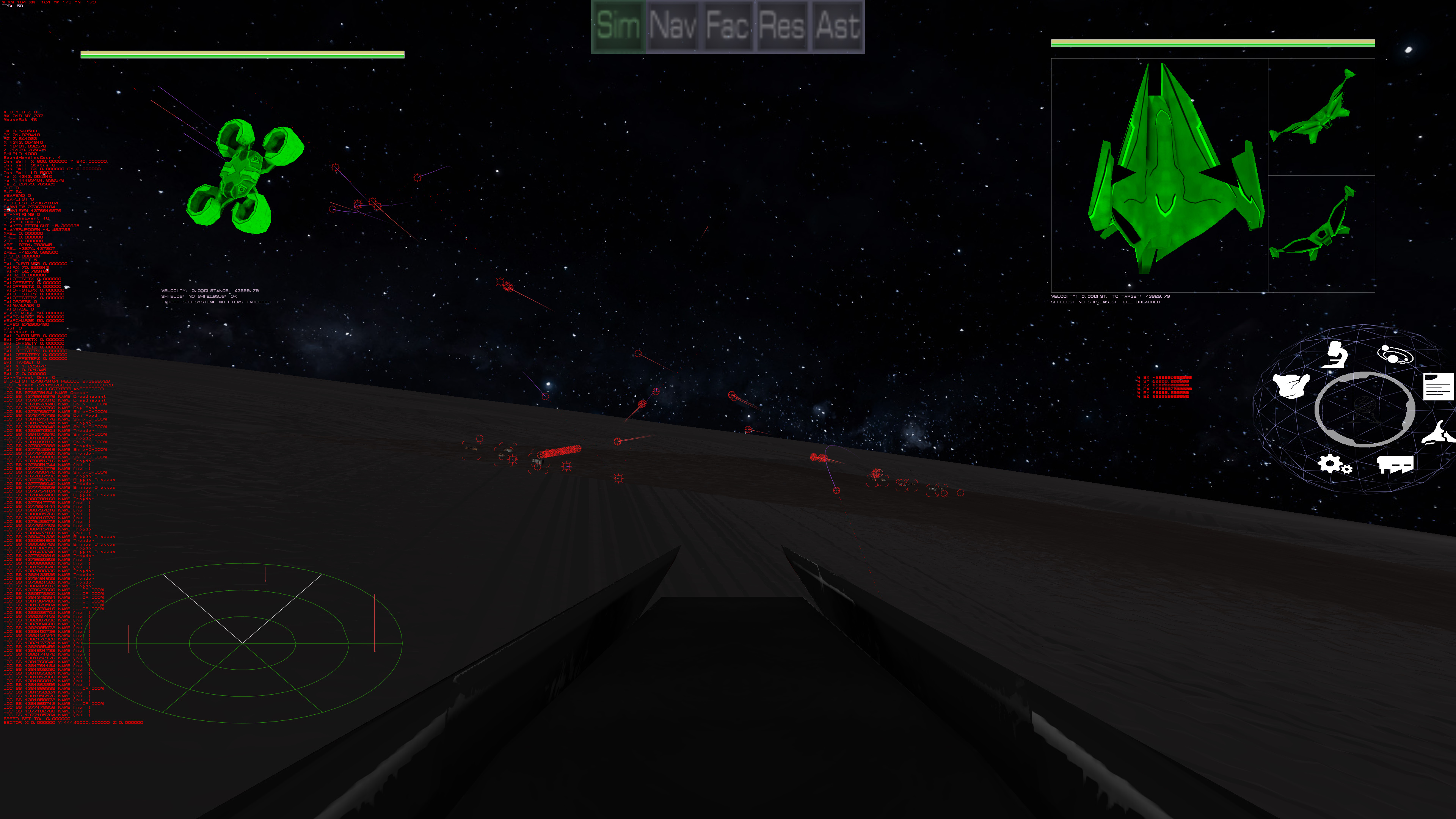
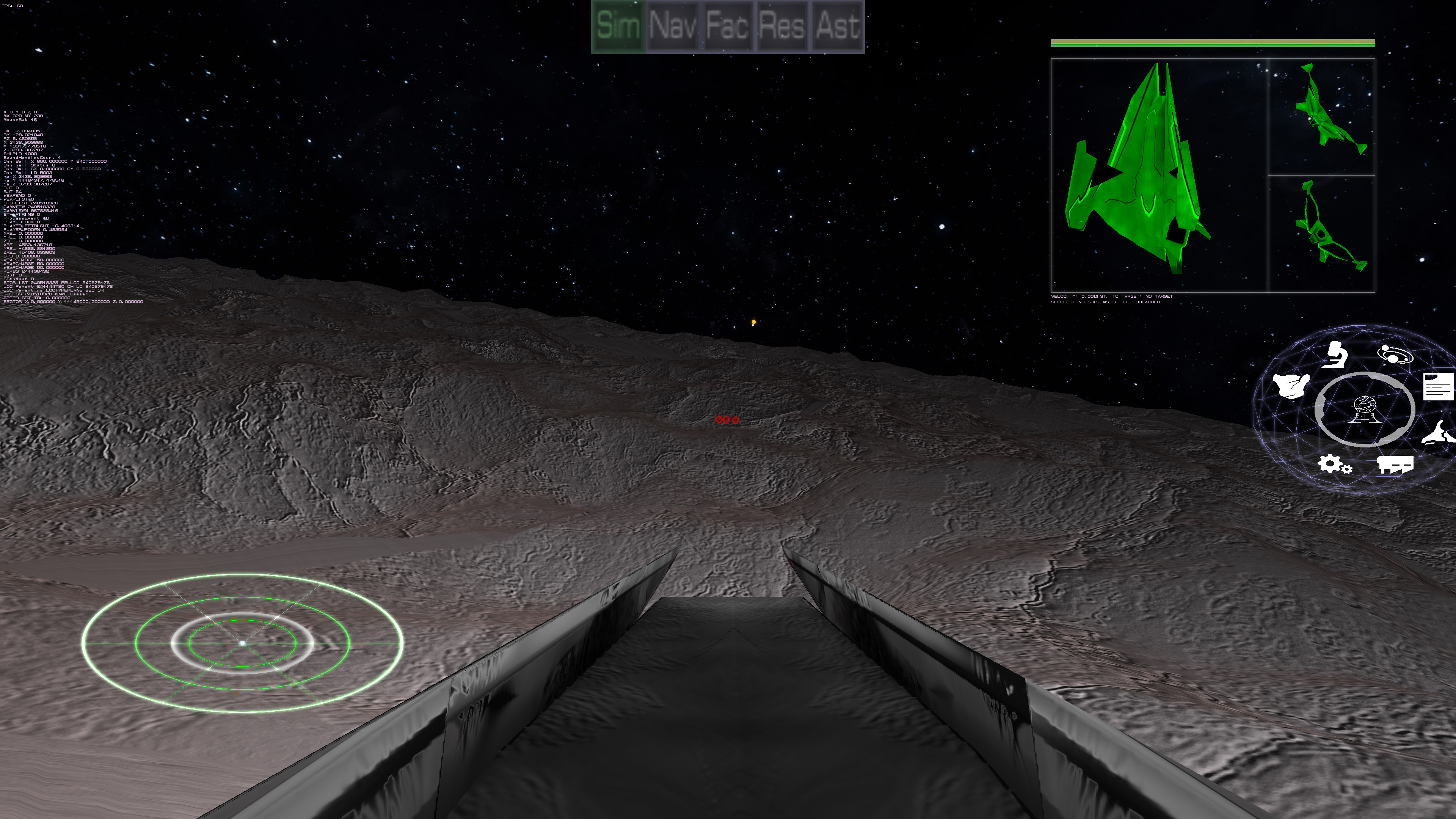
For context, here' how the current "cockpit" outlook appears in-game. The ship rendered in green on the top right corner is the player's display monitor. This shows the player's ship from every angle giving the player a full view of their hull armor. Bars visually display shield strength, armor status, and overall hull integrity. Text will give concrete information regarding velocity, distance to target, shields condition, and overall ship status. The ship rendered in green on the top left is the targeting monitor, which displays a selected enemy ship. In the above preview, an enemy builder bot is selected. This will be a simpler monitor that displays more statistical information about the would-be opponent.
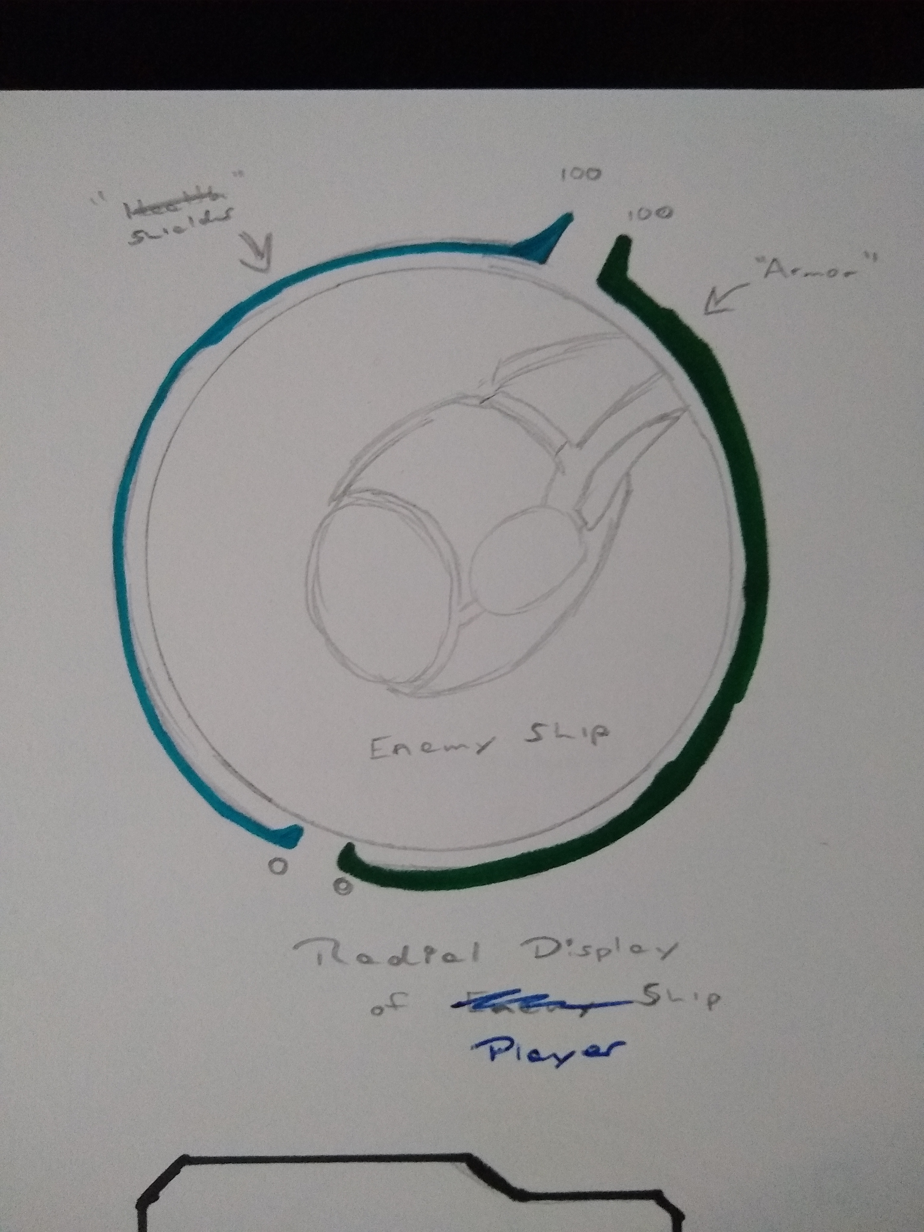
To give a more post-modern style to the player display, a radial theme was experimented with. The bars that indicate shields, armor, and hull wrap around the circumference as arc lengths.
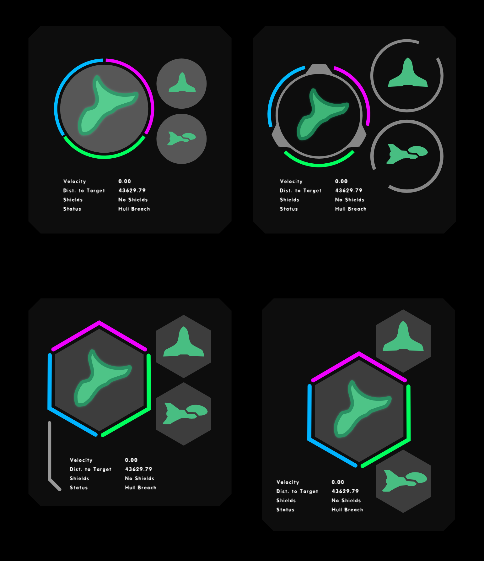
Moving onto a vectorization of the above display, different design flourishes were tried out with the player monitor. All three bars have been placed accordingly and the other smaller displays that provide the other view angles of the ship have been given mockups as well.
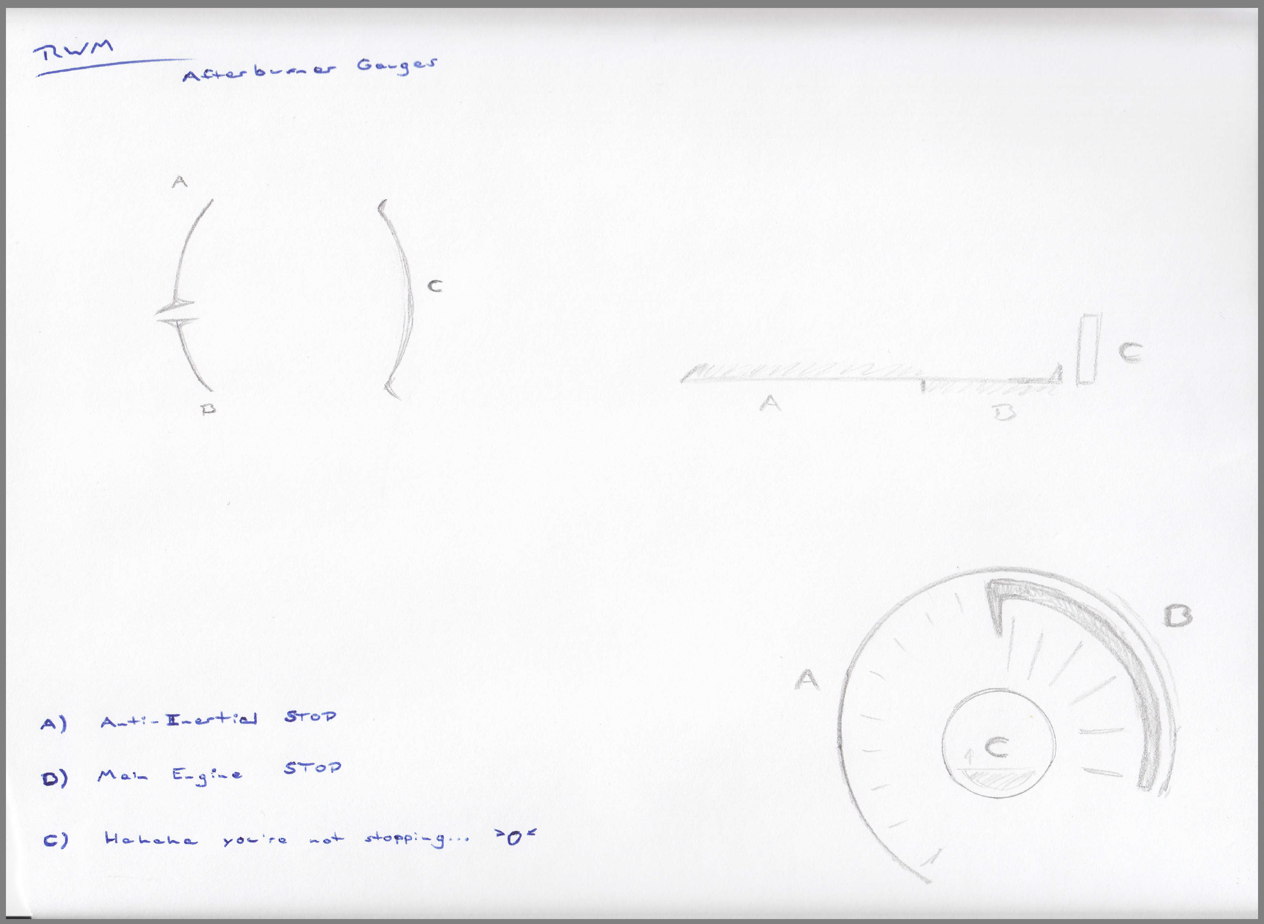
Next up I've begun work on the Afterburner Gauge. There's no friction in space. For "brakes" your ship has "anti-inertial engines" which are basically thrusters that fire forward to slow you down and/or bring you to a stop. These are weaker than your main engine though. And the afterburner is when your main engine is kicking out 110%. So, the Afterburner Gauge visually represents when you will to be able to stop at a set nav point: (a) with anti-inertials, (b) with your main thrusters after a 180-degree turn, and (c) when even that will not stop you and you are guaranteed to overshoot your target.
| Print article | This entry was posted by paulb413 on 09/25/19 at 01:51:00 pm . Follow any responses to this post through RSS 2.0. |

Synthesizer Design
The first sound you will hear in the game is this synthesizer, which is an instrument made with Max for Live.
![]()
This instrument, with all of the other effects that I added to it, sounded great, but didn’t handle dissonance well (when two sounds beat against each other). I ended up creating a second, identical copy of the synthesizer, panned them hard left and hard right, and had them play slightly different notes. Doing this solved that problem, and made it feel like the synth was surrounding you.
![]()
Here is a clip!
| Print article | This entry was posted by ckaminski on 09/23/19 at 10:59:00 am . Follow any responses to this post through RSS 2.0. |

Shields from PAX
While I was out at PAX Dev, for demo purposes, I updated the sheilds and how they look. Here is a live demostration of the shields being hit, with the monitor that shows the target's status zoomed in on the left for the pilot to see what area is most damaged, and therefore vulnerable. In a shield's case, the more red a section gets, the lower the damage it can take before a breach. In the middle of the video, it shows what a shield breach looks like. While the shields aren't in their final form, it's a nice visual update to what has been shown before. Enjoy!
P.S. The music clip is something that also is being worked on. ;)
| Print article | This entry was posted by Arthur M. on 09/19/19 at 11:21:00 pm . Follow any responses to this post through RSS 2.0. |

Research Building

Kat again with another building share. This time the research building.
As usual the concepts are created either with silhouettes or sketches. For the research building I wanted it to have a unique look. After drawing some designs out and group reviews, we came up with an idea to have multiple buildings connected. With the three connected it definitely looks like a lot of research and development is happening in your city.
Like with the mining facility, I created the low poly models in Blender. Each building was modeled separately and then joined with corridors. Originally the buildings were planned to be connected in a circle pattern but that was changed to the triangle pattern you see now for better impact in war.
Color and texture was added in 3d coat. To keep in common with the other buildings. copper tones are a dominant feature. Each building also has unique details not found on the other two.
Full story »
| Print article | This entry was posted by Kat on 09/18/19 at 01:12:00 am . Follow any responses to this post through RSS 2.0. |

Beams, Bangs, Bombs and BWAAAAAAAAT!: Weapon Types
Hello! My name is Adam and I'm in charge of the technology web as part of the Rank: Warmaster development team, which includes creating the guns, buildings, systems, and equipment you'll see in the game. Today I'll be talking about the different types of weapons you'll be using to make your foes regret their life decisions.
Under the hood, there are four different classifications of weapons; beams, pulses, missiles and cones. Beams act like standard sci-fi lasers, focused zero time-of-flight weapons that deal damage over time to a single point as they're held on a target. Pulses include all non-guided, ammo-based projectiles such as autocannons and railguns. Missiles are self-guided projectiles that seek out your selected target until they hit or run out of fuel. Cone weapons are similar to beams but affect a short range cone-shaped area instead of a tightly-focused beam.
Thematically, these categories can be used to represent the most classic sci-fi weapon archtypes. Pulse-class weapons function as rapid-fire machinegun type weapons, or slow firing but hard hitting cannons. Cone-class weapons can model both broad-spectrum energy waves as well as kinetic flak blasts designed for point defense. Beam-class weapons make the expected laser beams and particle streams. Missile-class weapons work as, well, missiles and torpedoes and any other guided weapons.
By massaging the different attributes available to each weapon class, we can start also get some more interesting effects. A missile-class weapon with a slower velocity but a much longer lifespan can be skinned as an assault drone or smart-mine that hunts down the enemy and explodes upon attaching to their hull. A pulse-class weapon that's very slow but deals devastating damage can be used to represent anti-capital ship torpedoes or plasma spheres that trade off guidance for the extreme damage capability needed to penetrate the toughest armor. A narrow but longer range cone-class weapon could easily represent the iconic main gun of a certain space battleship.
As development continues, additional attributes are slated to be added to the technology web, giving us more levers to pull and knobs to twist to customize the capabilities and behaviors of each weapon class. Please stay tuned!
| Print article | This entry was posted by Adam on 09/17/19 at 05:25:00 am . Follow any responses to this post through RSS 2.0. |

Asset Screen #1: Where's the icon?
I've recently started rebuilding the asset screen for Rank: Warmaster. This screen will allow you to control your personnel, your AIs, your installations, and your ships; your assets, in other words. It'll be a busy screen!
But everything starts somewhere, and here I decided to bring in some new icons while I thought about how to approach the rest of the task. Only, the icon didn't cooperate; it should have been colored bright white like the text, but instead it was gray and washed out, as you can might be able to see above. Here's a closeup:
Still, very difficult to see!
All troubleshooting boils down to somehow removing possible options until we're left with a small enough pool of possible answers that we can reasonable test them. After talking to Arthur, it seemed there were two major ways something like this could happen: either something could be wrong with the icon, or something could be wrong with the lighting. (Remember that in 3d modeling, we get to define light sources and where those light sources are pointing.) The question that we boiled this problem down to was this: "Is this image still washed out and gray in other contexts?"
As it turns out, the image displayed correctly in our screen building software. It also displayed correctly when used as a backdrop instead of an icon. In addition, when we turned up the ambient light, the image got brighter and more distinct. This meant that the image was almost certainly NOT to blame. The leftover option was the light source.
The light source did indeed turn out to be the problem. When I added a bit of code to make the light shine directly forward, toward the screen, the icon showed up as brightly as we wanted in the first place. Lesson learned: if you can't see something in your game, but it's visible elsewhere, check your lighting. Just remember where you moved it from so the next person to use it doesn't have my problem!
| Print article | This entry was posted by mdcode on 09/11/19 at 04:37:00 pm . Follow any responses to this post through RSS 2.0. |
UI/UX Artist: We Have a Logo!
Hi all! This is Paul, your UI/UX designer. It is with great pride that I announce that we at Laser Beams & Particle Streams Inc officially have ourselves a logo for our indie game dev start up! We finally have a face to put to the name! All done by hand by yours truly (minus some font at the end.)
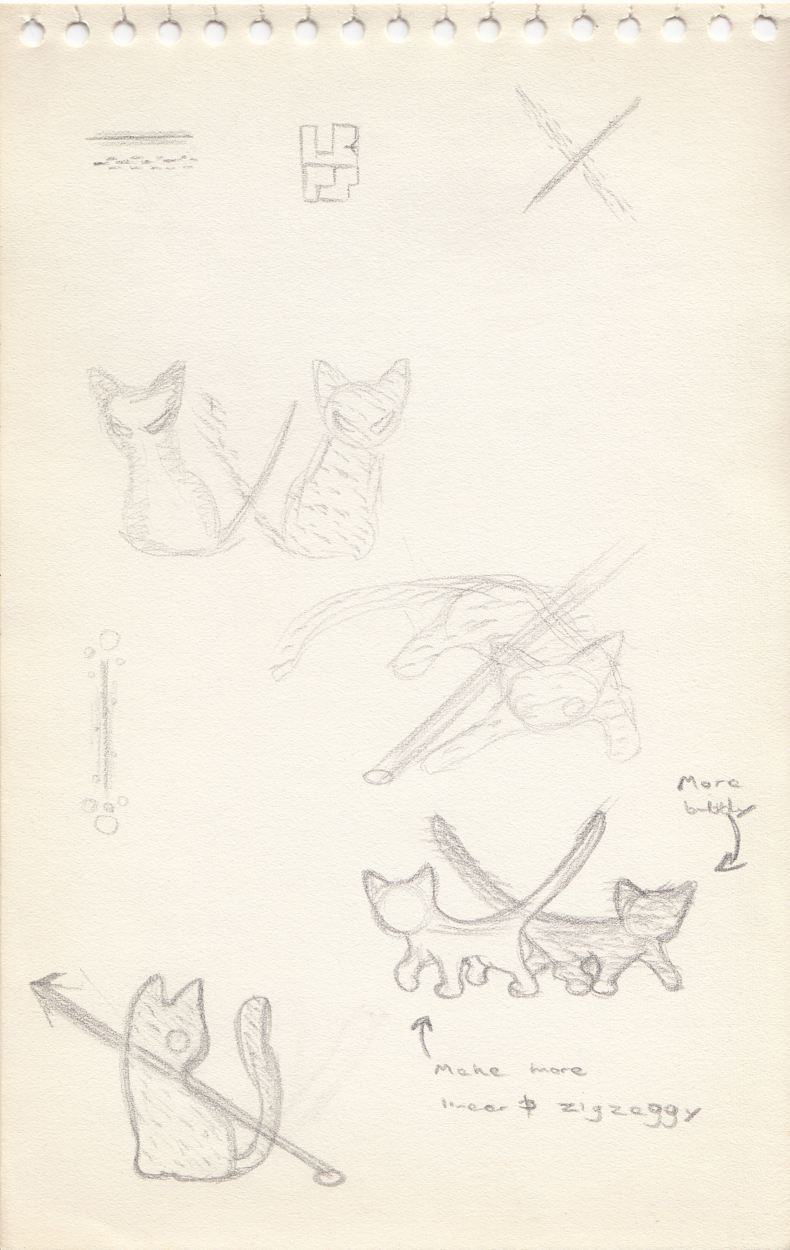
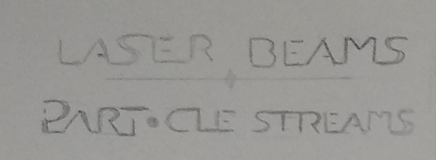
The start of any artistic endeavor consists of "scribble random stuff until you accidentally make something that looks good." I make my initial concept art sketches in pencil & paper. Not having an "undo" command available helps keep me moving forward. At first a "cat theme" was explored, owing to several dev team member's fondness for them, and the suggestion by one that the company might do with a mascot. Hence, a particle cat playing with a laser beam was among the first ideas treaded upon. This direction was ultimately not pursued in favor of a more energetic and literal visualizations.
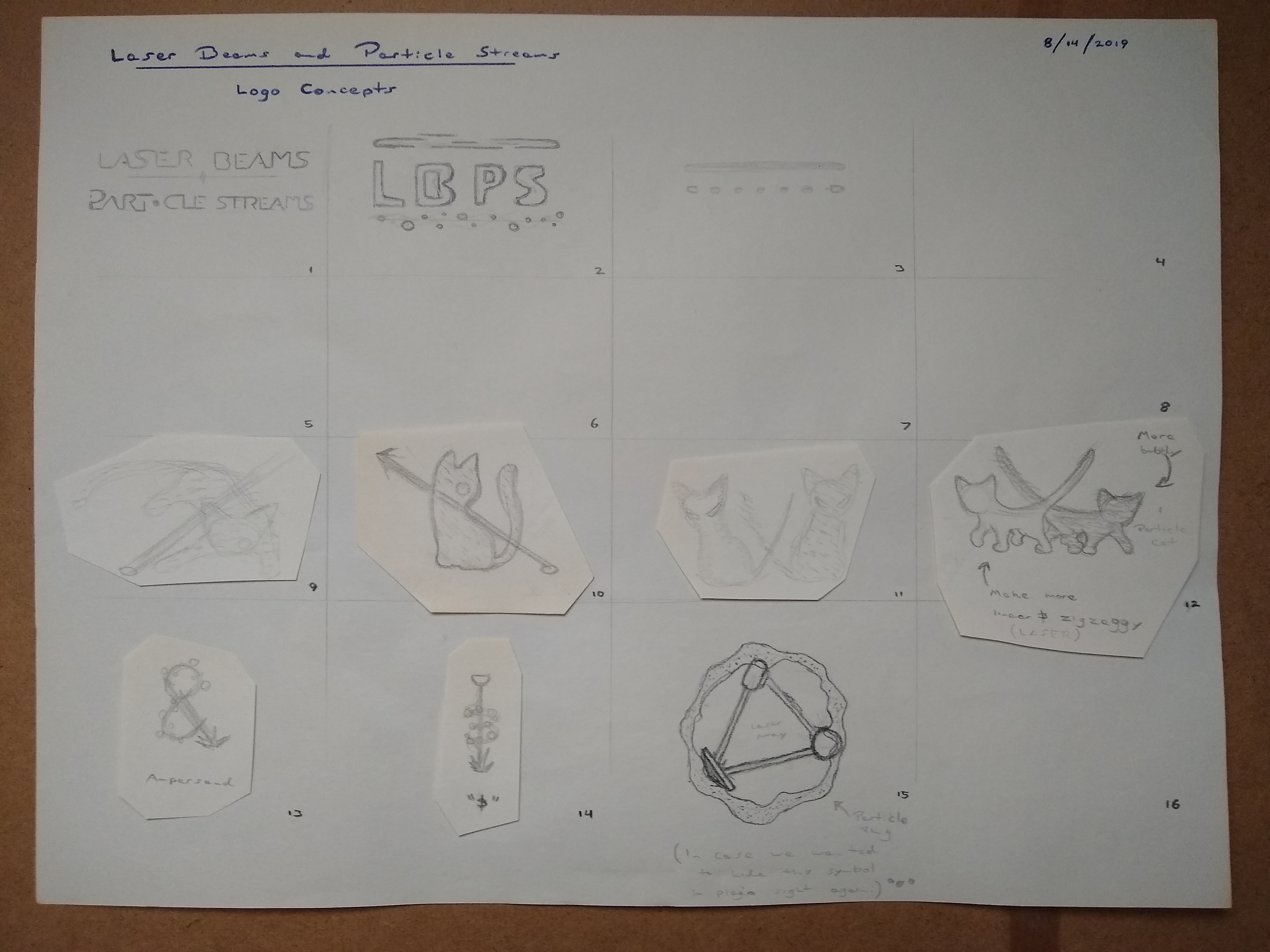
Still in pencil & paper, more literal renditions of lasers and particles were experimented with, as well as an interplay with typography. Ultimately type from square #1 was chosen.
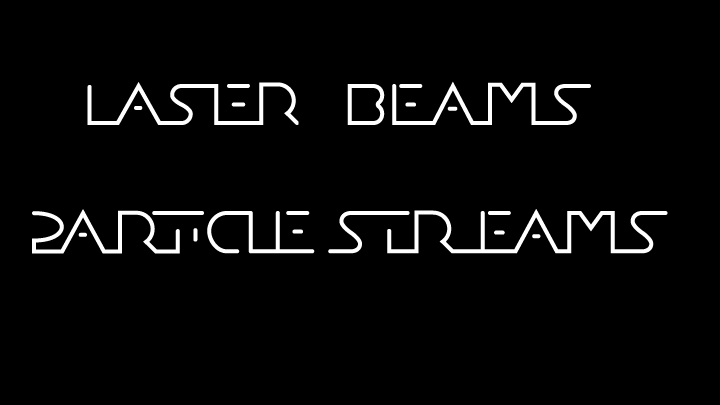
At this point vectorization took over. The hand-drawn lettering for "Laser Beams & Particle Streams" was redone digitally. It was decided that a laser beam would shoot between the two lines of typography, being transformed into a particle stream halfway through by the ampersand that would go at the very center.
![]()
The laser beam was either going to be red or yellow. It had to look either aggressive or energetic. Yellow was selected for its brightness. The beam was made out of progressively brighter vector lines encasing one another, transitioning from pure white to yellow from the center out.

The particle effect was accomplished by drawing dashed lines that were then blended and given a glow effect. A cool blue was chosen to contrast the "heat" of the laser. Having multiple lines in varying shades of blue help give the impression of depth and dimension to the particles.
The vectorized typography was given its full graphical enhancement: a bold outline, a metallic gradient, and a carefully drawn "&" symbol to both figuratively and literally tie it all together. The laser and particle elements were brought in behind. A lense flare was added for extra "pop." The font used to spell out "— Software Inc — " is Acherus Grotesque Regular, used under the The Fontspring Desktop Font EULA.
And thus, we have the finished product!
| Print article | This entry was posted by paulb413 on 09/11/19 at 07:22:00 am . Follow any responses to this post through RSS 2.0. |
Cross Posting
Many new changes are coming, that includes more frequent updates, and from differnt parts of the team. Earlier, there was an update from Chris about some of the music in Rank: Warmaster. Coming this week will be other updatese about the artwork and progress in the coding. Stay tuned!
| Print article | This entry was posted by Arthur M. on 09/10/19 at 02:36:00 am . Follow any responses to this post through RSS 2.0. |
Connective Threads in the Rank: Warmaster Soundtrack
My friend James Yuhas and I were talking about video games one day, and he mentioned that some video games use the same thematic material throughout the entire game, like Koji Kondo’s soundtrack to Super Mario World. I knew films and games use certain themes for certain characters, but I never thought about using the same material for an entire game! I realized that I should have some threads of connections between individual songs in the Rank: Warmaster soundtrack, so I decided to use a melodic figure in the Horns as one of the threads. Here is a clip of the first song you will hear in the game.
https://soundcloud.com/christopher-a-kaminski/rwm-peace-clip/s-fCaZb
| Print article | This entry was posted by ckaminski on 09/05/19 at 04:54:00 pm . Follow any responses to this post through RSS 2.0. |
The Terrain is improved...
While I still have a LONG way to go, the Terrain is looking FAR better than it was. With the new perlin noise to help at lower altitutes finally working correctly, and the newer shader pipeline to allow multiple texture overlays, it looks FAR better than before. Lots of bugs in it to work out, as always. However, this is good progress. :)
| Print article | This entry was posted by Arthur M. on 08/23/19 at 10:18:00 pm . Follow any responses to this post through RSS 2.0. |
-

Random photo
