HUD Updates and much more!
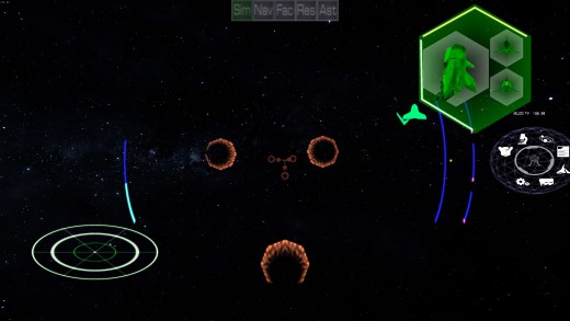
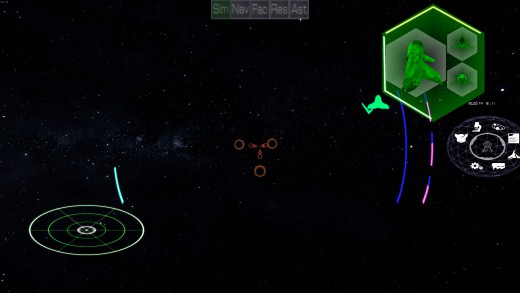
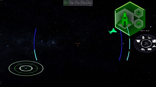
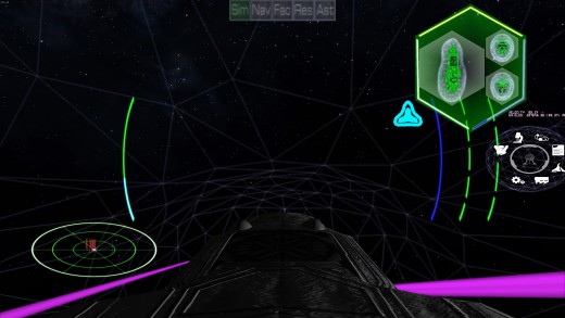
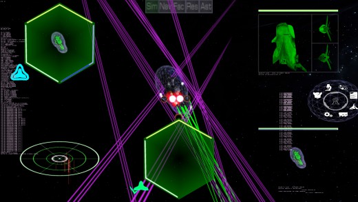
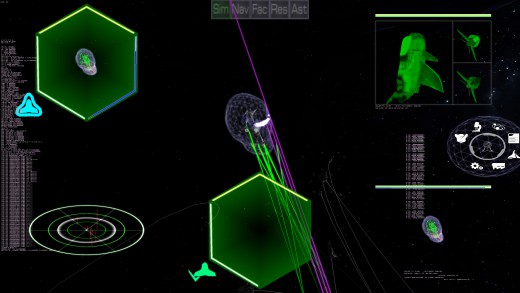
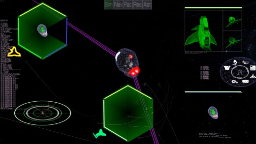
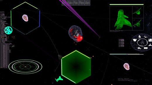
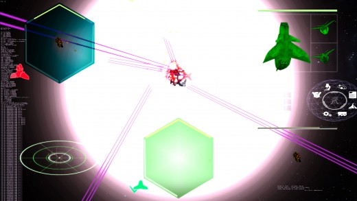
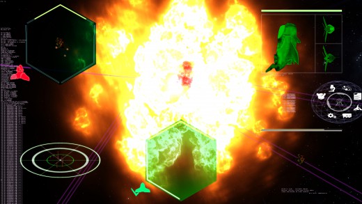
A lot of updates have happened since my last post. We’ve had a live stream, updated HUD elements, solid multiplayer testing, and lots of fixes. The last post was about Monitor elements which now have been mostly finalized, as you can see from the screen shots. What has been added is the first round of adding in other indicators. Currently, on the left is your speed indicator. The Blue meaning your current velocity, and the green meaning what you have it set to. When they overlay, you get a CYAN blue. On the right, is the weapon capacitor (energy) in blue. So when this is drained, you can’t fire. Further to the right are the individual statuses of each weapon. Green means it can Fire, Red means it’s recovering to fire (either from a lack of energy or the normal cycle time that is typical with pulse weapons). Pulse Weapons also have a Blue overlay which indicates how much ammo is left for that weapon. I have yet to put in a different look for when an individual weapon is destroyed. I’m aware that the new HUD arcs don’t exactly fit. I have to see if I need to move them over, or squash them in so they fit better. I haven’t decided yet. But everything in stages and progress is being had.
Also, please subscribe to our new YouTube Channel to see how all this works out!
| Print article | This entry was posted by Arthur M. on 12/14/19 at 12:33:00 pm . Follow any responses to this post through RSS 2.0. |

The Warmaster's progress
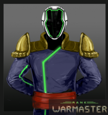
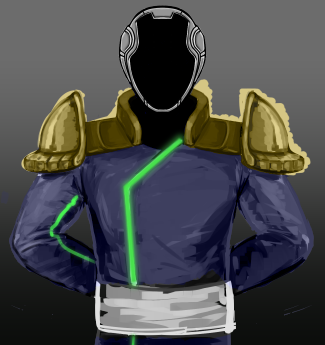
Another short update from me but here is progress of the warmaster action portraits.
Full story »| Print article | This entry was posted by Kat on 12/12/19 at 09:17:00 am . Follow any responses to this post through RSS 2.0. |
The gwobs are coming...
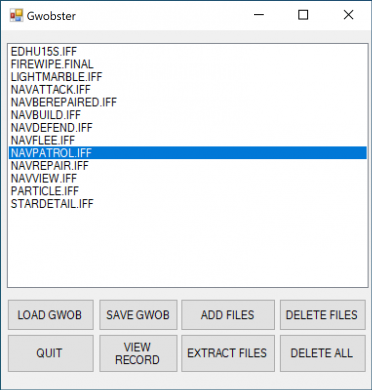
As of this week, Rank: WarMaster is running entirely off of our custom file package format, the gwob. This means that any image or sound file the game needs, it now reads out of dedicated single master file. For example, all sound effects now come from a file called, appropriately, "Sound Effects.gwob." We even have a custom-built program, Gwobster, just to create our gwobs; you can see a screen shot of Gwobster in action above.
It wasn't necessarily easy to get it working, though. The toughest bug involved a small subset of files that wouldn't read properly no matter how many times I verified that they were present and uncorrupted in the gwob. It turned out that the gwob was the the problem after all, but not because the file was bad; the bug occurred because the gwob was correct. It turns out that Windows doesn't distinguish between capitalized and uncapitalized files, so that two files named "cat1" and "Cat2" would be alphabetized intuitively, first "cat1," then "Cat2." This makes sense for a file system. But because of how computers represent letters, you can alphabetize things in other ways, one of which the game uses instead. Internally, the game sorts letters ordinally, which means via the numeric codes that computers use to represent letters. Alphabetizing ordinally, "Cat2" comes before "cat1," which prevented the game from seeing a small number of files in the gwob. It took a lot of careful reading of log files to figure this one out!
We've begun live-streaming our multiplayer tests; check them out at our Youtube channel!
| Print article | This entry was posted by mdcode on 12/06/19 at 07:02:00 pm . Follow any responses to this post through RSS 2.0. |

UI/UX Artist: Which Way'd He Go Officer?
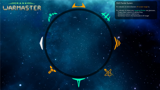
Hi all! This is your UI/UX Artist Paul here. This week I've got a new development for the in-game Heads Up Display to show you. Introducing the Compass!
If you've ever played first person shooter games like Call of Duty, Halo, or any action game, you may have noticed that there's often an indicator that appears on screen when an enemy NPC lobs a grenade at your player character. This indicator often has a simple icon for its function (in this example case, a grenade) and also a direction that "rolls around" an unrendered circular overlay on the screen to "point" out where the enemy explosive is so you can dodge it before it goes off. This "threat compass system" is simple and effective for the singular purpose it serves in those games, but of course Rank: Warmaster takes things a bit further than that.
As has been mentioned in previous posts, our space travel system involves realistic to life orbital physics. This however creates a problem for space combat: in a vast black void with no real visual references to eyeball target's change in velocity, an enemy ship looks like its stationary until it gets close enough to slingshot right past you. This is happening in a truly 3D environment where any number of complicated flight paths can be executed to shake off pursuers. You'd be surprised how easy it is to lose track of someone that is just above or below you! To solve this issue, the same concept of the Compass is not only being applied here, it is also expanded. Two compasses will be guiding the player.
One will indicate to a more long-lasting threat than a grenade: the enemies themselves. Specifically, the current enemy the player has target locked. A constant denoter of where that one hostile that zipped past you for the umpteenth time lies waiting.
The second compass pointer will be for your targeting reticles themselves. To get back to the orbital physics mentioned earlier, there are times where an enemy is behind you, and thus it becomes necessary to fire backwards in order to connect your shots. However, some weapons, pulses and missiles specifically, inherit the velocity of the ship that fired them. In other words, under the right conditions it is possible to friendly-fire oneself by firing in the wrong direction at the wrong time. To aid in successful combat and in avoiding accidental self-destruction, the second compass pointer indicates where your weapon fire is aimed.
Due to the fact that these two pointers are both related to targeting an enemy ship, these two pointers will often cluster near each other, and so unique icon design and color coding will be used to differentiate. Once again, these designs will likely adapt and evolve as in-engine implementation and further play testing follows.
| Print article | This entry was posted by paulb413 on 12/05/19 at 12:11:00 am . Follow any responses to this post through RSS 2.0. |

Right in the Face - Featuring the Ableton Live 10 Wavetable!
After I got Ableton Live 10, I started playing around with the Wavetable instrument. I'm still learning the instrument, but I'm beginning to understand just how powerful this instrument is. I highly recommend it!
This is what I came up with. It's called "Right in the Face," because I wanted something that starts right away and hits you hard.
Full story »| Print article | This entry was posted by ckaminski on 12/02/19 at 11:40:00 pm . Follow any responses to this post through RSS 2.0. |

HUD Advancements
Along with fixes to the multiplayer (second live stream this Tuesday!), work is being done to update the HUD graphics and functionality. In the screen shots, you can see the new "targeted ship" monitor in the upper left, with the old one for comparison in the lower right. The Damage bars for Shields (Blue), Armor (Green) and Items (Yellow), have been shifted from a horizontal bar that is hard to read, to a hexigonal shape, with dual colors representing the highest percentage armor of a single facet (if applicable), and the total hit points of that type. Generally, the facet goes to zero long before the total hit points of that type does (such as sheilds or armor). So the lighter color is the facet, with the darking being the total. Items don't have dual colors, and just are yellow. Also added is a status icon, showing the status at a glance rather than words (see the old monitor). The different statuses are: Shields Up, Shields Down, Powered Down, Hull Ok, Hull Breached, Jumpless, Weaponless, Immobile, Disabled (Reactor destroyed), Dead (pilot is dead because the cockpit was destroyed), and wreck (the ship is exploding). The last of the current updates to the monitor is the background of the monitor actually represents, at a glance, the status of the front, back, left, right, top and bottom armor as a whole. Currently, it shows the worst facet, but I haven't decided if this is useful or not, and more play testing with feedback will likely make it more useful and functional.
| Print article | This entry was posted by Arthur M. on 11/30/19 at 09:06:00 pm . Follow any responses to this post through RSS 2.0. |

Warmaster progress
Short post on the Warmaster today. Under the link are sketch poses and progress of the default pose colored.
Full story »| Print article | This entry was posted by Kat on 11/29/19 at 10:54:00 pm . Follow any responses to this post through RSS 2.0. |
Asset Screen #5
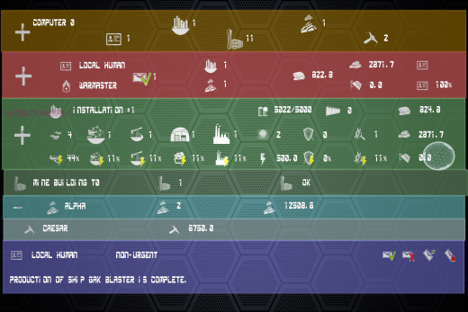
We finally have all the basic elements of the asset screen together: from top to bottom, a corporation bar, a personnel bar, installation and building bars, squadron and ship bars, and finally a message bar. All of the data appearing on the screen is being fed in live from a running instance of the game. The next step is to add functionality behind the scenes as we continue to play test Rank: WarMaster.
| Print article | This entry was posted by mdcode on 11/22/19 at 07:18:00 pm . Follow any responses to this post through RSS 2.0. |

UI/UX Artist: "Target LOCKED!"
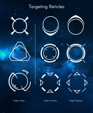
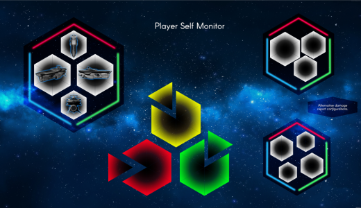
Hi all! This is your UI/UX Artist Paul here. This week we're going over the revised Targeting Reticles and Player Self Monitors design elements!
While in the fray of your outerspace battles, you want to know who's who and what they're doing (and what you're doing to them) upfront, instantly, and without taking your eye of the action. How does one do that? By placing the most vital information right where the eyes are going to be in the first place. That is the purpose of the "heads up display" after all. The trick is what to put where, and to use what is already there.
One aspect was to utilize the targeting reticles to convey simple information regarding the target they overlay. In this case the reticle will communicate two things: if the ship in question is moving closer to or retreating away from, and which ship the player has locked onto if any. This requires the reticle to be simple but also distinct between its states, as there are going to be a lot of these things on-screen during the particularly hectic space dogfights. These are still experimental, as the only way to tell for sure how well they function is to get into as much trouble in-game as possible. Thus further evolution of these designs will likely happen.
Further developments have also been made to the Player Self Monitor. Continuing an established hexagon theme, four hexagonal readouts divided into 6 wedges each will provide damage indicators for the player covering their ship in all spatial orientations. Color coding indicates severity with an intuitive green = "good," yellow = "watch out maybe," and red = "trouble." Each wedge changes color independently, allowing for a simplified sense of where damage is being taken on ones' vessel without taking the time to look for individual armor facets. Time and further testing will tell us how these elements will grow and adapt to the game's needs as well.
| Print article | This entry was posted by paulb413 on 11/20/19 at 11:26:00 pm . Follow any responses to this post through RSS 2.0. |

Even More Horns!
I really enjoy when game soundtracks have connective threads in them. Even though this track uses a lot of percussion and orchestral samples, I still wanted to feature the horns. This time, I wanted to make this part epic, with a soaring horn melody over all of the rhythmic pulses happening underneath.
Maybe I just like French Horns.
Here is a clip. (For those of you counting along at home, this one stays in 7/8 for the most part)
Full story »| Print article | This entry was posted by ckaminski on 11/18/19 at 09:49:00 pm . Follow any responses to this post through RSS 2.0. |
