
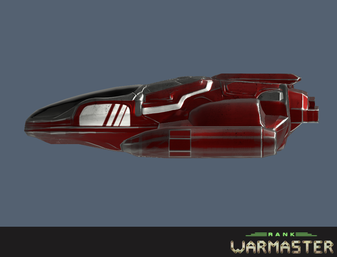
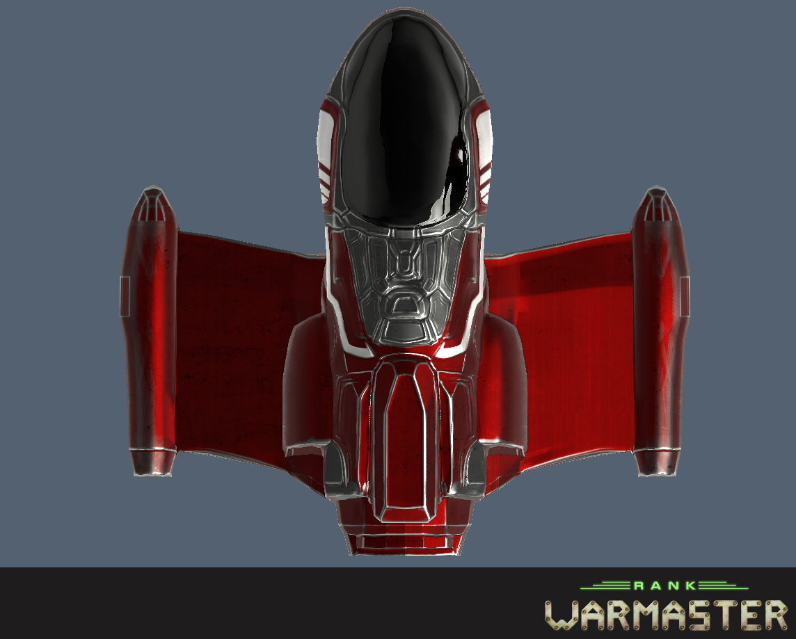
Finished red ship
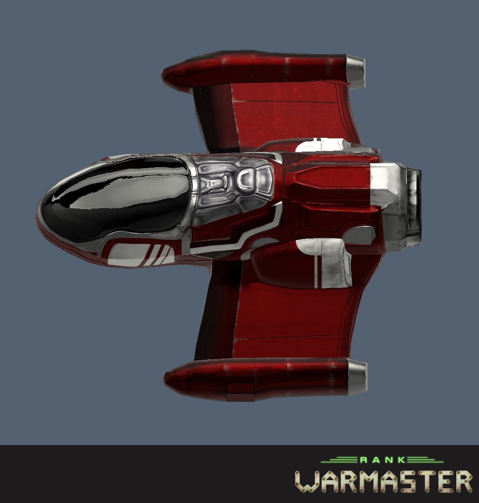
The final textured version of the red space ship. Now onto creating the shields to call the ship finished and ready to be put into the game.
Full story »| Print article | This entry was posted by Kat on 05/14/20 at 02:14:00 am . Follow any responses to this post through RSS 2.0. |

UI/UX Artist: Config Screen Update and a Touch Up on the Factory!
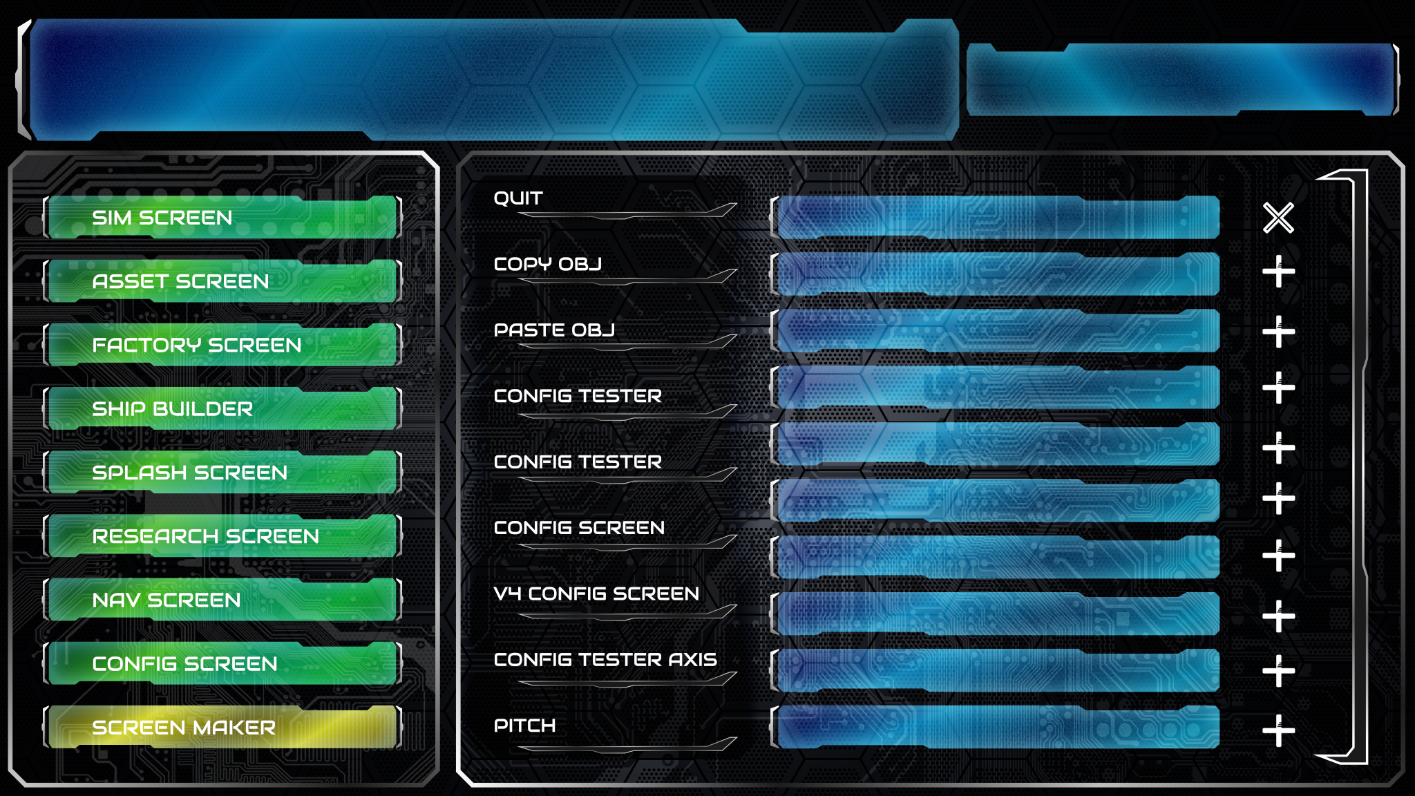
Hi all. This is your UI/UX Artist Paul with further updates to the Configuration Screen.
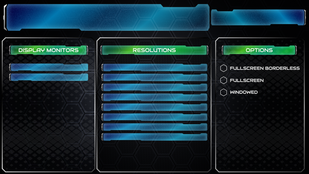
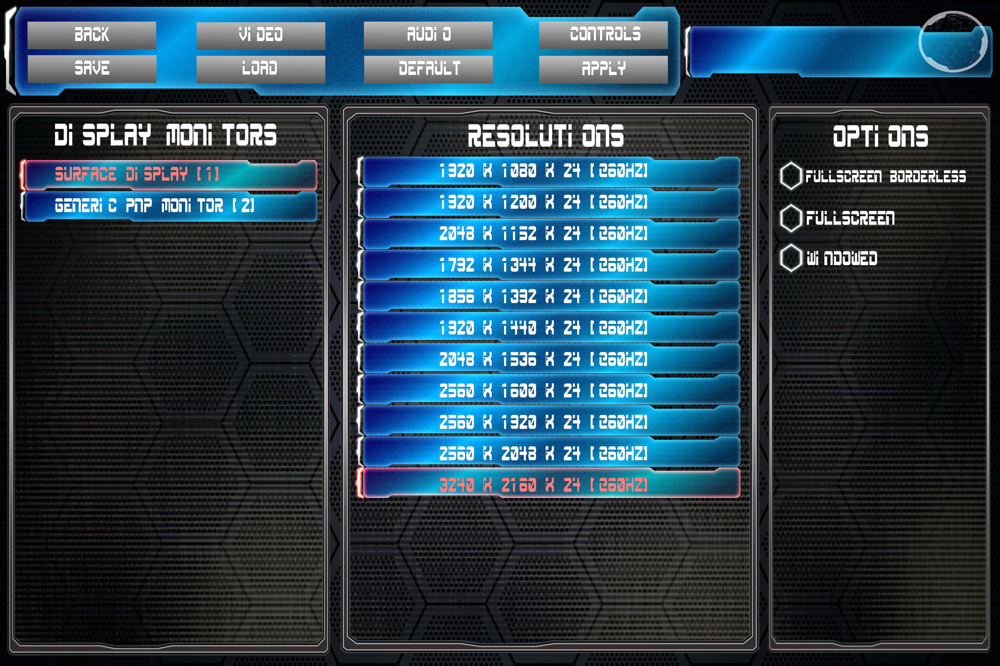
A backdrop has been agreed upon. The circuit board pattern fits the general theme of adjusting the in-game settings, and so it is now the official backdrop of all Config subscreens. The Resolutions Subscreen has received an additional subwindow for other more general options such as the Hyperthreading shown in the preview.
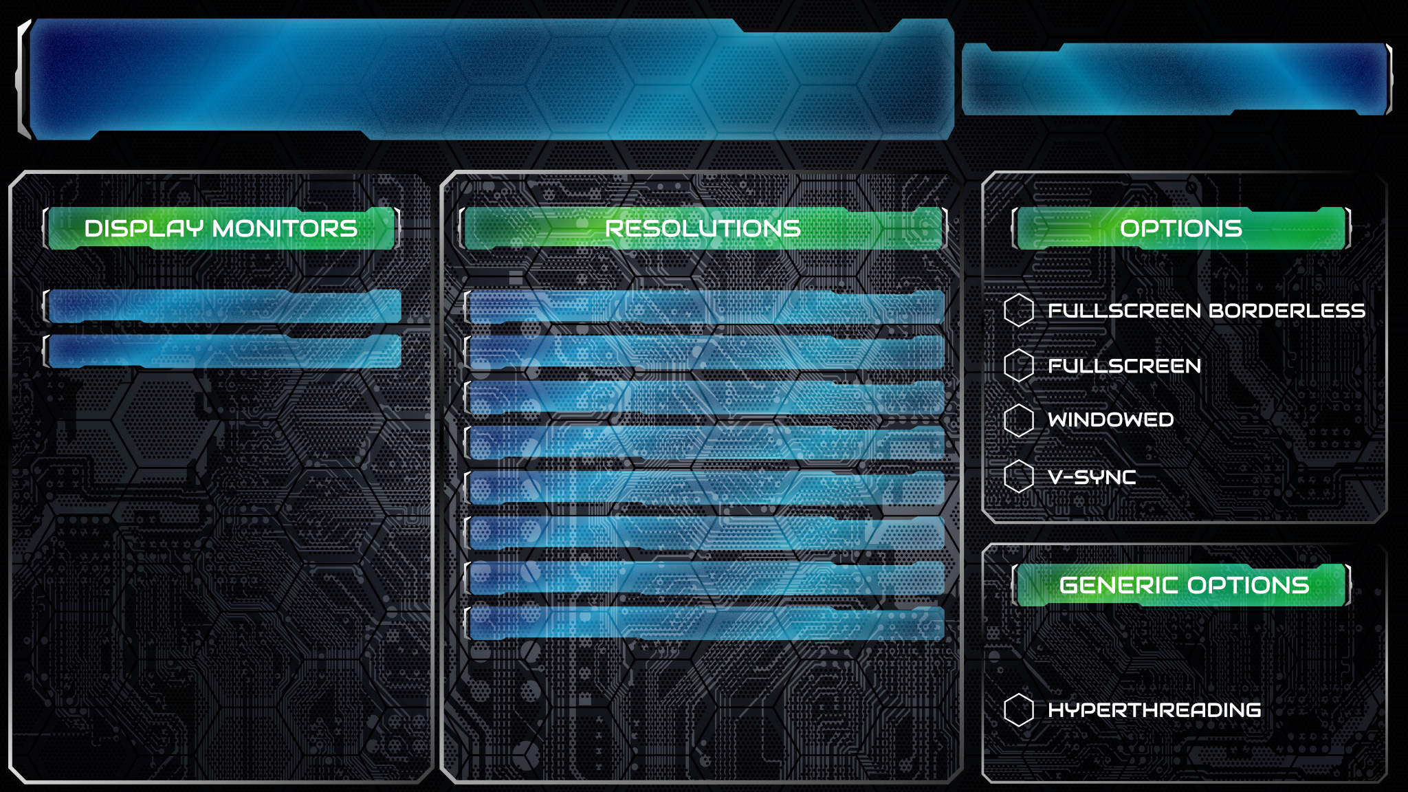
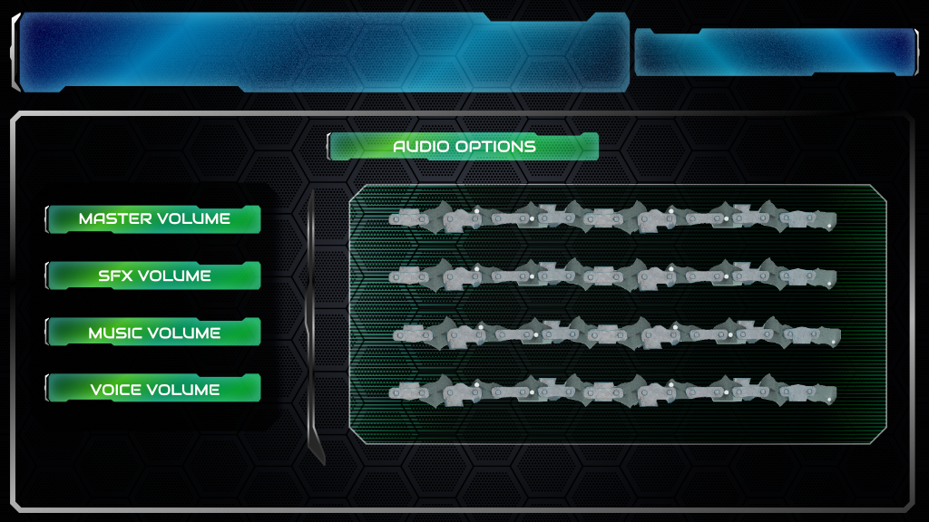
The Audio Subscreen has additional background effects, in this case a loosely tiling rounded block pattern, gradiented to resemble audio levels, an effect that worked out quite nice. Additionally numerical slots have been added to the right of the sliders to allow for precise digital readout of the current level setting.
Lastly, the Factory Screen has been given a brief update, with color palette coded to its over theme of manufacturing and construction. As the aesthetics of all the screens come together, each one is emerging with its own distinct color style. This is both artistically pleasing but also practical, allowing even a blurry glance at the screen to communicate which one is being viewed without reading any text. In the case of the Factory Screen, colors of Martian red-brown and construction equipment yellow dominate. The Config Screen by contrast, is a mostly white-gray, reflecting the colorless machine settings it is devoted to.
| Print article | This entry was posted by paulb413 on 05/07/20 at 02:07:00 pm . Follow any responses to this post through RSS 2.0. |

Always Room For Refinement
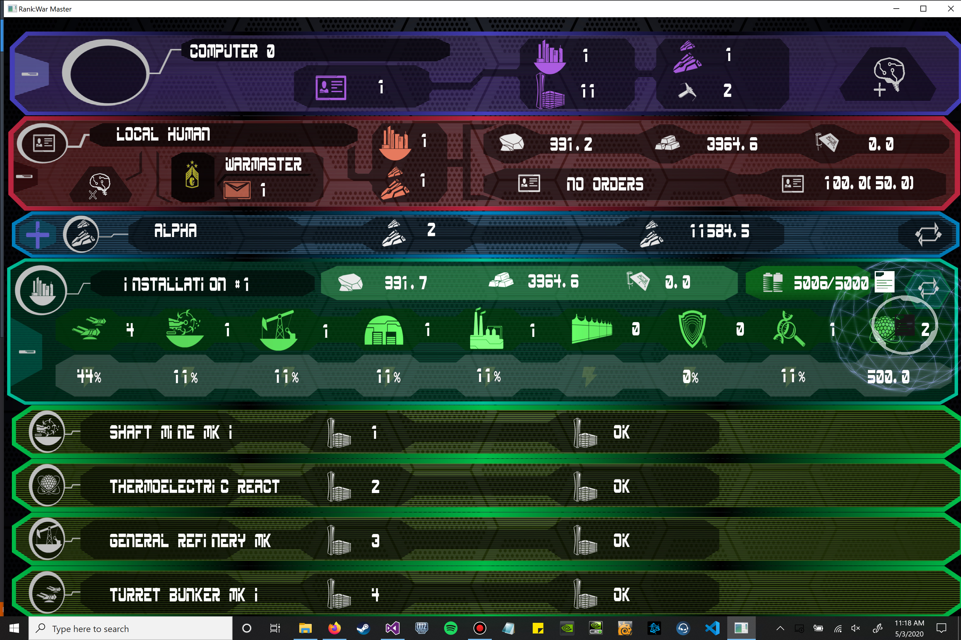
Every piece of art has a moment when it's complete, when we have to move on to work on something else. Until then, we keep polishing, keep refining; for an interface, that means making things easier to see, more distinctive, more of a pleasure to look at. We've added some of these details to the asset screen: selected icons are now highlighted in a color that matches their bar type, ranks now have their own unique icons, and building bar icons match their building type. Simple changes when taken individually, but put them together and they add up.
| Print article | This entry was posted by mdcode on 05/03/20 at 12:09:00 pm . Follow any responses to this post through RSS 2.0. |
Color progress of a ship

Unlike my last post, this one is more colorful. The ship has started to get a paint job. Texturing is being done in 3D Coat.
| Print article | This entry was posted by Kat on 04/29/20 at 11:28:00 pm . Follow any responses to this post through RSS 2.0. |

Controls overhaul and Squad possession
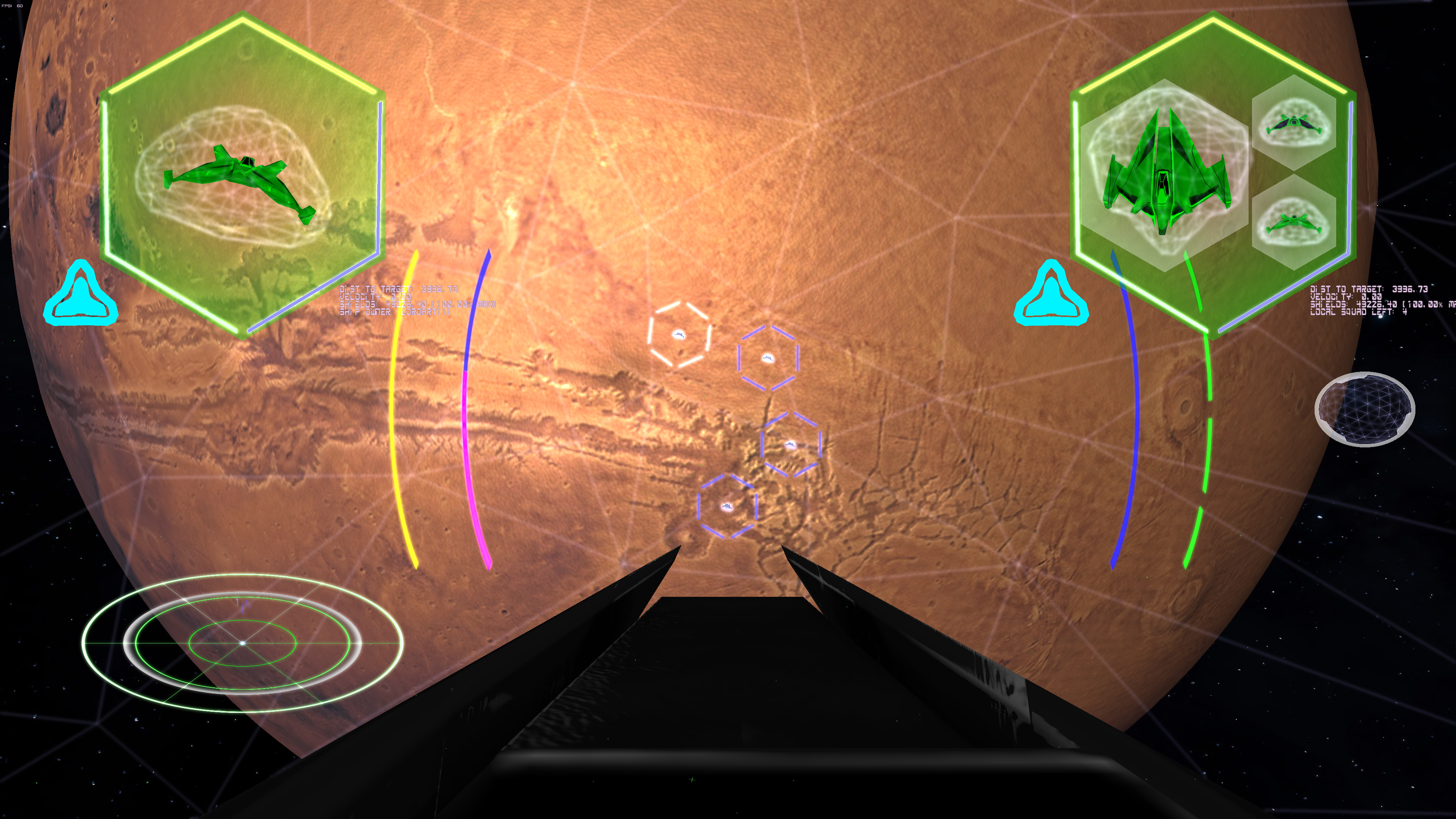
Sometimes development doesn't yield a screen shot because it's behind the scenes. This is mostly one of those cases. The entire human input system was overhauled to be far more flexible and support more devices at the same time. The controls before while being able to be personalized, were universal. Different screens really needed their own set of defined controls, and with the main simulation/piloting screen taking up most of them, very few keys were left for other screens, and certainly not ones that made any sense. Also, the joystick support was rather hard coded, and really only supported the first two buttons. It was one of those situations that was "good enough", but now isn't. Now each screen can have it's own unique set of preferences for each button on the system, and a specific command can have more than one button from difference devices assigned to it. So if you wanted Keys "J" and "K", Mouse button 3 and 7, and joystick buttons 3, 5, and 32, you could do it. Why would you want to assign so many buttons to the same command, who knows, but you can. Also, Axis support being assignable is a big add to the system. This includes mouse button axes (which includes the mouse wheel). They can be assigned like the buttons so there is overlap if you want. The main reason for the flexibility is because everyone's layout is different and their own personal play-style is different. Someone on the livestream said they got a mouse with a lot of extra buttons for a different game but never really was able to use it for another game until now. I have been aware of people fighting the controls, and this update has greatly helped.
To that end, fleet control, or more specifically, possession has been made far easier. The targeting of an enemy has also been overhauled. Using that overhaul, it can now target the nearest HEALTHY friendly ship. There is no point in possessing a ship that is critically damaged. There are also now one button possessions that can allow the player to instantly jump to another one of their own ships that is healthy, and have the option to keep their old target, or switch to the target that the AI had before the player took over. This allows the action not to be interrupted in the middle of a giant battle in space. Instead of being the old two step process of finding a ship (which usually meant scrolling through all the ships to find one that works which took a while) and then possessing it, now it's a simple button. Which can, of course, be assigned to an extra joystick and/or mouse button. Also, the addition of how many ships are left in your squad is now in the readout in the upper right (self-damage monitor). This is to show you how many ships you have left that are in action. It will disappear if your ship is the last one. Personally, I have one joystick button for targeting, and one button for the instant possession. It really keeps the game action flowing!
| Print article | This entry was posted by Arthur M. on 04/27/20 at 09:21:00 am . Follow any responses to this post through RSS 2.0. |
UI/UX Artist: Config Screen Visual Update
This is your UI/UX Artist Paul. I've been touching up the visuals on the Config Screen, which we've just seen from our coder Matt. Without further ado, here are a couple of preview screens:
Extrapolating from the blue glass text field motiff, a simple recolor was a nice way to make umbrella categories stand out from specific data fields.
Experimenting with new backdrop patterns. A subtle "crosshatch" is showing some promise. More textures will be tested out.
A little gradient transition can go a long way. It's an interesting excersize making a screen backdrop for a window with relatively little in it compared to a lot. What do I fill in empty screen real estate with? Negative space is an artistic tool in and of itself. ;)
| Print article | This entry was posted by paulb413 on 04/22/20 at 10:06:00 pm . Follow any responses to this post through RSS 2.0. |
Upgraded Config Screen
It's much easier to focus on enjoying a game if you can easily configure things to run in a way that works for you, so in the last few weeks we've performed an upgrade on R:WM's configuration screen.
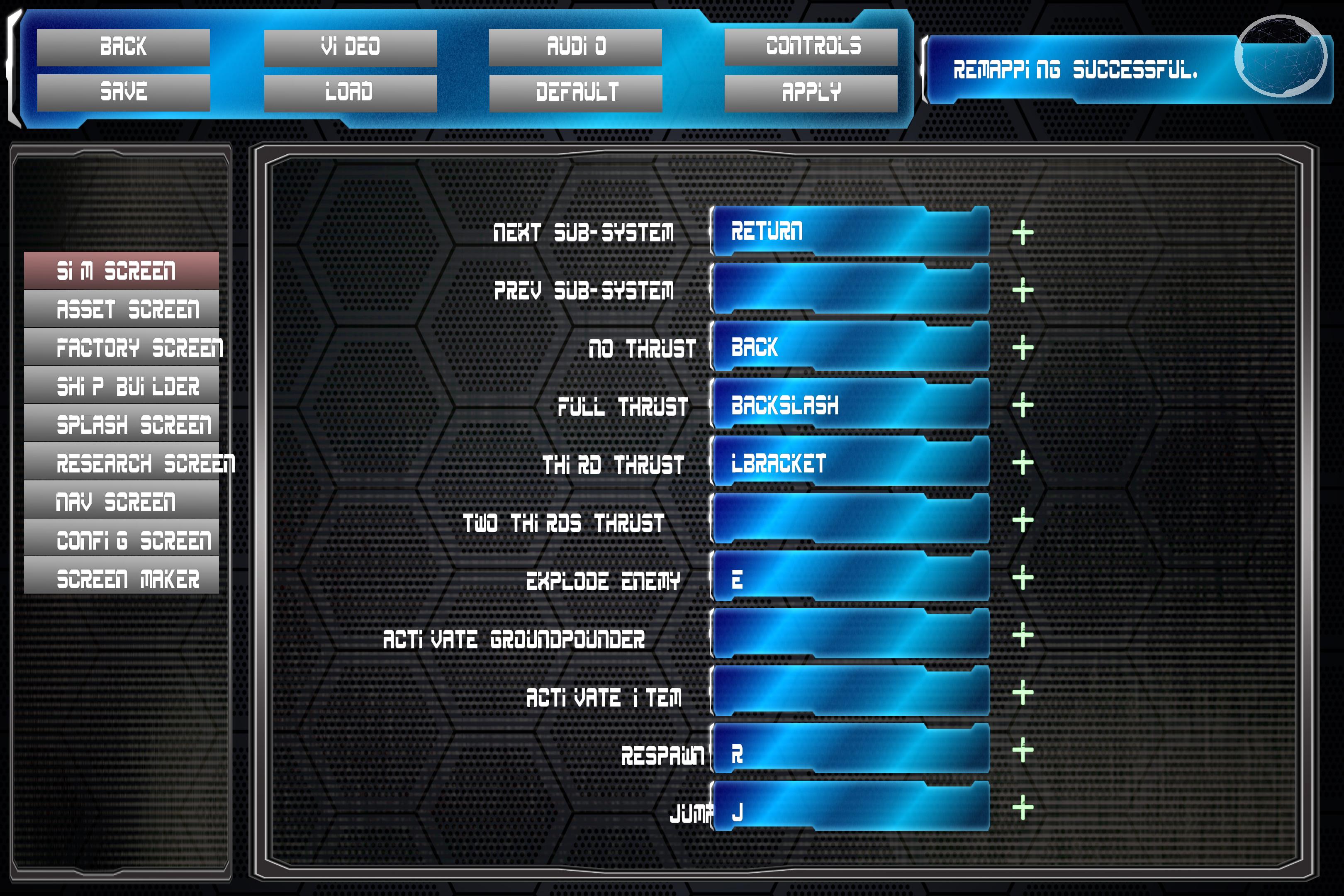
In addition to a visual upgrade, we've also upgraded the control assignment system. You can now assign controls per screen, rather than globally. This means that you can reuse the same keys for different actions depending on where in the game you are. The "A" key could do one thing in the flight sim screen, another in the research screen, a third thing in the navigation screen, and so on. You can also assign multiple keys to the same action on a particular screen. When you combine that with the heavily upgraded joystick support that Arthur has implemented, you can now have, for example, a fire button on both your keyboard and your joystick, or your keyboard and your mouse, for maximum convenience.
Check out our latest livestream, featuring a complete rundown of the new config screen features!
| Print article | This entry was posted by mdcode on 04/22/20 at 11:52:00 am . Follow any responses to this post through RSS 2.0. |
Ship progress
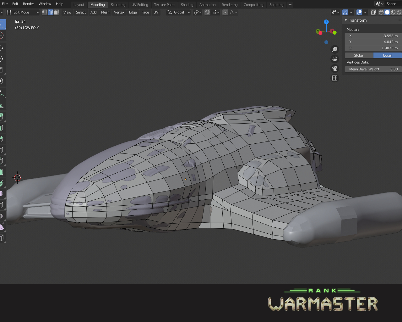
Not an exciting update but still an important step. Currently changing the low poly shape as the high poly version strayed away. This allows for a better texture bake. Next update will be 1000 times more exciting and colorful!
| Print article | This entry was posted by Kat on 04/16/20 at 12:57:00 pm . Follow any responses to this post through RSS 2.0. |
RTS building operational and Multiplayer Fleets

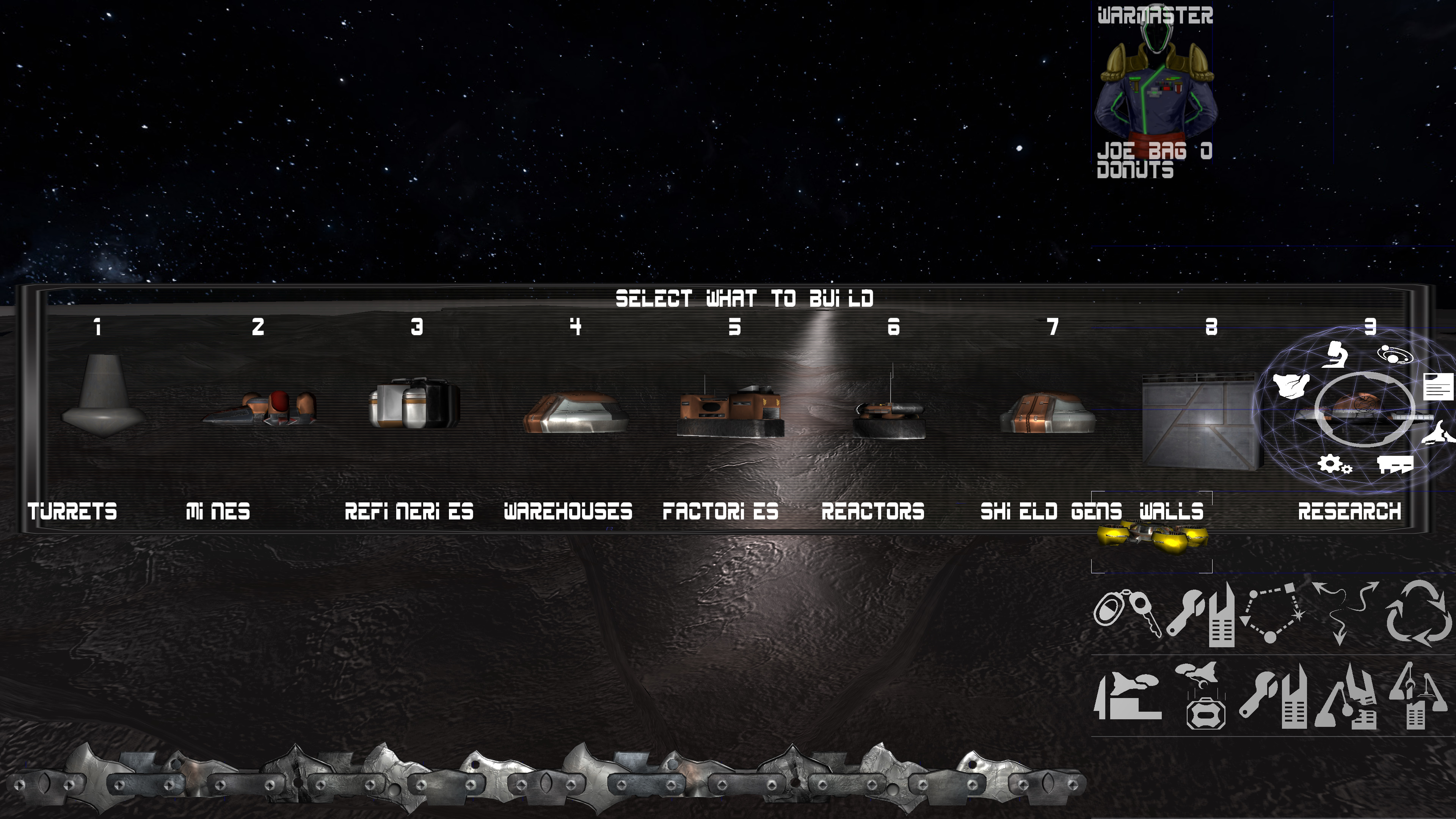
The Navigation/RTS screen is shaping up. Here is an example of building a reactor building. It's a much nicer interface for laying out a city than sitting inside your ship. This is also a good way of ordering fleets around at once.
Which also leads into fleet support now in multiplayer. While the OBS settings disappeared and I didn't understand what was wrong until after the live stream, functionally, fleets now work in multiplayer. People had a lot of fun during the livestream and now that I know how to reset OBS to the proper setting, next time won't be the slide show that was recorded. Playing it wasn't as bad as the recording, and I hope to show that in two weeks.
If you haven't yet subscribed to our youtube channel, please do to get notices when we are doing more livestreams! Thanks!
| Print article | This entry was posted by Arthur M. on 04/10/20 at 07:06:00 pm . Follow any responses to this post through RSS 2.0. |
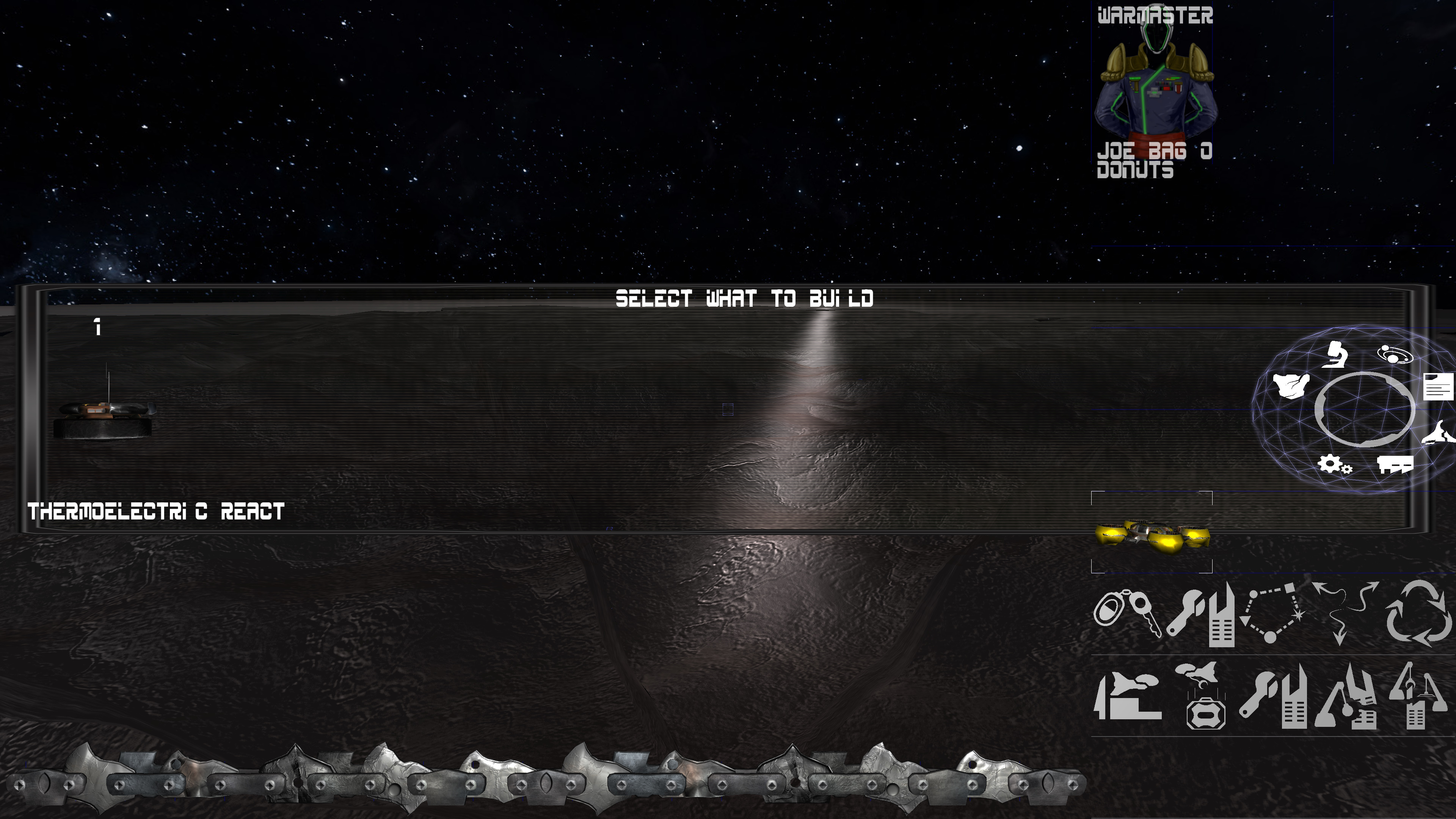
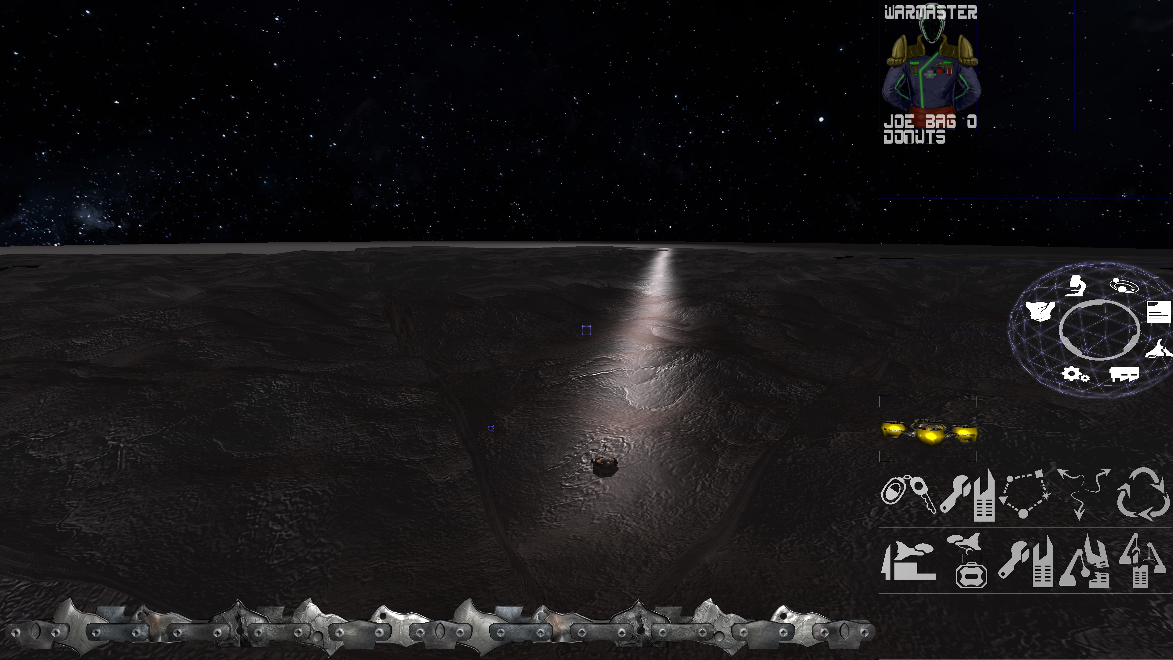
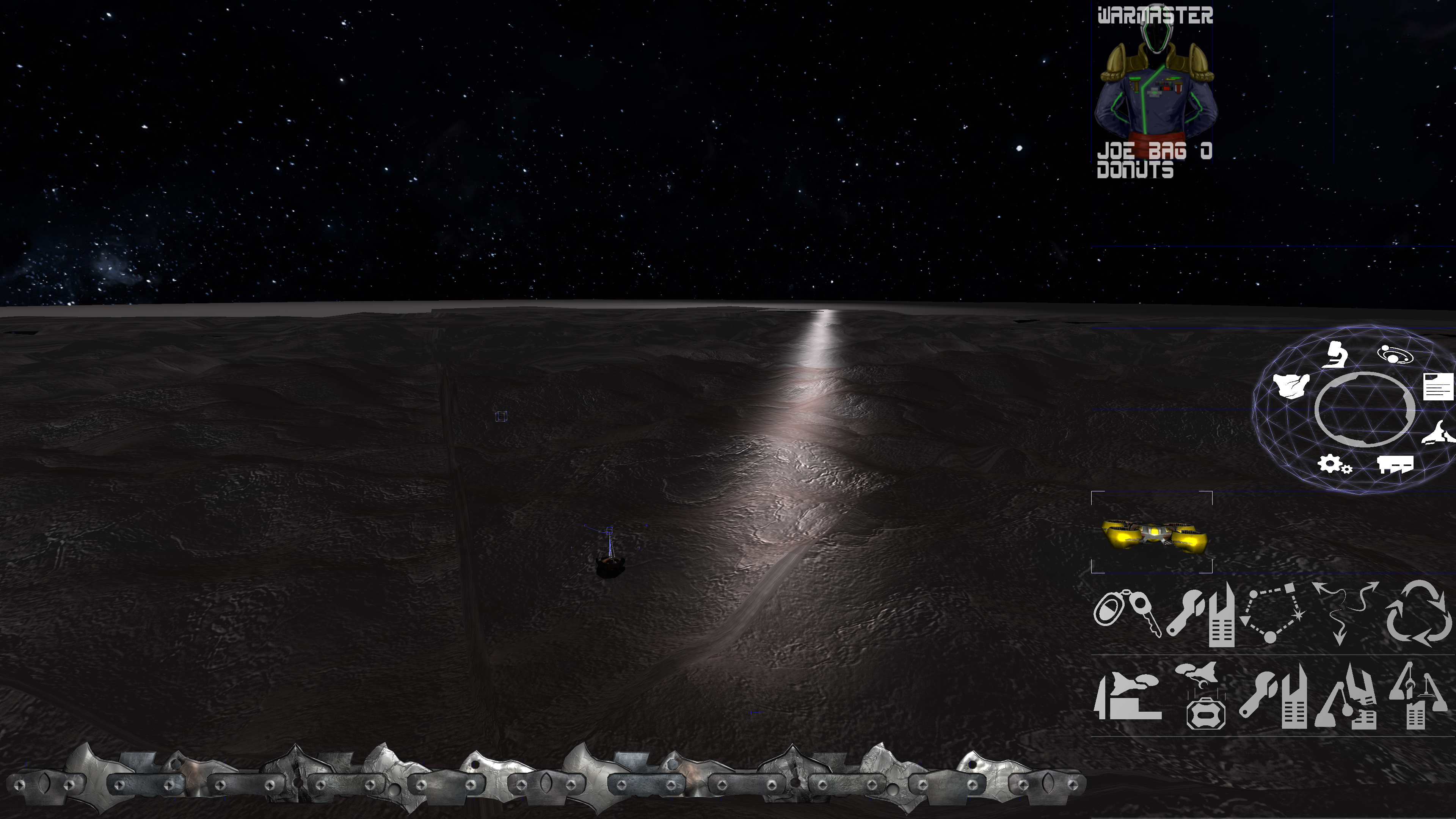
UI/UX Artist: It Fights For Control...

Hi all. This is your UI/UX Artist Paul here. This week I have a smaller delivery, but nonetheless a very important tool given Rank: Warmaster's nature. And those are the Controls for the Asset Screen.
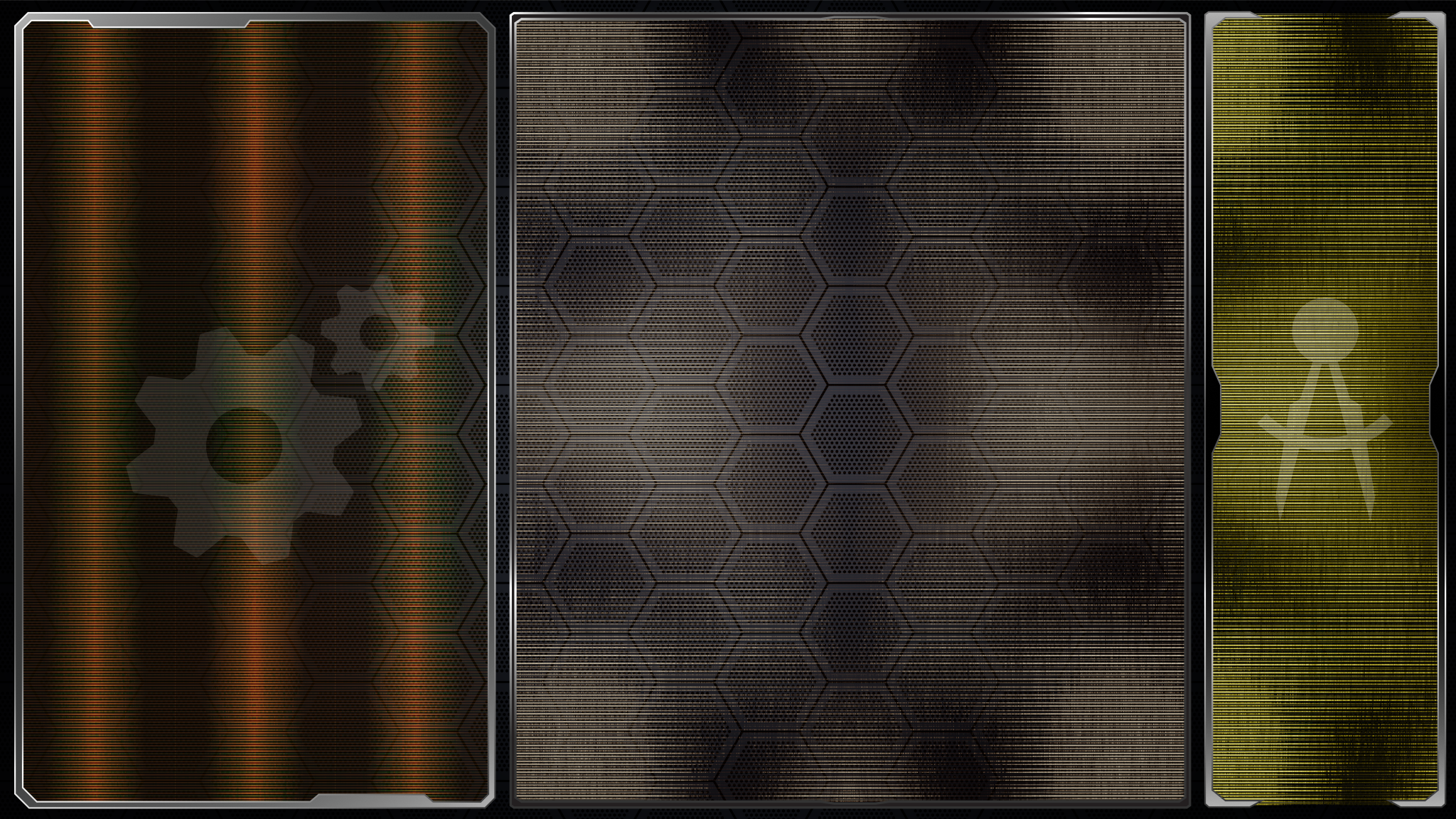
A minor tidbit of a graphical element set, but paralyzing to be without. In any game you have to be able to input data and easily denote quantities, even if it's just a matter of adjusting the in-game volume and screen brightness. In our case however, we have an empire to run, so being able to send resources to a recipient is absolute necessity. For that, a few simple mechanisms are needed: a text field to select the thing being transfered, a guage to input quantity, and a button to confirm the order. All of these things exist already both in code and raw graphical pieces, but bringing them together in a unified aesthetic was my task this time.
Diving into the deep end, the above teaser image displays the most complex of the Asset Controls. It combines all three mechanisms described earlier of a text window, slider, and activator button.
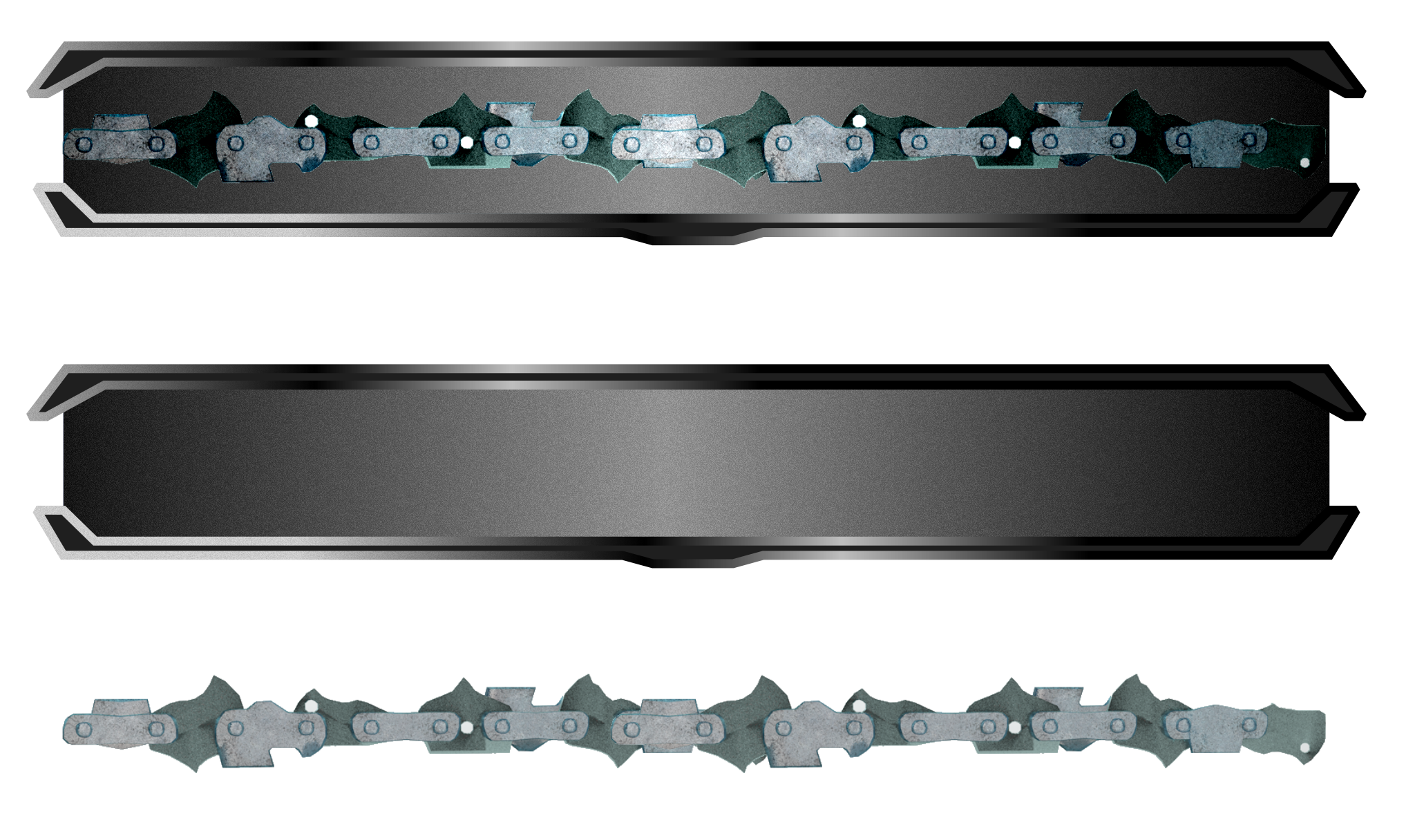
Here is a close up of the gauge slider itself, with an excised preview of the gauge chain bar shown below. Sometimes all you need is a slider bar, and the advantage of building the most complex backdrop first is that once you have that, you also have all the simpler elements as well.
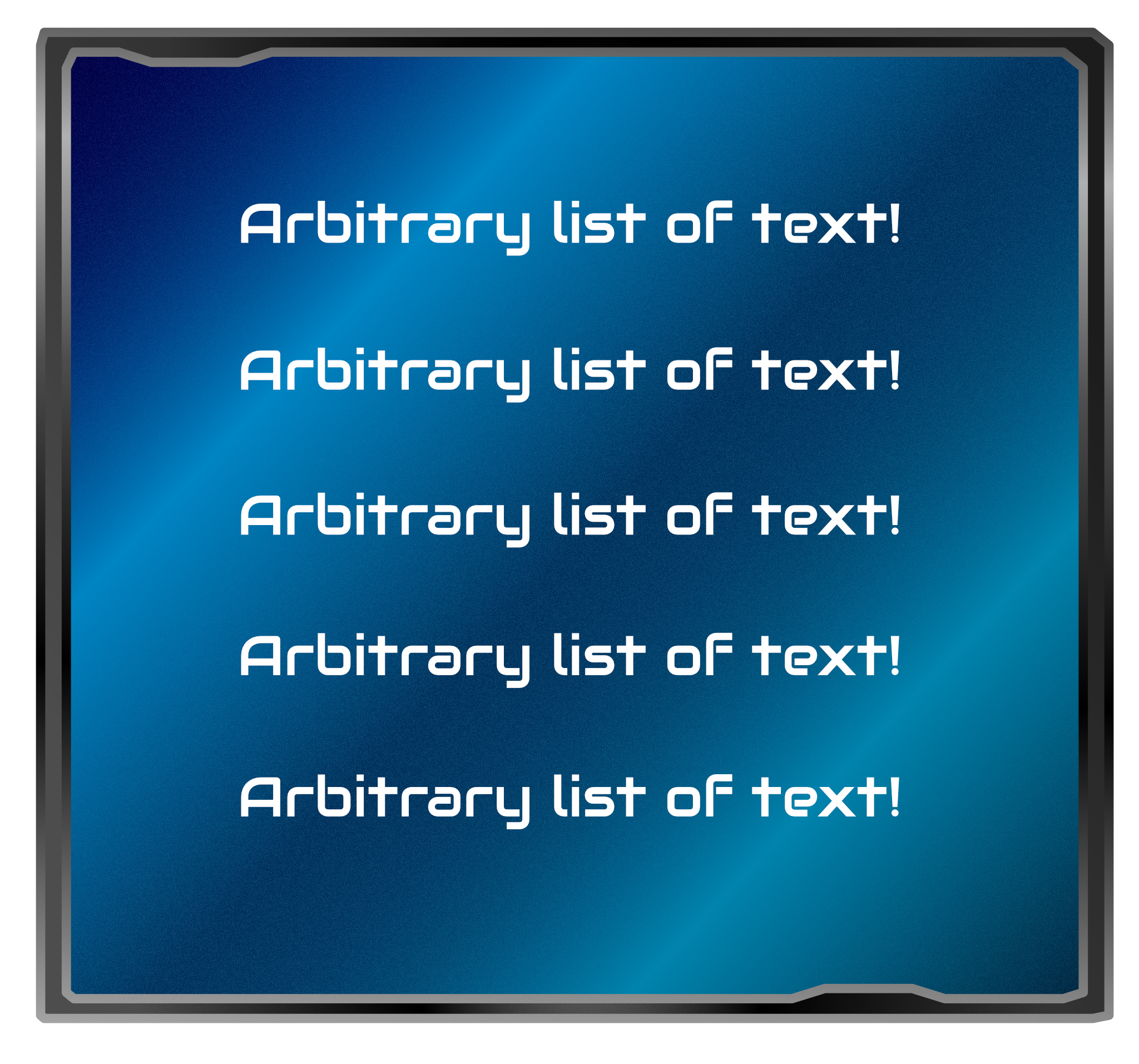
Lastly, here's a potentially optional wide text window. We are already using the individual text lines for lists, as demonstrated by the previous blog post. So this might not be implemented. However it was nonetheless one of the proof-of-concept pieces created along the way to the aforementioned text lines, and given the reflexive nature of design, there's no guarantee we won't see this element or some permutation of it somewhere else in the future.
| Print article | This entry was posted by paulb413 on 04/09/20 at 12:25:00 am . Follow any responses to this post through RSS 2.0. |
-

Random photo
